Talk:Reading/Web/Desktop Improvements/Archive1
Archives
|
|---|
|
Archive1 · Archive2 · Archive3 · Archive4 · Archive5 · Archive6 · Current discussion |
Interested in more
editI attended session about process of desktop improvements on Wikimania 2019, and there it was very nice discussion. So, as I`m interested about this, you can contact me any time if you needed about upcoming process. --Ehrlich91 (talk) 15:31, 31 August 2019 (UTC)
desktop on mobile
editI use wikidata on a mobile device with horizontal FullHD++ display. Still it starts with the mobile optimized view. Worse: After I have switched to desktop view, it ever and ever again reverts to mobile view, even so they tab stays open, I am logged in, if I have to reconnest to wifi. It doesn't matter to me if it is done with cookies, preferencs or javascript, that checks for screeen size, but: The one and only but massive improvement of desktop would be, if desktop view simply would stop to vanish. --C.Suthorn (talk) 08:00, 16 October 2019 (UTC)
- @C.Suthorn: For your comment: Two options: You might find it useful to switch on the "Advanced contributions mode" in your settings at the mobile versions, see more info at Reading/Web/Advanced mobile contributions. Alternatively, you might try using one of the browser-extensions which forces a redirection, e.g. firefox (but obligatory security warning, don't install random extensions, do check the author/sourcecode/usercount/license/etc.)
- If you have any feedback on the ideas and details specifically in the project page here, that would be appreciated. :) Quiddity (WMF) (talk) 16:01, 16 October 2019 (UTC)
- About Firefox: On the mobile device, I cannot decide to use the browser of my choice. (similar might be the case with iOS, where Safari is embedded so close with the OS, that using another browser is not really a way to go). I will look into the mobile preferences, but: Why? I never entered a xx.m.wiki... Url into a browser. I always use xx.wiki... because I prefer the desktop version. --C.Suthorn (talk) 16:41, 16 October 2019 (UTC)
Admin tools
edit- Deletion page -- It happens a lot when the admins need to delete several pages in a row with the same reason. So this tool should be able to store the last selected one to put it by default.
- Block page -- Same as above.
- Special:import -- Same as above, the most part of the importations are templates so it's counterproductive to import them into "Transwiki:" by default: let's use the last selected option instead. JackPotte (talk) 08:17, 16 October 2019 (UTC)
- @JackPotte: Hi. This project is to do with the entire design of the skin of the wikis, for all users, and is not going to be touching the design of individual special:pages. However, please do file phabricator tasks for your feature-requests, as they are good ideas. (this list of related phab #tags might help you).
- If you have any feedback or questions about the details in the project page(s) here, that would be greatly appreciated. Thanks! Quiddity (WMF) (talk) 16:11, 16 October 2019 (UTC)
Less items, less links, less confusing in toolbar
editCurrently, the sidebar blocks may be configured by local project admins, while the #p-tb tools block seems to be hardcoded at skin PHP level.
This should be reduced, and/or made available to local config.
I do regard the following links as no longer meaningful for anonymous readers and perhaps even newbies. They should get display:none on action=view for new or anonymous users:
- Related changes – not reasonable for a normal reader, confusing, meaningful for experienced editors only. One of many many possible advanced links, but a quite sophisticated one. Dedicated to those who are interested in checking article changes, but not promising for a reader.
- Upload file – a reader wants to read an article, not uploading a picture. Might have been meaningful in the first decade of wiki experience, but does need some background information about licenses. Available through Special pages anyway, like a hundred other special pages. If a project does like that link it can be offered in a Contribute section of the sidebar, but I do recommend a tutorial as link target for new users.
- Wikidata item – needs background; confusing for regular readers and does not help.
For deliberate action= like history or info or edit the user is in expert mode anyway. In such mode additional tools may appear, even more than today.
The same goes for printing, PDF (broken), exporting, book creation. Might have been meaningful in the first years, but papers in bookshelf are not really matching the needs of the handheld device driven community.
General note, even on items configurable to by local project – the following items might have been nice in the first years of wiki experience, but they do not tell anything on a Wikipedia or Commons:
- Recent changes – not meaningful for external people. You need to be member of that community to understand what is going on. Otherwise it is a meaningless game. Yes, things happen. Yes.
- Random page – to make the first experience that Wikipedia is an encyclopedia with many articles on topics you never heard of. Reasonable to introduce the new Wikipedia project in 2005. Nowadays our readers are born after Wikipedia has been founded. Nobody needs to make a test experience that Wikipedia is an encyclopedia with articles. Brother and sister, Mom and Dad are using Wikipedia frequently.
- Sandbox – not meaningful for content projects. Has been helpful in the first decade for wikisyntax experiments. Meaningful on a test wiki or by a technical site like mediawiki.org but useless with VisualEditor. For creation of a new article you need much more background on contents and requirements and policies. That link may be offered within guidelines how to contribute, but pointless for readers.
Items may be delivered as display:none and could be subject to user or project CSS rules for certain needs, but on +900 wikis without technical community it is better to switch off by default. The links are equipped with id= already.
I do agree with the following Stockholm statements, and pointed to explicit items.
- Different people have different needs.
- The interface should be more modular and configurable.
- The interface should be less dense, especially for readers. There was agreement that over time a lot of clutter has built up in the interface.
By keeping the classic appearance for registered users more or less as current but omitting items for anonymous view a smooth migration for old fighters will reduce riots due to disruptive changes.
Greetings --PerfektesChaos (talk) 09:48, 16 October 2019 (UTC)
Re: Feedback wanted on Desktop Improvements project (fawikipedia)
editI have nots iced Farsi wikipedia has been chosen to be one of the first winkies to utilise new format of wikipedia as beta. From your note in farsi version of village pump I gathered users need to attend this page and give feedback. I agree to be part of this improvement plan. Some concerns have already been discussed there. Gharouni (talk) 10:43, 16 October 2019 (UTC)
"Reading mode" and "editing mode"
editIn my opinion, a main reason for the problems related to UI is that the classic Vector skin tries to serve both readers and editors with mid-2000s tech, but fails to be a good interface for any of these two groups. A separation into quite distinct "read mode" and "edit mode" could be helpful, although it is clear to me that our readers are always considered to be (potential) new editors, and one does not want to alienate newcomers with a complete new interface that they have never seen in their reader role.
- Regarding a potential "reading mode" it would be cool if the content was horizontally restricted to a certain maximum width, in order to keep text line length at reasonable values. This would make reading *much* more efficient on Desktop. I suspect that the current average display has full HD resolution, which leads to texts which are really difficult to read due to line length (around 250 characters per line (!), depending on font and so on…); editors also tend to write paragraphs that are too long because of that. For readers, there should also be much more whitespace surrounding the text, and much fewer links to all sorts of editorial tools and pages.
- In "reading mode", the "editing mode" should be clearly advertised, and when entering the "edit mode", all the necessary links for editors could be displayed. Even that should be less than what we see currently, and lots of links could be re-organized in a much more logical way. IMO even for the "editing mode" a horizontal width limitation would be helpful, but it is not as important as for the "reading mode".
Another side remark: please make sure that the UI is quickly responsive after a page is loaded. There is a tendency that too much or inefficient javascript code slows down page loading, which can be really annoying for editors at least. —MisterSynergy (talk) 12:15, 16 October 2019 (UTC)
- @MisterSynergy: That's a good description of a core part of the problems, and of the challenges connected to the idea of a two-mode experience. :) Thank you for the specific ideas, and for the friendly description of the (shared) concern about performance [We do know that some experienced users still use MonoBook primarily for reasons of improved performance, among other reasons]. If you have any thoughts or questions about the ideas and design-mockups currently in the project pages, that would also be appreciated (perhaps in a new section). Thanks, Quiddity (WMF) (talk) 16:25, 16 October 2019 (UTC)
- I quickly scrolled through these slides and was positively surprised that the presented design mockups—which I all really like—seemingly still count as "no drastic changes to the layout"
 . That said, some of the design mockups are already implemented either way in the Timeless skin that I happily use in German Wikipedia for roughly a year now. That skin does implement some of my suggestions, in particular the fixed content width, and I find it much better than the classical Vector skin in spite of its apparent beta quality in many places. It feels like a development clearly into the right direction, but in some sense not implemented consequently enough, like "stopped somewhere halfway of the necessary journey towards a really useful UI design"; for instance, it still tries to serve readers and editors with basically one UI which is a compromise for both modes, and the number of rarely used links has been re-arranged, but not really reduced. Anyways, based on what is presented in the PDF slides and my positive experience with the Timeless skin, I have some hope that this desktop improvement initiative is going to be useful for the movement. —MisterSynergy (talk) 19:27, 16 October 2019 (UTC)
- I quickly scrolled through these slides and was positively surprised that the presented design mockups—which I all really like—seemingly still count as "no drastic changes to the layout"
- Hmm... I use a lowly 25 inch screen with around 280-300 characters per line and I wish there was more... it's really a matter of personal taste. @MisterSynergy: , you named one side issue, that paragraphs become probably too long, but there's more. Thе articles themselves increase; seven years ago a 400 kB featured article was a one-of-a-kind bomb, today it's just one of many. Big screens lend themselves well to large tables, elaborate graphic layouts, math, oversized infoboxes etc., and each of these 'excesses' has quite a few proponents who will certainly oppose any downsizing of text area. Any substantial redesign, IMO, should address graphic layout directly, in a MOS-like way, and then explain what to do with legacy pages. Too many pages won't fit the proposed shrunk page pattern, but who will fix it? Retired electrician (talk) 19:25, 18 October 2019 (UTC)
- Sure, I understand. The more content we densely squeeze into the viewport, the less excessive it appears in some situations. But I think we should acknowledge that:
- Line lengths of 250, 300, or even more characters per line (cpl) are simply way beyond any acceptable values with respect to optimal readability; there is in fact personal preference regarding optimal line lengths, but typical values are in the 35 … 110 cpl range. I don't think we should necessarily restrict ourselves to that range, but it can definitely provide orientation.
- A substantial part of the readers use mobile devices, AFAIR it is meanwhile even the majority of readers. Their displays are much smaller than desktops, thus content produced on and optimized for excessively wide displays does not go down well for them.
- Median page size was at ~2.5k around two years ago (and it hasn't changed much if I may speculate); important articles in terms of readership tend to be a little larger, but are still more at wikitext lengths of the order of 10k or so. There is a tendency that some authors write articles on advanced university term paper level, but this is certainly not a good orientation for our UI design.
- In general, I find it quite remarkable that Wikipedia is at its core a text-based medium, but we *never* had an UI that is in any way optimized for the needs of readers: efficient reading, efficient navigation (internal links and search function), and to some extent also use of talk and history pages. This lack of reading experience optimization is probably related to the origins of Wikipedia in the early 2000s, when average desktop displays were much narrower, and content was typically stretched across the entire screen. The Vector skin is sort of a modernized derivative of Monobook, as it still uses the same early-2000s UI design ideas.
- Mind that a good reading UI could be user configurable: content width, font size, and maybe even font face could simply be made selectable within certain limits, in order to allow some sort of optimization according to personal preferences. There could also be a "dark mode" for reading. (All as indicated in File:Sketch of reading preferences panel for the Desktop improvements project.png.) —MisterSynergy (talk) 21:26, 18 October 2019 (UTC)
- Sure, I understand. The more content we densely squeeze into the viewport, the less excessive it appears in some situations. But I think we should acknowledge that:
Diverging interests of casual readers and experienced editors
editI feel like interests of eexperienced editors and casual readers differ a lot here.
- As an experienced editor,
I want as little collapsible items as possible, even if I have to choose non-default gadgets. In particular I want to have non-collapsed the following things:
- Advanced editor / admin links (move, delete, protect...): I sometimes have to do bulk deletions / bulk protections, and having to uncollapse every time means one extra click
- Sidebar tools: page links (what links here, related changes, Wikidata...) and general links (recent changes, new pages, village pump). I am likely to click them for pretty much any page, and I don't want one or two extra cliks for this.
- Interwikis: I edit multiple wikis and speak multiple languages, sometimes I am interested in a specific language (e.g. I may want to open an article in Polish about a town in Poland), sometimes I am interested in all languages (e.g. I want to find the one which is most up-to-date). No collapsible interwikis, and especially no interwikis search will work for me.
- Full-text search (e.g. to find and replace a typo).
- Quick links to sections, particularly to edit the right section.
- As a reader,
- I want to quickly find an article I need via search, with as good descriptions as possible in case of disambiguation
- I want to use some links on sidebar (such as current events or random page)
- I want to have interwiki links easily accessible and prominent. Not sure the current option is perfect, it might be underused because of this, thus an A/B test would be useful.
- I should be offered an intuitive way to edit, as we expect to turn interested readers into editors. I should probably be able to check help or FAQ in an intuitive place
I understand that my interests might differ from that of most readers, but please include a less collapsible option, preferrably as a global gadget, and do not hide anything newbies may need when they start editing — NickK (talk) 15:10, 16 October 2019 (UTC)
- @NickK: Thanks for the feedback. A few of the points you raise were also mentioned during Wikimania (see Wikimania Stockholm research report for details), and it's clearly understood that some editor workflows need constant and instant access to these links.
- Overall, it's currently looking like one of the better options might be to collapse the sidebar for logged-out users, and leave the sidebar uncollapsed-by-default for logged-in users, perhaps along with some re-examination of the specific items in the default&customized sidebars.
- There is also some recent analytics research at phab:T229926#5491420 that is looking at some specifics of what links are most used, and determining what to research next, although the nuances of important-but-edge-case-workflows need to be kept in mind as they tend to not show up in broad statistics. Thanks again. Quiddity (WMF) (talk) 19:20, 16 October 2019 (UTC)
- @Quiddity (WMF): Thank you, a lot of interesting data there!
- Can we perhaps have a deeper analysis, notably with inclusion of more projects (particularly those with different sidebar arrangements), and with split of users by activity if possible (e.g. splitting logged out users who edited from those who did not, logged in users with advanced rights, those without but who actively edit, and those who do not edit)? I am pretty sure patterns will be different especially from one group to another.
- Another point: can we have more data on interwikis usage please? In particular what are the most popular interwikis per language, and whether they are collapsed or not by default.
- Thanks — NickK (talk) 19:40, 16 October 2019 (UTC)
- I agree with the separation of the the user populations, but I warn against considering the "readers" as interested in the article page only. If we want to improve reader engagement and competency, please make talk page and history easily accessible for readers. TIA --H-stt (talk) 14:11, 17 October 2019 (UTC)
Customizable UI
editThere are many links in menu, but some of them I use seldom.
- link to main page is duplication of logo.
- section print/expot I used maybe once in 15 years.
- actions for page (move/delete/etc) in vector are hidden, so I still use monobook in my main wikis
- search field and personal links are always visibkle in timeless, but it would be fine, if I can some links "pin" out of collapsible menu.
So I would like to have possibility to hide some links/sections and some "pin" so are always visible.
And one more thing - it would be fine, if there is button for going to top/end of page (e.g. I want to see categories). JAn Dudík (talk) 19:08, 16 October 2019 (UTC)
- @JAn Dudík: Thanks for the specific ideas and details. Customizability is always the ideal dream, but is also unfortunately the most technically complex; it's hard to create, hard to maintain, and especially hard to make it with good "performance" (speed) for all the users. This is partially why gadgets/user-scripts are so well-loved by highly-active editors, and hence why we're trying to collect more details on which ones are related to this project. Thanks again. Quiddity (WMF) (talk) 19:28, 16 October 2019 (UTC)
Instead of hiding, make the UI specific for readers/editors.
editA lot of the reasearch proposals suggests hiding this and that. That is not really the solution. Instead, the sidebar should be as-is for logged in users (many users are pretty resistant to change anyway), but for others the sidebar would include the table of contents when there are 8+ headers, link to pdf creation for that page (for the laptop users), the language links and an link to an Help desk (where it exists) or the Village pump (where it does not). Many readers also do not realize that the Categories would make it easier for them to find similar material. Maybe that needs to be renamed to Folders, but only for the logged out users.
I see these research suggestions are made based on click counts, but really I would not read so much into that. The fact is that many users do not find these links in the first place. Specifically, it has taken me quite some time to explain where users can find the language links. That is an indication that the whole UI needs to be rethought from scratch, rather than shuffling or hiding links away.
What would be really useful is moving the "Edit" tab over next to the "Talk" tab. Really, that change is long overdue, and yes, there is an research paper on it somewhere. Also, the crosswiki search will be really useful for readers, but that is allready being worked on anyway.--Snaevar (talk) 20:59, 16 October 2019 (UTC)
- @Snaevar: thank you for the ideas. A couple of notes from our side:
- We are currently looking into different behavior for the sidebar for logged-in and logged-out users, with the sidebar being open for logged-in users and closed for loged-out users. Some of your suggestions are actually pretty close to what we were thinking as well. What we are trying to do in terms of separating different links is to have the things related to the article (such as PDFs, table of contents, etc) in a different place than things related to site navigation (such as links to the help desk or village pump). I like the idea of making a help link more obvious for logged-out users - maybe this is something we can explore further
- For language links, we are exploring a few more options on making them more prominent, such as moving them to the top and highlighting the main languages someone might use
- Feel free to check out all the individual ideas we tested and some more in the research report. Thanks again OVasileva (WMF) (talk) 10:58, 17 October 2019 (UTC)
Improvements for Consideration
editI mention the following improvements for consideration:
- Shared templates - Similar to how File: works now, if Template: exists locally, use the local copy. If Template: doesn't exist locally, use a common copy. It doesn't have to come from Commons. It could come from MediaWiki or Meta as a central repository for common templates. But having common templates and a single point of update, perhaps by language, would go a long way toward standardizing the user interface and functionality.
- Shared gadgets - Similar to shared templates, provide a central repository of common gadgets, again either on MediaWiki or Meta. Having a central place allows easier implementation for small wikis.
- en.wikiversity has Quiz and MOOC add-ins / gadgets. I don't know if they would be useful elsewhere, but they should be considered.
- The LintHint gadget should be standardized and centralized.
- In the process of standardizing and centralizing gadgets, provide clear documentation and examples for how new gadgets can be created. This may exist already, in which case, link to it and improve it.
- The biggest complaint I hear from new users is how difficult it is to work with files / images. Upload is not at all obvious, the upload user interface on Commons is completely different, etc. Embedding existing files is also not intuitive for new users. We need to get to a point where properly licensed media can be added as easily in wiki as it can on other sites or editors will move on and create content elsewhere.
- Remember security. Much of what you describe is under the restricted UI area, where most users can't make changes.
Thanks for asking. -- Dave Braunschweig (talk) 02:29, 17 October 2019 (UTC)
- @Dave Braunschweig: Those are some good ideas, some of which are being worked on elsewhere e.g. phab:T121470 (and the first 2 are taking a long time because they're immensely hard both technically and socially), but they are not part of the area that this particular project will be covering. This project is primarily about the areas highlighted in the image at the top of Reading/Web/Desktop Improvements/Research and design: Phase 1, and making the sites easier to use for everyone. Please take a look through the project page(s) and share any further feedback you may have on the ideas and design ideas within. Thank you! Quiddity (WMF) (talk) 18:05, 17 October 2019 (UTC)
- @Dave Braunschweig: , shared templates definitely won't be done in the scope of the Desktop Improvement project, but I agree that it's a very necessary change. I'm trying to write a proposal about this here: Global templates. I'd love to hear what do you think about it.
- Since it won't be in the scope of the Desktop Improvement project, it's better to continue this conversation at Talk:Global_templates.
- Thanks! --Amir E. Aharoni (talk) 14:52, 28 November 2019 (UTC)
- @Amire80: Excellent proposal. I added my support. -- Dave Braunschweig (talk) 15:45, 28 November 2019 (UTC)
Unterschied Autoren und Leser
edit- Ich denke Autoren benötigen ganz andere und ggf. individuell verschiedene Dinge als ein Leser.
- Für Autoren ist eine Umfrage hier ggf. nützlich. Für Leser ist es IMO eher nutzlos. Hier im mediawiki-Wiki sind ja nur die "hardcore"-Nutzer. Selbst den normalen Wald- und Wiesen-Autor werdet ihr hier eher nicht erreichen. Das ist m.E. ein gravierender Nachteil. Wenn ihr also an deren Feedback interessiert seit müsst ihr wohl andere Wege wählen ... achja und nicht vergessen: "andere Länder, andere Sitten" - nur weil in US-Amerikaner etwas toll findet, muss das Deutscher noch lange ich toll finden. Also ggf. mal ein wenig umschauen (und nicht wie bei der Verschiebung des Suchfeldes von Links nach rechts 8 (in Worten "acht") Leute frage. So habt ihr das beim letzten Mal gemacht und das ist irgendwas zwischen peinlich und unfähig. Meine Erwartungen sind aber ehrlich gesagt genau so. Ein paar Nutzer hier, ein paar Hardcore-Wikipedianer auf der Wikimania und dann die Techniker bei WMF; fertig. So ist meine Erwartung wie die Millionen Dollar schwere WMF arbeitet; heute und in Zukunft. Nichtdestotrotz hier meine Anmerkungen;
- Ansonsten bin ich monobook-nutzer der sein Suchfeld links hat. Würd ich gern so beibehalten.
- ich würde gern bestimmen können welche Sprachen mir prominent angeboten werden. Die 9 größten Sprachen nützen mir überhaupt nix. Außer englisch verstehe ich keine davon. Dafür aber polnisch. Die taucht aber nicht auf. Das individuell gestalten zu können empfände ich nützlich.
- Ein großteil der Links die Links im Menü zu finden sind halte ich für nicht nützlich. Weder für Autoren noch für Leser. "Witzig" sind die Links unter "In anderen Projekten". Das ist so gut versteckt, dass es nur für Autoren wirklich eine Bedeutung hat. Warum nicht mit Symbolen arbeiten? Allerdings ist das Commons-Symbol so kryptisch, dass es wohl auch nutzlos ist. Hier müsste etwas her, dass auch von einem Nicht-Insider sofort verstanden wird.
- Tja und abschließend sei es nochmal gesagt: ich, wie Sicherlich die meisten die hier kommentieren sind mehr oder weniger alte Hasen mit einem eingeengten Sichtfeld. Wenn ihr wirklich etwas verbessern wollte und nicht nur ein bischen rumflicken, dann geht zum einen raus und fragt die "einfachen Leute" und nutzt ggf. eine Design-Agentur die mal frischen Wind in die Bude bringt ...Sicherlich (talk) 15:27, 17 October 2019 (UTC)
- @Sicherlich: Thank you for the feedback. Sorry for replying in English. For your comments about language links, the details in sections 2.2 and 2.7 here might help: Universal Language Selector/Compact Language Links/de. Quiddity (WMF) (talk) 17:52, 17 October 2019 (UTC)
- @Sicherlich: I will add: This is just one of the channels we're using for feedback. We're also going to be doing quicksurveys with all editors, and we will test prototypes (when ready) using central notice so more people can participate, and we will be doing outside user research with readers. Quiddity (WMF) (talk) 18:29, 17 October 2019 (UTC)
- @User:Quiddity (WMF): Englisch: kein Problem.
- Sprachlinks: das ist nicht das Problem um welches es mir geht. Im Artikel de:Deutschland sehe ich im linken Menü unter "In anderen Sprachen" standardmäßig Links zu 9 Sprachversionen der Wikipedia. Davon spreche ich genau eine: englisch. Weitere Sprachen kann ich nur durch extra-Klicks sehen. Oder ich ändere das irgendwo in den einstellungen (oder monobook, css. oder k.A. wo ich das geändert habe) und sehe alle Sprachen. Ich würde aber gern standardmäßig "deutsch, englisch, polnisch" sehen. Der Rest ist für mich im allgemeinen irrelevant.
- Bzgl. "andere Kanäle" muss ich mal Goethe zitieren: "Die Botschaft hör ich wohl, allein mir fehlt der Glaube". Das wurde auch bei der "großen" Designänderung vor X Jahren behauptet. Nach eifrigem Nachfragen stellte sich dann raus, dass es besagte 8 Leute waren. Das in Kombination mit dem sonstigen Auftreten von WMF lässt mich die Aussage wenig glaubhaft erscheinen (sorry, wenn ich Dir damit Unrecht tuen sollte. Am Ende bist aber Du Sicherlich nicht der einzige im Projekt) ....Sicherlich (talk) 07:47, 18 October 2019 (UTC) Erläuterung Auftreten von WMF: Das reicht vom Superprotect über Heilman bis zu Fram aber auch so einfache Dinge wie es WMF seit Jahren nicht schafft außerhalb des englischen Sprachraums zu denken/zu sprechen. Im Sinne von AGF ist es wohl einfach Unvermögen zu Verstehen das dies eine Bedeutung hat. Wenn man AGF weglässt ist es wohl Arroganz
- @Sicherlich: Re: language links: If you add Babel boxes to your meta-wiki userpage, that will force the inter-language links that you want, to always be shown (if available) on all wikis. (More details in my link above).
- Re: non-English work, there is some ongoing or recently concluded/started work, e.g. Growth and New Editor Experiences and m:New Readers (and now Inuka team) and Project Glow (just from my memory). I understand your point, but it's not possible to talk to/work with everyone at once!
- If you have any additional ideas on "Ich denke Autoren benötigen ganz andere und ggf. individuell verschiedene Dinge als ein Leser." beyond the ideas you already added, that would be appreciated. If I understand correctly, so far you've recommended: an easier way to customize which inter-wiki language links appear by default, a clearer display of inter-wiki (project) links, and a cleanup of sidebar links.
- Thanks again. Quiddity (WMF) (talk) 18:48, 21 October 2019 (UTC)
- Ah! Gut, ich dachte es geht nur um die angezeigte Wiki-Sprache. Gucke ich mir an. Zeigt natürlich gleich das nächste Problem: Einstellungen macht man überall verstreut ein bischen. Wenn irgendwas aber nicht mehr funktioniert ist es abenteuerlich herauszufinden wo was geändert wurde.
- Sprachen: Guck Dir mal Deine Links genau an: Mit eher zufällig ein bischen, manchmal gar nicht teilweise übersetzten Seiten wird als also "non-English work" angegangen? 😂 Danke für die Bestätigung, dass es WMF völlig überfordert ist mit der bedeutung von "global". Du hast Recht mit "it's not possible to talk to/work with everyone at once!". WMF ist aber nichtmal in der Nähe von "mit allen". Es spricht mit wenigen Hardcore-Wikipedianern. Denen die auf irgendwelchen Konferenzen rumlaufen und/oder mit Leuten die sich auf meta-Wiki oder gar hierher verlaufen. Das ist ganz dicht an "mit keinem" dran. Aber was red ich; diese Geschichten werden regelmäßig an WMF herangetragen und es wird genickt und zugestimmt und gesagt "danke für Deinen wertvollen Input" und es passiert genau gar nix. ...Sicherlich (talk) 21:27, 21 October 2019 (UTC)
- The actual work in those other projects is/was carried out in the local languages. I agree it would be great if everything was translated, but that's not practical. It's already a lot of (deeply appreciated) effort to do translations for pages that really do need it like this one, and Tech News. We all have to prioritize as best we can. Quiddity (WMF) (talk) 16:58, 22 October 2019 (UTC)
- "that's not practical" - ist es für die großen Sprachen problemlos: Dolmetscher einstellen: Problem gelöst ... man könnte natürlich auch eine Art Botschafter in den Projekten haben, der neben der Sprache auch gleich noch die Kultur kennt. Sowas in der Art gabs ja auch, wurde aber durch den völlig sinnlosen und überzogenen Einsatz von Sperrechten (aka Superprotect) leider verbrannt. Man könnte Sicherlich auch die lokalen Chapter dafür begeistern. ... Es gäbe also genug Wege, wenn ein Wille da wäre ...Sicherlich (talk) 19:42, 22 October 2019 (UTC) "like this one"? Also die deutsche Übersetzung ist ziemlich unvollständig, dito die spanische, die französische, die polnische usw. einzig zh scheint übersetzt
- The actual work in those other projects is/was carried out in the local languages. I agree it would be great if everything was translated, but that's not practical. It's already a lot of (deeply appreciated) effort to do translations for pages that really do need it like this one, and Tech News. We all have to prioritize as best we can. Quiddity (WMF) (talk) 16:58, 22 October 2019 (UTC)
Proposal: respect the user's screen space and attention
edit[@Quiddity (WMF): Dumping this here since I don't know what a sane format for this would be on the page.]
TLDR version: please fix phab:T163098!
The current page layout on most projects appear to have been driven by "Stuff I think is important" priorities from people working on one narrow nook and cranny of the software or another. For example, the "branding" folks (those guys that think renaming every project to "Wikipedia" is a great idea) will insist that the logo be in exactly the place and size where it currently sits. The Legal folks will insist we have a footer full of disclaimers and other legal mumbo jumbo. We must, of course, have the search field easily accessible and visible (after all, the ElasticSearch guys spent a lot of time on the new search engine). Visual Editor is the saviour for editor retention, and since all those recalitrant old-timers refuse to have it be the One True Editor, we must set aside prime space for two "Edit" buttons. And so forth… And all of those things are probably true too. It's just that they are narrow concerns and true only in isolation.
The one concern missing in all of these voices is the content. The article on Wikipedia, the media and file description on Commons, the works on Wikisource, etc. To take a meta-example from a non-content page, the Special:Watchlist. Go look at it… See all the fancy OOUI chrome for the filtering functionality (which nobody uses on the Watchlist, but it's the same code that's used on Special:RecentChanges, where it is used, so the Watchlist gets it too)? All the other stuff crammed in there? Now try to identify what the primary purpose of that page is, and what part of that page the user is primarily interested in. How much of the available page space is budgeted for that primary content, and how much is budgeted for secondary and tertiary content?
I did this exercise for my own very real use case on English Wikipedia, and filed a bug for it: phab:T163098 (Isarra was, not unexpectedly, the only person that looked at it). Ballparking on those screenshots (I'll get out a ruler and measure if you want) I'd say 90% of the available page space is given over to secondary or tertiary content, and only 10% to the primary content. That's not just not optimal, it's an outright catastrophic failure.
The issue isn't as bad for actual content pages, but there's still a disproportionate amount of space given over to things other than the primary content (the Wikipedia article, as the obvious example).
This problem also manifests in ways more subtle than mere relative size: look at a page and tell me what element is most important in it? The writing system direction tends to correlate with a hierarchy of importance for visual regions of a page, so for left-to-right horizontal readers, the page elements in the top left corner are by far the most important, with decreasing importance the further to the right and down you go. Guess what's in the bottom right corner (most likely partially hidden behind a need to scroll vertically)? That's right, the primary content of the page (the Wikipedia article). What's most important? The logo, then the toolbox widgets and other meta-stuff.
I was bothered by this reversal of priorities to the point I actually wrote a toy user script (w:User:Xover/focus.js; if you try it, it puts a little image dingus in the top left corner that toggles hiding/showing) that hides everything except the primary content on the page, mainly for use on my Watchlist. The difference is… eye-opening!
I'm going to propose… that the effort start by completely reversing the hierachy, and goes to the opposite extreme. Top left is reserved for the actual primary content. Any chrome, branding, information (legal etc.), links and tools go to the right and the bottom (maybe the logo joins the legal disclaimers and terms of use?). And that starting from that baseline, every single element that wants to move up and to the left has to justify its increased priority relative to every other page element, and especially the primary content. And the more space you want to occupy (the bigger the chunk of the budget you're asking for), the better you have to justify it. If we absolutely positively need to have something up in the top—left real estate somewhere, at least make it as small as possible. A small 18x18 globe icon that pops up the language switcher? Probably much easier to justify up there than a big >100x100 box of text listing the different languages…
You can't deploy a design taken to that opposite extreme, of course, because visual hierarchy and such aren't the only axis on which to assign priority, and in the real world you have to take into account users' learned behaviour from other sites. But maybe starting from that new baseline, and with new fresh eyes, it becomes feasible to move the logo to the top right instead of the top left? Maybe, just maybe, we can move or redesign the left sidebar such that it doesn't take up so much of that valuable top—left page space? If we stick more of the left sidebar stuff up into drop-down menus at the top (like the "More" menu), maybe what's left can be handled differently? If switching languages is a button-like UI widget somewhere, maybe we don't need to have a left-sidebar list of all of them? And so forth and so on…
With widescreen monitors and the type of content we host, the vertical space is much more precious than the horizontal, and the space that's too far right is effectively "junk" real estate (in a fullscreen window on a 32" desktop display, the right edge is in Siberia). So it should be hard to justify every use of a vertical pixel, and anything that's happy to exist on the far right of the page can get that space for cheap. But whether Bel Air or the Caucasus, the design needs to consider the cost of the stuff that's put on the page, especially that fixed stuff that's always there and is present on every page.
And one thing is for the visitors (they may need hand-holding in the form of branding and links to FAQs etc.), but for someone who has been here ten years and is trying to write an article about a neglected female scientist from the global south… They know what site they're on. They probably wrote the FAQ that's linked there. They're +sysop on a couple of the other language projects linked in the sidebar. They have keyboard shortcuts that trigger custom user scripts for all the stuff that's in the editor toolbar. They don't need the reminder that their contributions must be dual-licensed under blah blah. Why isn't the editor text box full screen on the left of the screen and a live-updating preview of the page in fullscreen on the right? Those are the two elements they actually need in that setting. Visual Editor would approximate this, but since it has prioritised being friendly to new users it has limited support for stuff experienced users need (like arbitrary templates) meaning the experienced users are the ones most opposed to Visual Editor.
The interface isn't for a single, homogenous, group of users, and so it can't be a single fixed thing that tries to cater to everyone. Who the user is determines what are the important parts of it, so the interface needs to adapt to which user is using it. And if it does, it can get rid of things that are of no interest to the current user and thus gain back valuable real estate on the page. Ugly confusing wikimarkup and template invocations should not be dumped in the face of a new user or normal reader just trying to fix a typo, so take those away and use the space for branding, legal, or FAQ links. Conversely, take away the branding, and legal, and FAQs for the experienced users (who have asked for that in their preferences), and you have loads of space to put in technical tools or prevent distractions from the content or…
Bottom line, I, as a user of the interface, want you to respect my available screen space and the demands on my attention, and to be frugal in imposing on either. What task or content I am after determines what is worth my screen space or my attention. Your concern for branding, or legal, or user interface design or technical purity are insufficient grounds for "spending" my screen space and my attention.
I am, above, exaggerating for rhetorical purposes, of course; but if you adopt that perspective and then analyse the UI and layout there are a lot of questionable decisions there.
And if anyone can manage to boil that wall of text down to something that fits in the format of these suggestions I'll be mightily impressed, and not a little grateful! :) --Xover (talk) 10:11, 18 October 2019 (UTC)
- Hi @Xover: . Thanks for taking the time to write in detail. :) IIUC, and just hitting the highlights, and without addressing the many good ideas in phab:T163098, you are commenting on:
- 1) the size of OOUI interface elements -- (I made a related reply about that in the #section below this),
- 2) the layout of various interface elements, which sometimes get added on new lines individually, instead of all in a row. -- Yes, this has been a point of concern for experienced editors. It's hard to balance newcomer-friendly clarity with experienced-editor needs for density/efficiency, but there is still room for improvement in some of the designs.
- 3) the collapsibility of blocks of interface elements -- Good news, you can collapse the new filters! Although I just noticed some odd whitespace there, and will file a task... phab:T236105.
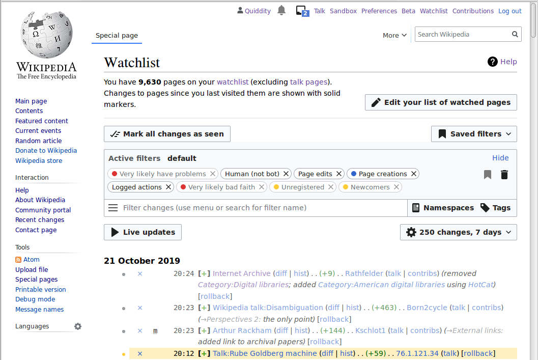
- 4) Whether anyone uses the improved filters on their watchlists -- I do for one! E.g. https://i.postimg.cc/qBy8f3CH/image.png - the background-color filters help me quickly find potentially problematic edits to focus on. I've also got a custom rule which gives 60% opacity for editors with 500+ edits (
.mw-changeslist-user-experienced {opacity: 0.6;}) which further helps me focus attention on newcomers. Plus I frequently tweak which namespaces are displayed. - 5) recommending overall that more of the actual content in watchlist/etc pages should be "w:above the fold"
- 5.1) endorsing the idea of giving more visual focus to the content of mainspace content-pages.
- 6) tentatively endorsing the idea of a new feature to toggle a sticky-collapse of the site-sidebar
- 7) tentatively endorsing the idea of more page-tools being located in dropdown menus -- (However, I'll note that many other comments on this page and the other research were from active editors whom are concerned about any changes to features that they use constantly being any harder to access at all. E.g. they don't want the "block user" link hidden in a dropdown menu because they use it dozens of times/day.)
- 8) various comments about the value of vertical space, and the top-left corner (in LTR languages).
- 9) suggestion of potentially moving the site-sidebar to the opposite side of the screen
- 10) requesting side-by-side editing and preview -- I know there's a userscript on enwiki for this (w:en:User:Bradv/splitpreview.js), but after testing it just now I see the areas are not resizable (i.e. it has a bug. Understandable as it hasn't been updated since 2008!) - you could try asking the author how complicated it would be to fix it? Or try filing a task in phabricator requesting that feature be added to the existing wikitext editor(s).
- 11) Overall: requesting more customizability/flexibility/auto-adaptation based on the individual needs of each user(type). -- (again, see my comment in the section below, about ideal world scenario of infinite customization vs the pragmatic present, but personally I agree!)
- I hope that manages to boil it down accurately without losing too much of the nuance! Some good ideas, with some personal and some global recommendations. Thanks again! Quiddity (WMF) (talk) 22:11, 21 October 2019 (UTC)
- @Quiddity (WMF): I think you've admirably summed up the essence of my points (impressively: I wouldn't have been able to distill them so!). Except on one point: I'm not actually arguing for a lot of customization, so much as better adaptability. Compare the "Advanced mode" being rolled out for mobile. Since there are way too many competing concerns for one layout to rule them all, categorising users and scenarios into a smaller number of broad categories and making the UI able to adapt to each of these broad groups, possibly by making each group self-classify by picking their category either in the preferences or on the fly ("Right now I'm adminning", "Right now I'm writing articles", "Right now I'm patrolling recent changes", etc.). Obvious categories are "Default/new user", "Experienced normal user", and "Admin" (I'm not sure accessibility categories are relevant here: in this context, the most distinguishing feature of a blind admin is that they are an admin, not that they happen to be blind); but some deeper analysis would be needed here. The good news is that this is something that can be done iteratively—if funding and priorities otherwise allows for that—and such an effort would almost certainly benefit greatly from any general improvements. Somewhere in the bowels of Phabricator there's also an epic for treating the rendered output as somewhat of an "API" (ala. the toolboxes) that would enable Gadget or user scripts to customise the layout more easily and to a greater degree, which might alleviate the need for specific core changes and enable more experimentation (data gathering) before making any core and core skin changes. --Xover (talk) 08:50, 22 October 2019 (UTC)
Adapt the size of OOUI widget to desktop environment
editHello, I think that some improvement could be made to OOUI in desktop interface. It seems that OOUI has been designed with a mobile-first perspective in mind (all widgets are oversized on computer screens : big buttons, large spacing between component, a lot of padding in text input or drop lists, huge checkboxes...). From my point of view, all these elements are wasting vertical space on the screen making forms unpractical and inefficient to use on a computer. Sometimes it is impossible to display a form entirely in the viewport (for example on the block page). It contains just a few components but I need to use my scroll wheel to see all elements. I have a 4K monitor with 2160 pixel in height and I'm a really surprised not been able to fully display a simple form on my screen (which was possible before OOUI).
Similarly, labels and text boxes are not on the same line, wasting vertical space even more. My screen has 3840 pixels in width so I think there is enough place to put label and input boxes on the same line...
These big widgets are probably very useful on devices where you use fingers to click, select, check the checkboxes... like phones and tablets but are really annoying to use on a computer with a mouse... As an advanced user, this inconvenient interface could eventually discourage me from continuing to contribute to Wikipedia...
As it is impossible to disable or avoid OOUI, I tried to reduce the oversized components, paddings and margins in my custom CSS but with very few results because of OOUI CSS complexity... --Shawn (talk) 18:48, 21 October 2019 (UTC)
- @Shawn: Hi. The other reason that some OOUI design aspects are larger than some people like (including me), is for accessibility reasons. E.g. people with vision problems, and people who have challenges with getting a mouse-pointer to align with a very small target (e.g. arthritis, hand tremors, etc). In an ideal world, all users would have multiple personal preferences for how everything looks, but sadly that massively increases the software complexity (I wrote an essay about it years ago at Just make it a user preference, because I adore customization, but it really is very very hard, both to setup, and then to maintain forever). However some improvements are planned, and further feature requests are always welcome in phabricator. But we people who like extreme density of interfaces need to balance our desire with the needs of others, at least for now. I hope that helps! This specific project won't really have much overlap with OOUI, but if you have specific questions I might be able to help if you post them on my talkpage, or at Talk:OOUI.
- If you have any feedback about the ideas and questions in the project page(s) here, please do share those. Thanks, Quiddity (WMF) (talk) 19:11, 21 October 2019 (UTC)
- @Quiddity (WMF): I don't think OOUI can be out of scope for any effort to improve the desktop experience. A lot of existing UI is based on OOUI, and it is encouraged for new stuff. And accessibility does not mean "bigger buttons": as Shawn points out, that is more a touch-vs-pointer concern. People able to operate a mouse pointer at all fall within a, relatively speaking, narrow range of ability and are helped by general accessibility properties. In particular, if the UI supports being zoomed by standard browser mechanisms and use appropriate foreground—background contrast, both people with fine-motor issues and people with vision problems are helped. My screenshot of the cramped watchlist above is with the zoom level at 125% because on that particular laptop and where I sit relative to the screen when using it, my eyes need a little help with the text (graphic designers that knee-jerk to reducing font size to 0.8 and increasing line-spacing to 1.2 should be forced to use unsmoothed bitmap fonts—Arial for preference—for a year!). --Xover (talk) 09:02, 22 October 2019 (UTC)
Maps and flagged revisions
editOn bar:Nassig there is a map created with openstreetmap, but this functionality does not work in wikis with flagged revisions activated. It would be a big improvement to solve this problem. --QXK (talk) 10:43, 26 October 2019 (UTC)
- @QXK: That's a good point, but not connected to this specific project. It looks like there is a task for that issue at phab:T192695 if I understand correctly. I hope that helps. Quiddity (WMF) (talk) 19:30, 29 October 2019 (UTC)
- Hi Quiddity. I think that QXK's request is inside the scope of the project. The main issue is, that wikis with the FlaggedRevs extension cannot make use of the mapframe feature of the Kartographer extension. Therefore readers using the desktop see broken maps. For exmaple de:Emmerich am Rhein. Do you see the little red dot in the west of Germany? Click on the map. You will see a blank map of Germany without the dot or any other marker. Another example: de:Burg Giebichenstein. A click on the map with the little red crown shows the blank map. This is a very bad experience for readers. So fixing phab:T192695 will solve the issue. Raymond (talk) 07:32, 30 October 2019 (UTC)
- Hi @Raymond: I agree that the bug is an important problem to solve. But this project/page is about changes to the overall design of the wiki UI - see the image at the top of Reading/Web/Desktop Improvements for a visual reference. Additionally, the software at fault for that bug, Kartographer and FlaggedRevisions, are not maintained/written by anyone in the Reading Web team, therefor they don't have the relevant expertise to help investigate that bug. I hope that clarifies things. I will ask a few people to take a fresh look at it, in case that helps. Quiddity (WMF) (talk) 18:50, 4 November 2019 (UTC)
- Thank you Quiddity for the explanation. Raymond (talk) 18:58, 4 November 2019 (UTC)
- Hello Quiddity, the problem with FlaggedRevs and mapframe has been discussed on many pages but it seems that there is no solution in sight. Thank you for adressing it to the right people. I hope somebody will investigate this bug soon. --QXK (talk) 21:58, 4 November 2019 (UTC)
- Thank you Quiddity for the explanation. Raymond (talk) 18:58, 4 November 2019 (UTC)
- Hi @Raymond: I agree that the bug is an important problem to solve. But this project/page is about changes to the overall design of the wiki UI - see the image at the top of Reading/Web/Desktop Improvements for a visual reference. Additionally, the software at fault for that bug, Kartographer and FlaggedRevisions, are not maintained/written by anyone in the Reading Web team, therefor they don't have the relevant expertise to help investigate that bug. I hope that clarifies things. I will ask a few people to take a fresh look at it, in case that helps. Quiddity (WMF) (talk) 18:50, 4 November 2019 (UTC)
- Hi Quiddity. I think that QXK's request is inside the scope of the project. The main issue is, that wikis with the FlaggedRevs extension cannot make use of the mapframe feature of the Kartographer extension. Therefore readers using the desktop see broken maps. For exmaple de:Emmerich am Rhein. Do you see the little red dot in the west of Germany? Click on the map. You will see a blank map of Germany without the dot or any other marker. Another example: de:Burg Giebichenstein. A click on the map with the little red crown shows the blank map. This is a very bad experience for readers. So fixing phab:T192695 will solve the issue. Raymond (talk) 07:32, 30 October 2019 (UTC)
Should subpage redirect to here?
editCurrently there is no discussion at Talk:Reading/Web/Desktop Improvements/Wikimania Stockholm research report. Should that talk page perhaps redirect to here, since this is where the discussion is actually happening? (If so, I'm not sure how to make the redirect, since that talk page comes up as a "Flow-enabled" page when you follow the redlink.) - dcljr (talk) 03:19, 28 October 2019 (UTC)
- @Dcljr: Fixed! (And I'll do the others next) Thanks. Quiddity (WMF) (talk) 18:12, 29 October 2019 (UTC)
- @Quiddity (WMF): Should we enable flow on this talk page just like Talk:Reading/Web/Advanced mobile contributions? Masumrezarock100 (talk) 05:30, 3 November 2019 (UTC)
- @Masumrezarock100: No, we're using a classic wikitext page here on purpose to make it familiar for experienced editors from other wikis. Thanks though. Quiddity (WMF) (talk) 18:36, 4 November 2019 (UTC)
- @Quiddity (WMF): Should we enable flow on this talk page just like Talk:Reading/Web/Advanced mobile contributions? Masumrezarock100 (talk) 05:30, 3 November 2019 (UTC)
Do not hide anything by default without a reliable mechanism to opt out
editA lot of what I have to say has already been pointed out in the report itself, but here are my views, anyway. Specific ideas from the report are underlined for ease of scanning. (Note: I am an experienced MediaWiki editor — but not an admin, steward, or sysadmin — who nowadays mostly maintains m:Wikimedia News and sometimes helps newly created Wikimedia content wikis "get the kinks out" after their creation. Both of these things call on me to visit multiple Wikimedia content wikis each day — usually different ones each day — mostly in languages I don't understand; so, cross-wiki standardization is important for me.)
It worries me when I hear people talking about "hiding" (collapsing or menufying) items in the interface by default for the convenience of some group of users (usually readers). Everyone uses MediaWiki sites in different ways, and one user's "clean" and "comfortable" interface is another's "hideous" (no pun intended) and "frustrating" one. In general, therefore, I think any proposal to "hide" an interface element by default should be accompanied by a perfectly reliable opt-out mechanism to keep it always visible (preferably across all Wikimedia wikis that use unified login) if a user wants that. Note that providing this through a simple "toggle" feature per-wiki (change it once and it remains set that way on that wiki only) is not sufficient: for logged-in users there should be a "set it once, forever, everywhere" mechanism (and, for that matter, also a way to override that on specific wikis — i.e., a global preference).
More specifically, I find the idea of providing different interfaces for different types of users (within the same skin) intriguing, but a little worrying: the implementation of the idea is, of course, critical to its success or failure. I don't particularly like the idea of forcing logged-out users to see the site purely from a "reader" perespective (after all, logged-out users can, of course, also edit). And I especially don't like the idea of forcing logged-in users to see the site in one particular (new) way. In light of this, the idea of selectable reading preferences (such as content width, text size, background color, and hover previews, according to the mockup) is an exciting possiblity. I know the existence of a mockup doesn't mean it's possible to do, but if these kinds of choices could be provided to logged-out users, then surely the choice of how detailed an interface you want to see could also be provided to users, whether logged out or in. In particular, users could choose to interact with the site as a "reader", a "new editor", or an "experienced editor" (or whatever), and the interface would show a selection of features appropriate for those audiences. (I'm sure it's much more complicated than I'm making it out to be… but should it be? After all, everything we're talking about here is, for the most part, "presentation" only, as opposed to "content" — literally, for each thing, should it be visible and, if so, where and in what form — so if we were "doing things right", it seems like it would be "relatively easy" to give users this kind of choice. Right?</dream>)
As for collapsing the sidebar by default, I'm glad this is only being considered for logged-out users, because I would strongly oppose doing this for everyone. And collapsing individual submenus in the sidebar was already tried in the past and it didn't work out; how would it be better this time? (Not surprisingly, my own opinion on this is: if I can choose to see any or all of the submenus not collapsed, every time on every wiki, then I'm fine with it. Otherwise, no.)
And while we're talking about the sidebar, I would be against placing the table of contents in the sidebar (either replacing what's already there, or in addition to it). Letting it be an always-available drop-down menu on a "fixed" article bar (always at the top of the page when scrolling) seems like a better idea to me (but only if this can be implemented much better than the "Save" button in Special:Preferences currently is). Similarly for selecting languages through a drop-down menu: you usually have to scroll to find the languages, anyway, so needing to click (or possibly just hover) on an article bar to see them is perhaps not too much of a burden. In both cases, ideally it would be immediately clear what the feature does before you engage with it — although this is admittedly a high hurdle. Note, BTW, that some users may need to select "arbitrary" languages from full lists of available options on a regular basis (as opposed to, say, a handful of their own most-chosen options or some kind of "curated" list), so hiding the full list behind multiple clicks or menu levels may be annoying for them. (I found the report unclear as to how very long lists of languages were going to be handled.)
I have no strong feelings about how the search bar is presented, since I personally hardly ever use it. (I usually open a new tab and use my browser's "quick search" feature [I've set up "wp" to signal an English Wikipedia search, "wt" Wiktionary] when I want to search for something.) However, when I do use the search box, I find the "open search results in a new tab or window when holding down the Ctrl key" gadget on the English Wikipedia very useful. I wish I could use that everywhere (it really should be the default).
As for hiding "article tools" behind a menu, not suprisingly, I am also wary of this idea. If it must be done, then making it always accessible (again, on the magical "article bar") and possibly responsive to mere hovering might be preferable. (Not sure how reasonable this hovering idea is, but if it happens it should probably be made opt-out [i.e., require a click to open menus].)
Finally, the idea of a "pinning" feature that would allow certain user-chosen items to always be visible (assuming some stuff gets hidden) is an interesting one, but could it work across wikis and across login sessions?
As with the report itself, I have not tried to make these opinions entirely consistent with one another. I'm mostly reacting to each thing in isolation, as if that's the only thing being changed. (And sorry for the inordinate length of this comment. I didn't have time to make it shorter.) - dcljr (talk) 12:34, 28 October 2019 (UTC)
- @Dcljr: Gloriously detailed and clear (and friendly) feedback, thank you. I'll respond more, later. Quiddity (WMF) (talk) 23:03, 29 October 2019 (UTC)
- For the collapsing individual submenus in the sidebar I would disagree. I think it might work, but would require an extra addition -- favourites. Do you remember all this extensions and script people invented back for monobook to have some extra links on top? I do, I made some too 😉. So the favourites could be added by staring a menu item. You would have to be able to re-order them too. Favourites would be always expended and users could have as many links as they want. Perhaps even add special pages there that are not in the original menu. I think you might win some hearts of old editors with a feature like that 🙂. --Nux (talk) 23:57, 2 January 2020 (UTC)
- Hi @Dcljr: - sorry for replying so late. Thank you so much for your thorough feedback. You had a lot of good ideas there and I wanted to take the time to address a few of them in particular.
- Re: On "hiding" (collapsing or menufying) items in the interface by default: We also agree here that we should have a mechanism for opting out. Our plan is to collapse the sidebar by default for logged-out users and to keep it open by default for logged-in users. That said, we will respect the state that a given user leaves the sidebar in. As in, if your sidebar is open by default and you wish to collapse it, we will continue to display it collapsed across sessions. We currently don’t have plans to add this as a global preference, although I definitely see how it can be valuable. Perhaps this is something we can reconsider throughout the course of the project. If we run out of time for a change like this, however, we would definitely hope to see it developed as a gadget or other type of beta feature and would be glad to offer advice/support for this type of initiative.
- Re: On reader preferences: Introducing reader preferences is definitely something we’re interested in doing. However, introducing more complex preferences is currently blocked on some technical issues - mainly, for all non-JS preferences we would have to serve multiple versions of the site which is a heavy traffic burden. I think what you said around reading and editing is interesting however. After this project is completed, we have been planning to create a basic and advanced version of the site and have been debating whether it makes sense to split this along a logged-in/logged-out line or whether we would have a toggle that allows anyone to switch back and forth. It seems that your opinion is that the latter would be more reasonable.
- Re: On languages: We’ve also been thinking a lot about how to get faster access to languages that a user needs more frequently. One of the things we’ve discussed is selecting the top two languages and presenting them outside of the dropdown language selector.
- Re: On searching: Thank you for that detail about the gadget. Ctrl-clicking (and middle-mouse clicking) is also a default feature in most browsers/OSs, and it appears that gadget is just to override what happens when a user Ctrl/middle-clicks on the magnifying-glass icon. It looks like some of the search widgets correctly handle that interaction for results in the autocomplete list, and some don't, and none of them handle ctrl-clicking the icon. We shall investigate.
- Thank you again, and I hope you'll continue to share your perspective and experience with us all. OVasileva (WMF) (talk) 10:34, 4 March 2020 (UTC)
Default settings defaulting to old solutions
editI work with hundreds of new editors (students) each year, and I can tell you what is IMHO the biggest problem with all the new ideas that slowly are getting implemented: half the students don't pay attention to the intro new account pop up 'chose visual vs classic etc.', and end up stuck with old, unfriendly versions. Each intro class I have to spend lots of time fixing stuff in their preferences to make sure they have the same, unified (and modern/friendly) set of tools. So rather than suggest specific improvements, I want to stress the importance of making sure that new accounts will be deployed with new/best tools. DON'T give them the choice 'old vs new'. Set them up with new stuff, and let the few who care go to preferences and enable old style tools/modes/whatever. Most newbies will be much happier with new layouts and we are still loosing people/annoying them by making them edit in old style layouts/code editors etc. just because they didn't read properly through the new editor welcome 'chose old vs new' popup.--Piotrus (talk) 06:38, 1 November 2019 (UTC)
- @Piotrus: If you can wrangle enwp into not losing its collective mind at the idea of Visual Editor being the default for new users I am sure any number of people would be giddily happy to make it so. But keep in mind that VE still has some severe limitations in terms of editing almost any article you choose at enwp (mostly related to templates) so even if you only care about new users this wouldn't be a perfect solution. I do agree with the main thrust of your comment though: forcing new users to make a choice they don't understand and couldn't care less about is not user friendly. Such choices almost always belong in the preferences where a sufficiently motivated user can hunt it down (annoyance is a great motivator), possibly aided by shortcuts to the relevant pref from contexts where it might be relevant. If you're going to pop something modal in a user's face it better be a matter of life and death! --Xover (talk) 14:28, 1 November 2019 (UTC)
- @Piotrus and Xover: As I see it on enwiki, 'Visual Editor' has a distinct name, but the so-called classic editor, wikieditor, source editor, wikimarkup editor - call it what you will- does not have a clear identity at all, nor does it have the equivalent of the VE Manual...it's simply 'there'. So, it's hard to talk about one editing tool (VE) compared to another tool when that second tool is virtually nameless, and thus incredibly hard to refer to in a coherent manner. If we could make it clear that Tool B is great for simple editing, but Tool A is better for more complex work, and thus there'll be times when only Tool A will do, then we'd keep a lot more people happy. They'd then know that Tool A is needed for tasks X,Y, and Z, but not for general tasks A,B, or C. If they want to do those tasks they'll have to learn how to use (INSERT EDITING TOOL NAME HERE). But we never seem to make this clear distinction clear! I realise this more of an issue for enwiki to deal with, but I thought it was worth flagging up. Nick Moyes (talk) 23:15, 27 November 2019 (UTC)
- @Nick Moyes: Good point, I actually realize the same thing recently (there is no guide to the 'classic' editor in the style of VE). This is actually a VERY big problem, and should be addressed by WMF (shouldn't be that difficult, either, just write a manual). Btw, Wiki Edu has a training module entitled "Wikicode vs VE". --Piotrus (talk) 03:05, 28 November 2019 (UTC)
- @Piotrus and Xover: As I see it on enwiki, 'Visual Editor' has a distinct name, but the so-called classic editor, wikieditor, source editor, wikimarkup editor - call it what you will- does not have a clear identity at all, nor does it have the equivalent of the VE Manual...it's simply 'there'. So, it's hard to talk about one editing tool (VE) compared to another tool when that second tool is virtually nameless, and thus incredibly hard to refer to in a coherent manner. If we could make it clear that Tool B is great for simple editing, but Tool A is better for more complex work, and thus there'll be times when only Tool A will do, then we'd keep a lot more people happy. They'd then know that Tool A is needed for tasks X,Y, and Z, but not for general tasks A,B, or C. If they want to do those tasks they'll have to learn how to use (INSERT EDITING TOOL NAME HERE). But we never seem to make this clear distinction clear! I realise this more of an issue for enwiki to deal with, but I thought it was worth flagging up. Nick Moyes (talk) 23:15, 27 November 2019 (UTC)
Interested wikis
editNi! For when the day comes, Portuguese Wikiversity would be interested in participating in testing the improvements as a whole wiki. We will be waiting for further contact through our Esplanada. --Solstag (talk) 10:52, 6 November 2019 (UTC)
Section editing links
editHi,
One of the oldest feature requests for our wikis is a section editing link for the opening section, also known in English as lead section, lede, and 0th section. (See task T2156; original 2004 Bugzilla bug.)
This was never done for the desktop site, even though it's supposed to be really easy. It was done on mobile platforms, and was quite successful there as far as I know.
Perhaps this project is an opportunity to finally do it on the desktop site? --Amir E. Aharoni (talk) 14:21, 28 November 2019 (UTC)
- For reference: en:MediaWiki:Gadget-edittop.js is how this is done on desktop currently. - dcljr (talk) 01:29, 1 December 2019 (UTC)
- In some wikis, which use this particular gadget :)
- It's about time to make it uniform across all wikis. --Amir E. Aharoni (talk) 08:45, 5 December 2019 (UTC)
Language switcher issues
editHi. Regarding the proposed language switcher, the placement seems very prominent. It also seems like it would interfere with a half-dozen other user interface elements that are competing for that space, including geo coordinates, the page protection icons, etc.
I'd like to better understand how common it is for a user to be reading an article in one language and want to switch to a different language-version of that article, particularly when the different language-version might have substantially different content. Is this a common use-case? I have my doubts, at least for English projects.
On sites such as mediawiki.org, there's already a user interface(?) language switcher deployed to MediaWiki wikis. It's in an even more "top" and prominent place in the user interface. What happens with it? Is this proposal to have two language switchers at the top of every page? --MZMcBride (talk) 07:23, 13 December 2019 (UTC)
- @MZMcBride: Hi, sorry for the late reply.
- Re: Help:Page status indicators and other page-top-corner elements, yes we're aware of those and they won't be removed.
- Re: readers switching languages: We looked into this prior to committing to the design for the prototype. Results are in this jupyter notebook which (with some limitations) found that interlanguage links were the majority of sidebar clicks on English Wikipedia and the remainder of the studied wikis (~40 to ~85% of clicks), followed by clicks to the main page. There's also some recently concluded research about languages, detailed at ../Language Switching User Tests, and some more at ../Language Switching Research. Also some details and questions at ../Wikimania Stockholm research report#Language switcher.
- Re: Enwiki readership demographics, the statistics of total pageviews for a month (~10billion) related to per country pageviews for a month seem to indicate that less than half come from countries where English is the primary language.
- Re: the different UI on multilingual wikis: Yes, this is confusing! As is the language-variant tab on wikis with multiple writing systems. The planned change is to move the interlanguage links and the universal language selector on wikis with multiple language versions into the article header (we will post some mockups once we’ve settled on the exact workflow); I.e. unify the design so that all wikis will become consistent. Additionally we know that lots of people are searching for things like "Simplified Chinese" and "Traditional Chinese" in the ULS search box and expect to find it there (but do not currently do so).
- HTH. Quiddity (WMF) (talk) 17:12, 17 January 2020 (UTC)
Be bold!
editHi, I just came across this again and just wanted to say that I am very much looking forward to seeing the outcomes of this project. I invite you to be bold and change things as much as your research suggests. My hypothesis would be to at least halve the number of things a reader can click on on the top, to the left and at the bottom of an article body. :-) --Gnom (talk) 23:00, 14 December 2019 (UTC)
- +1 to that. The simplest feedback I can give is just: be bold. Dare to follow your research.
Vector is 10 years old. Both the Internet (not only design or user interface) and research on users' behaviors have changed a lot and made progress since then. I see no reason for being so last century. Tar Lócesilion (queta) 01:44, 19 December 2019 (UTC)- Hear, hear 😊 —Aron Man.🍂 edits🌾 05:37, 19 January 2020 (UTC)
Newsletter for the Desktop Improvements project
editWill there be a newsletter for this project? ↠Pine (✉) 20:45, 19 December 2019 (UTC)
- There is one, linked at the top of Reading/Web/Desktop_Improvements#Updates, and I've just sent out the second update. Quiddity (WMF) (talk) 17:22, 17 January 2020 (UTC)
Hamburger menu and icons
editHi, so you asked if the hamburger menu is internationally recognised -- it is not. There are research that say you should have either both hamburger and text or just text saying "menu".
Also note that although I agree the sidebar menu is cluttered to an average user, if you will hide it the interactions will regress. I'm guessing you know that, this has been said a lot (e.g. by Luke Wroblewski). I just want to stress this point. If there is anything you want readers to click then move it out of the sidebar. Some community link perhaps? Some kind of indication showing there is more to Wikipedia.
Some links:
- https://www.nngroup.com/articles/hamburger-menus/ -- about hiding navigation in general. This studies confirms that what is out of sight will rarely be used if ever.
- https://www.lukew.com/ff/entry.asp?1945= -- "Obvious Always Wins"; "out of sight, out of mind". Mostly visual article that interactions die when menu is hidden and thrive when it is shown.
- https://axesslab.com/icons-ruining-interfaces/ -- this is a story about how icons we think are obvious... Are not obvious 😉.
- https://www.nngroup.com/articles/icon-usability/ -- icons usability by NN Group. I like this rule of thumb especially: "Use the 5-second rule: if it takes you more than 5 seconds to think of an appropriate icon for something, it is unlikely that an icon can effectively communicate that meaning.".
- https://web.archive.org/web/20170721011927/https://sitesforprofit.com/mobile-menu-abtest -- best for last. This is a study about this specific case -- conversion rate for different type of menu buttons (icon, text, icon with text, text with border).
As you can see I'm quite interested in the topic 😉.
Cheers, Nux (talk) 23:43, 2 January 2020 (UTC)
PS: Oh and hiding User tools into a collapsible menu is a bad idea. For the same reasons mention above. Only it would be worse, because you would hide very important items. Items that I think are crucial for Wikipedia survival -- like the Watchlist page. You need editors to go into that and to keep quality of articles at a decent level.
- @Nux: Hi. As a part of this project, we are committed to keeping all current functionality (including links) on the page. That said, we completely agree that a lot of the sidebar links can be more useful for users and encourage communities to begin discussions on improving them in the future. In terms of the hamburger menu, we will be testing our prototype with both readers and editors to assess whether the hamburger menu is recognized. Based on our prototype feedback so far, users do recognize the icon, although it is true that a few also mentioned this concern. We will also perform A/B testing on the icon on some of our test wikis - if we see a particularly large decrease in clicks to sidebar links, we are prepared to iterate on the design and have alternate versions of the sidebar which do not use the icons. In addition we will be monitoring other metrics that could potentially be related to the sidebar, such as account creation. Similar to the above, if we see any significant drops here, we will iterate on the design.
- For the user tools, your feedback matches what others have said. There are a few design variants we're already looking at, such as this design which uses additional icons outside the menu. Further feedback or specific improvement ideas are welcome! Thanks. Quiddity (WMF) (talk) 17:27, 17 January 2020 (UTC)
Hamburger icon alternatives
edit-
 OOui logo-wikipedia
 -
 OOui listBullet
 -
 Noun project Globe
 -
 Noun project navigate
See phab:T243268 – Choose expressive icons for the header buttons for more.
—Aron Man.🍂 edits🌾 09:45, 23 January 2020 (UTC)
Ping @Quiddity (WMF): so this gets to the right persons and a proper menu icon can be chosen. —Aron Man.🍂 edits🌾 10:21, 23 January 2020 (UTC)
- Thanks, we'll look and reply on phabricator. :) Quiddity (WMF) (talk) 19:22, 23 January 2020 (UTC)
Timeless skin
editI like the Timeless skin that User:Isarra was/is maintaining. Will further development and maintenance of Timeless be included in the scope of the Desktop Improvements Project? For reference, see recent December 2019 emails here, here, and here, and Isarra's report at meta:Grants:Project/Timeless/Post-deployment support/Final. ↠Pine (✉) 20:05, 8 January 2020 (UTC)
- Timeless is a volunteer-maintained skin, like Monobook, Cologne Blue, and Modern. Quiddity (WMF) (talk) 17:30, 17 January 2020 (UTC)
- @Pine: I'm not sure if you implied this with your question, however this was my very first thought when I saw the screenshots: #Build upon Timeless skin —Aron Man.🍂 edits🌾 05:27, 19 January 2020 (UTC)
Will there be any changes to typography?
editHistorically many concerns have been raised against the existing typography in Vector. I was wondering if changes are in scope. I was also wondering if people feel they should be and if so what they'd like to see. Prior art: Re-evaluate serif font stack for headers, h3 should not be more prominent than h2 headings and h4, h5, and h6 headers should not have the same styling. Jdlrobson (talk) 19:41, 15 January 2020 (UTC)
- @Jdlrobson: For the specific issue of indistinguishable headings h4-h6 and conflicting size of h2-h3 see a well-researched solution at: Vector headings typography fix .
- The headings of all 5 active skins are compared and a balanced solution is demoed for each, but primarily for Vector. —Aron Man.🍂 edits🌾 17:22, 16 February 2020 (UTC)
- @Jdlrobson: As discussed at Topic:Vgz5fbxhwzp3k4ct (uggh), I disagree with the premise that h4, h5, and h6 headers should not have the same styling. At the very least, h5 and h6 should be the same since h6 is almost never used on Wikipedia and whatever differentiation we create between h5 and h6 decreases the differentiation of the other headers (which are much more important). I would also favor significantly increasing the size of h1, which should help. Kaldari (talk) 18:03, 17 February 2020 (UTC)
- @Kaldari: Thanks to your feedback I've updated the proposed solution to better differentiate h2-h3. As h4 is properly distinguished from the content in this solution, h5-h6 can have any size between h4 and the content, that choice is arbitrary and not the focus of the solution. Feel free to comment on the update. —Aron Man.🍂 edits🌾 15:54, 21 February 2020 (UTC)
- @Jdlrobson: As discussed at Topic:Vgz5fbxhwzp3k4ct (uggh), I disagree with the premise that h4, h5, and h6 headers should not have the same styling. At the very least, h5 and h6 should be the same since h6 is almost never used on Wikipedia and whatever differentiation we create between h5 and h6 decreases the differentiation of the other headers (which are much more important). I would also favor significantly increasing the size of h1, which should help. Kaldari (talk) 18:03, 17 February 2020 (UTC)
- Tracked at: phab:T245838. —Aron Man.🍂 edits🌾 15:57, 21 February 2020 (UTC)
Should users be able to choose their preferred font?
editLink to phabricator thread: phab:T243508 - Choose up-to-date fonts - more legible on LCD screens - with the Desktop Improvements project
@Jdlrobson: Maybe this should be an RfC. —Aron Man.🍂 edits🌾 13:01, 23 January 2020 (UTC)
- Vector uses the default sans font (Arial on windows), Timeless uses "Segoe UI", both with small font-sizes.
- The web has moved on to using bigger font-size and more readable fonts, that effectively utilize anti-aliasing, such as the widely used Roboto (serif: Roboto Slab) or Noto Serif. I'm using the latter with a self-developed userstyle. If I turned it off - to compare - for a moment, it actually hurts my eyes.
- Adding some text-shadow to headings, links and bold text make it even more pleasant to read. I hope such improvements will be soon added to the skins.
- The use of Noto, or similar font can be added to every skin's style sheets with little effort, only the decision needs to be made.
- To help with that decision, those interested can be easily test it with a userstyle (see instructions and links here).
- —Aron Man.🍂 edits🌾 05:06, 19 January 2020 (UTC)
- Further study of previous research and discussions (Typography refresh 2014) revealed that updating the default font would divide the community, resulting in considerable opposition.
- I believe the appropriate approach is to introduce a viewing preferences drop-down (phab:T244748) where readers can opt-in to use one of a few chosen fonts. Many websites follow this approach. In that context it's worth exploring which fonts to offer. —Aron Man.🍂 edits🌾 13:39, 14 February 2020 (UTC)
Related research and discussions
edit- Universal Language Selector/WebFonts already uses webfonts
- Design/Projects/Improve mobile reading experience - A/B comparisons
- Typography refresh/Font choice (2014)
- Typography_refresh#Why_is_the_type_size_and_leading_increased?
- Typography_refresh#Why_are_we_using_serif_fonts_for_the_headings?
- Typography_refresh#Why_did_we_specify_new_sans-serif_fonts?
- Typography_refresh#What_about_using_webfonts?
Discussions
- Talk:Typography refresh#Breakdown
- Talk:Typography_refresh/Archive_2#Choice_of_fonts (Nimbus Sans, Helvetica, Charis SIL)
- Talk:Typography_refresh/Archive_4#Nimbus_Sans_L
- Talk:Typography_refresh/Archive_3#Arial
- Talk:Typography_refresh/Archive_2#Liberation_Sans_too_narrow_when_compared_with_other_fonts
- phab:T175877: Update sans-serif font stack on mobile web to use system typefaces
- phab:T209915: Typography: Define a font stack for monospace fonts
—Aron Man.🍂 edits🌾 13:39, 14 February 2020 (UTC)
Evaluate the feasibility and impact of restoring font-size to the browser default / user setting
editDisplay resolutions and dpi are continuously increasing, raising the need to occasionally increase the font size to remain legible for a wide spectrum of readers. A typical webpage - such as news sites - nowadays shows the main article content with the font-size configured by the user in their browser (default: 16px). The Minerva skin already uses this font size, Vector's font-size was last increased from 0.8em (12.8px) to 0.875em (14px) in 2014 in the Typography refresh project.
The Desktop Improvements project is a good occasion to consider changing the font-size to the user setting (default: 16px) typically used by websites.
User choice:
There are a few approaches to cater to different user needs:
- A skin preferences popup with a font-size changer could be implemented within the Desktop Improvements project. This feature is often requested, see Wikiwand's "Personalize" popup in the top-right corner for an example and the task phab:T91201: Accessibility settings/preferences.
- This change can be opt-out within the Desktop Improvements project (which is already opt-out).
- Readers can change their font-size setting in the browser, or use a font-size changing addon / stylesheet.
—Aron Man.🍂 edits🌾 13:58, 13 February 2020 (UTC)
Closing summary
editWe are not considering any typography changes via the Desktop Improvements project. That would be a massive research project to do again (due to our unique constraints [e.g. of needing to support 300+ languages, across many hardware and software variants, and also needing to scale incredibly efficiently regarding bandwidth usage for end-users and caching for us]), and this team cannot do that simultaneously with the already known (and expected-unknowns) project scope.
Additionally, as the section Reading/Web/Desktop Improvements#Constraints says, we want to avoid touching article contents or styling as much as possible. This is partly to avoid project scope creep (which was a problem during the 2014 Typography Refresh), and partly to avoid overwhelming everyone with numerous aesthetic changes and code changes.
In short - web typography is an immensely complex set of overlapping issues (only the tip of the iceberg is covered above), and is not part of this project. Quiddity (WMF) (talk) 21:06, 28 February 2020 (UTC)
TOC, category list, wikitable
editThese three page parts seem not to fit into modern Vector performance and design. They surely haven't been changed for a while, whereas other UI parts are changing more radically (OOUI forms, OOUI preferences). Please take these elements into consideration. --Dvorapa (talk) 20:27, 15 January 2020 (UTC)
See also T158570. --Dvorapa (talk) 20:28, 15 January 2020 (UTC)
- @Dvorapa: As you might have seen, there are potential ideas for changes to the TOC given in the project pages. Please do give feedback on those design mockups
- Regarding categories and wikitables, do you have any specific design ideas in mind? They are already very cleanly or minimally styled. Thanks. Quiddity (WMF) (talk) 17:32, 17 January 2020 (UTC)
- Regarding categories and wikitables, just the colors are little bit odd in comparison to blue-white tabs, OOUI buttons, wikieditor, etc.
- To the mockups/ideas, I like sidebar version together with the main menu collapsed. Off title version seems interesting, but users might not understand, what the "v" icon next to the title does. Only a connection with the sidebar depending on the main menu state it seems reasonable. The first mockup with separated text button seems a little bit unexpected and unfitting. All three are quite good for Minerva, but I can't imagine any of those in Vector (like on Ultra HD screen). --Dvorapa (talk) 20:01, 17 January 2020 (UTC)
The best UX (user experience) I've come about so far was a scrolling TOC in the left sidebar, with the currently visible section highlighted. See for an example WikiWand.
I would take that design a step further and combine with the collapsible sidebar idea and tabs for: 1) TOC, 2) navigation, 3) article info, editing tools, widgets, 4) bookmarks
With that the problem of too many nav links, that motivated the two sidebar columns design of Timeless would be resolved:
- the links would be better organized (navigation vs. article info and editing).
- on articles the TOC would become the primary navigation tab, on the Main Page the Site Navigation would be the primary
- there would be plenty of space for gadgets on the editing tab and space for a bookmarks tool on its own tab
- complex gadgets could add an extra tab for their own needs
- the category list could be shown either below the TOC, always on-screen, without the need to scroll down below a long TOC, or on the article info/editing tab below gadget links
—Aron Man.🍂 edits🌾 04:13, 19 January 2020 (UTC)
- @Aron Manning: Thank you for the feedback. We don’t currently have any final mockups for the ToC although we have been playing with a few ideas, one of which is with a scrolling ToC in the sidebar. What we definitely know is that the sidebar should be accessible anywhere on the page and that opening/closing it should feel intuitive. Quiddity (WMF) (talk) 19:32, 23 January 2020 (UTC)
Build upon Timeless skin
editSkin:Timeless is the most up-to-date and comfortable skin for desktop. The moment I saw the proposed screenshots my first thought was it would be great to implement these improvements atop the Timeless skin. Many of the example screenshots are actually about turning Vector into Timeless by adding a fixed header with a search bar in the middle, a drop-down user menu, or moving the vectorTabs (Talk, Edit, History) into the article. Similar looks are possible with just a few lines of css in Timeless.


From a practical point of view it was an obvious choice for me to fork the Timeless skin, or alternatively the Minerva skin, therefore I'd like to raise this as a serious option. There are strong reasons to do so:
- There's been an RFC: Where to implement Desktop Improvements project where it was pointed out that Vector has considerable "technical baggage", that's been improved significantly in Skin:Example (an alternative to fork) and Timeless skin. Forking Vector would duplicate the unrewarding task to clean it up, or the baggage would be carried on. Developers' time is better spent on creating something new.
- Timeless is volunteer-made, with all the love and motivation that comes only from the person who dreamed it. It's a great product and Isarra deserves the appreciation for it.
- Building upon a volunteer project would send a positive message to people willing to contribute. The Foundation is trying hard to get more contributors: this is one way to motivate volunteering.
- Wikimedia is a cooperative venture. To cooperate is to integrate the best of what everybody can offer and at the moment Timeless is the best skin on desktop. Following that ideal it should be considered to enable Timeless as the default skin, while the Desktop Improvements are in development.
—Aron Man.🍂 edits🌾 05:17, 19 January 2020 (UTC)
- Follow-up: this was decided before this suggestion was made (phab:T234907, see section "RFC Outcome") in favor of working inside Vector without a fork, with an opt-out setting (phab:T236176), not benefiting from the advances of Timeless. —Aron Man.🍂 edits🌾 13:46, 14 February 2020 (UTC)
Feedback for Wikimania research report
edit- Main navigation / collapsible sidebar
- Yes. Hamburger icon: try to avoid. An alternative idea to express the purpose ("Wikipedia Site Navigation"): a wide-open V (arrow) below the Wikipedia logo, very close to it. This would express graphically that the contents of the wikiglobe can be opened, which in this context is the site navigation.
- Language switcher
- Yes! Finding the language I want in a multi-page list of languages on popular pages is a major inconvenience (frustration).
- The language selector is kind of a search field itself (just in a different namespace), therefore it conceptually belongs together with the search field. That's the constraint it should satisfy.
- The popular trend is to put the search field in the middle of the header (some pages put it on the left, some on the right). In my view the language selector should also be in the header, next to the search field, on its right or left.
- Search
- Where: In the middle of the header, or a bit to the left, so the language switcher has space to the right.
- Article navigation / table of contents
- Move the TOC in the collapsible sidebar, like WikiWand. Dropdowns look cool at first blink, but how will that fit a 2 pages long TOC?
- User tools (moved into a drop-down menu)
- Yes. Obvious to users of Timeless skin, Youtube, Medium, Instagram, Pinterest, Github, etc.
- Next to: Echo alerts and notices, Watch list, Contributions (optionally), Discourse notifications (future feature).
- In the end the header buttons area might become as populated, as it was in Vector, but 1) the focus has shifted in a decade and 2) icons take up less space than text.
- Should be icons, not text. Even though people won't know initially their meaning, it takes only one hover/click to learn it.
- Article tools (consolidated in one list/dropdown)
- Yes for consolidated. I propose to make it a tab on the sidebar, then it could give home for all the gadgets.
- If it's a dropdown, it needs to be pin-able for serious work, either on a tab on the left sidebar or to the right.
- The title should be "Article info" or "Page tools" or similar.
- Free-form feedback exercise
- Make TOC always visible -- Make it the default tab on the sidebar (except on Main Page make site navigation the default)
- Dark mode -- Generic theming is the same difficulty as a dark theme, see example implementation.
- Sidebar decluttering -- Rethinking the order and the contents of the navigation sidebar to prioritize links needed by readers, casual and new users to
- find help with any issues they experience,
- find the right forums / boards to get in contact with editors,
- find the actualities,
- navigate the content: find articles, projects,
- learn about editing: find manuals, guides, policies.
- See a suggested order.
- Limit content width -- Make left sidebar wider for 4 tabs: 1) TOC, 2) site navigation, 3) article info, 4) bookmarks. On wide screens add a right sidebar for 1) infobox, 2) article info, 3) editing tools.
- Find better language icon that expresses the concept of translation / multilinguality.
- Make edit button BIG -- Rethink the "Vector tabs" Page, Talk, Read, Edit, History. Suggestion: Discuss, History, Edit (drop Page, Read).
- Add icons, move them on one line with the article title (Example: WikiWand).
- Reading preferences panel -- theme switcher, font size, content width (Example: WikiWand).
- Article activity stats panel -- Make it pinnable as the right sidebar.
- Ideas not discussed yet
- Section headers stick to the top of the screen (position: sticky;).
- Collapsible sections (by clicking section header), animated scroll-up.
- Icons after section headers -- visible only when hovering that section, or the header:
- Paragraph symbol (¶) after section headers for linking to that paragraph.
- Edit icon that pops up (to the right) 2 links: "Visual editing, Source editing".
- Smooth scrolling animation when clicking TOC links (Example: WikiWand).
To summarize how I imagine the new design
edit- Fixed header (from Timeless and Minerva)
- Sidebar tab icons: TOC, site navigation (hamburger?), article tools, bookmarks
- Small logo
- Search bar
- Language bar
- Button bar for user tools
- Echo alerts and notifications icons
- Watchlist and User contributions icons
- Cogwheel icon for skin settings, theme selector
- User menu drop-down icon optionally with user-name (from Timeless)
- Multi-tab collapsible left sidebar
- TOC (primary)
- Smooth scrolling animation
- Site navigation
- Links re-prioritized
- Article tools and gadgets
- Bookmarks
- TOC (primary)
- Content
- Vector tabs ("Join discussion, Edit history, Edit, Edit source") moved on one line with article title, next to each other
- Protection expressed by "View source" button with a padlock icon instead of edit buttons
- Discuss and Edit buttons emphasized for logged-in users
- Sticky section-headers, paragraph icon, edit icon to its right
- Collapsible sections, at least the linking sections at the bottom: See also, Notes, References, Further reading, External links
- Vector tabs ("Join discussion, Edit history, Edit, Edit source") moved on one line with article title, next to each other
- Collapsible right sidebar (enabled by default on wide screens)
- Article tools bar also available on the right sidebar for increased editor efficiency
- Article activity stats panel
- History panel (recent edits, possibly combined with activity stats)
- Discussions panels (recent comments on talk page)
- Color themes (experimental project): white, paper, dark themes, user created themes, theme crafting competitions.
Some of these features that aren't available yet (bookmarks, activity stats, history panels) are listed to ensure their place in the design.
—Aron Man.🍂 edits🌾 20:51, 19 January 2020 (UTC)
Feedback discussion
editFor comments
Get rid of the sidebar entirely
editThe sidebar is used only VERY rarely; I would guess that less than 0.1% of the page accesses on Wikipedia generate an access to a link from the sidebar. Yet it wastes a considerable fraction of the window's area -- 10% or more, depending on the width of the latter. All the items in the sidebar can be placed on pull-down menus, and may even be easier for readers to find. --143.106.24.25 00:38, 4 February 2020 (UTC)
- For reference: phab:T147717: Consider a floating TOC sidebar —Aron Man.🍂 edits🌾 23:11, 17 February 2020 (UTC)
- We think that sidebar contents should be up to the wikis themselves. In fact, we think that these changes might call more attention to the contents of the sidebar itself. Our hope is that it will begin conversations within communities to determine whether the links included in the sidebar per wiki might need to be revisited. OVasileva (WMF) (talk) 10:33, 4 March 2020 (UTC)
Hi. Looking at Reading/Web/Desktop Improvements/Opting in and Release Plan, it's confusing for two reasons:
- Why not make a new skin with a new name instead of trying to take the Vector name?
- Ah, apparently that was the best option, but was deemed too difficult, sigh. At least Isarra warned you all.
- Why not use beta features for these proposed changes? Isn't that the point of having beta features?
In general, if the goal is to improve the "consistency between the desktop and mobile experiences" as Roan says, it's very unclear why getting rid of MobileFrontend isn't being discussed. That is, by far, the single biggest source of discrepancy between mobile and desktop. --MZMcBride (talk) 02:26, 28 February 2020 (UTC)
- Thanks for your reply. Seems like you found phab:T234907 with the pros and cons of different approaches of building with a new vs existing skin - let us know if you need more details there. In terms of beta features, this is something that we discussed in the beginning of the project but it was very important to us to also have the ability to receive feedback from anonymous users as well as editors from the very beginning. Unlike changes in the past, this project consists of multiple individual changes and our hope is to measure the effects of each one and iterate on the results. Using beta features only would give us feedback from a very specific type of user that is not necessarily representative of our entire base of users and, I would argue, not fully representative of the base of logged-in users either. In terms of consistency - here, we are speaking more in terms of visual and functional consistency between the sites. That said, once the project is complete, we are also interested in examining whether combining the mobile and desktop sites is a viable way forward. OVasileva (WMF) (talk) 10:31, 4 March 2020 (UTC)
English Wikipedia left sidebar
editI understand you all here are considering making some improvements that would include updates to the sidebar. There have recently been a few rumblings at en-WP about changing the sidebar there. Your comments and suggestions at that discussion would be welcome. Cheers, Sdkb (talk) 21:44, 1 April 2020 (UTC)
- Update: The rumblings are now a draft set of proposals, located at w:Draft:Wikipedia:Requests for comment/2020 left sidebar update. Your feedback would be much appreciated! Cheers, Sdkb (talk) 15:27, 4 April 2020 (UTC)
- Hello, Skdb! Afaik this project is not much concerned about the contents of the sidebar, leaving that decision to community representatives. I am, however, interested, and I value your efforts: imo it is high time the navigation links got an update. So much so, that a few month ago I've also made a sketch for what I think to be a more optimal presentation. Feel free to read it or even take ideas from it:
- User:Aron_Manning/Design/Site_navigation_sidebar. —Aron Man.🍂 edits🌾 19:41, 7 April 2020 (UTC)
- Thanks, Aron Manning! I just also read through more of the comments above here — I support many of the ideas proposed (particularly on flexibly adapting the interface to reader vs. editor needs), and I hope to see them come to fruition! SGrabarczuk (WMF), you mentioned at the pump that you all were writing a reply — is there anything else you wanted to add on before I launch the RfC, or did Aron address the relation? (If you do want to add on, no rush, just please let me know to hold off on the launch.) Cheers, Sdkb (talk) 22:17, 8 April 2020 (UTC)
- Update: Following SGrabarczuk's reply at the Village Pump, the draft RfC has been launched. Please direct most future comments there. Courtesy ping: Aron Manning. - Sdkb (talk) 22:34, 10 April 2020 (UTC)
- Thanks, Aron Manning! I just also read through more of the comments above here — I support many of the ideas proposed (particularly on flexibly adapting the interface to reader vs. editor needs), and I hope to see them come to fruition! SGrabarczuk (WMF), you mentioned at the pump that you all were writing a reply — is there anything else you wanted to add on before I launch the RfC, or did Aron address the relation? (If you do want to add on, no rush, just please let me know to hold off on the launch.) Cheers, Sdkb (talk) 22:17, 8 April 2020 (UTC)
Similar to read
edit
I don't know if anyone mentioned this before or if this is already a part of mockups, but I would personally consider Related pages extension to be part of Reading/Web/Desktop Improvements. They are currently hidden by default on desktop, which is a shame and an inconsistency from mobile version. --Dvorapa (talk) 16:18, 14 April 2020 (UTC)
- Yes, I agree with Dvorapa. Related Articles are already displayed in Minerva and is easy to be used in Vector. -Geraki (talk) 18:05, 15 April 2020 (UTC)
- I agree. In future we can even improve Relatedpages using complex data mining of related concepts from Wikidata, eventually substituting the "Further reading" subsection.--Vojtěch Dostál (talk) 18:38, 26 April 2020 (UTC)
- Hey. This definitely sounds excellent, and I'd support it. However, it isn't without reason why we haven't added this feature to the list of our plans. First of all, there was a pushback from the community. Secondly, according to our data, this feature was hardly used by desktop users:
- while users on the desktop web Wikipedias were likely to see the related articles panel (35% ready-to-seen event ratio versus mobile web's 27.3% ratio), desktop users evidently were far less likely to click on a related article - they apparently clicked only 3.4% of the time when seeing the related articles panel.
- We may perform the tests again, but it isn't clear now what exactly should be changed (and what is doable for this single team) to increase the probability of a higher ratio radically.
- We'll keep this idea in mind, though! SGrabarczuk (WMF) (talk) 22:59, 7 June 2020 (UTC)
Logo size
editIs there any way we could keep the size of the logo the same? I feel like it's an important part of the site's visual identity. Enterprisey (talk) 20:32, 18 May 2020 (UTC)
- Hi Enterprisey! We do value the visual identity. However, we have to take the requirements for introducing a sticky header and collapsible sidebar into account. In our opinion, maintaining the current size conflicts with consistent experience (keeping logo and the sidebar at the same place on the screen while scrolling above and below the fold). So we prefer to make the logo a bit smaller and provide comfortable experience than to introduce an "above-the-fold-logo" (of the current size) and "below-the-fold-logo" (that would fit the sticky header).
- At the same time, we collect and analyse extracted API data. If data shows that smaller header impacts our recognizability, we'll reconsider this issue. So far, based on our user testing, no such concerns have been raised among readers. SGrabarczuk (WMF) (talk) 22:44, 7 June 2020 (UTC)
Regarding the logo update on Testwiki
editIf someone else is wondering and don't know how to see the logo update on Testwiki, you need to go to your preferences there and select "skin" and untick the setting "Use Legacy Vector". Stryn (talk) 18:27, 19 May 2020 (UTC)
Logo reconfiguration and Wiktionary
editThere are some important issues relating to the logo reconfiguration change and Wiktionary. (The following relates to my understanding of the English Wiktionary, but I suspect much of it applies similarly to other Wiktionaries.)
On Wiktionary, available vertical space is critical (so much so that the site's CSS specifically overrides the Mediawiki default to reduce the size of the top bar), while horizontal space and the sidebar are not. A fair amount of work has been done to shave off as many pixels as possible from the vertical space, so that the tiny bit of content that the user is actually looking for (often the definition) may be, at least occasionally, above the fold or at least not so far below it. This change results in an expense of 45px, which is a serious loss to usability.
Also, the smaller logo is in fact the wrong logo on the English Wiktionary.
--Yair rand (talk) 05:12, 1 June 2020 (UTC)
- @Yair rand: Personal opinion: while you could shave off 15px margin from the new header with one line of CSS, getting rid of the header I don't think will be an option.
- Looking at wikt:sun, I think your wiki would greatly benefit from a TOC in the sidebar (especially on the right), thus trading width that you don't need for height. I've made a few proposals for this feature on this page and advocated for it. There seems to be a slight chance for this to be considered. Would you like that option? —Aron Man.🍂 edits🌾 08:50, 6 June 2020 (UTC)
- IIRC, English Wiktionary has had literally years of debate on that topic, and multiple votes (eg 1, 2), and several alternatives thought up, including my own "Tabbed Languages" gadget (which was approved by community vote, but still not implemented due to certain formatting issues). --Yair rand (talk) 04:59, 8 June 2020 (UTC)
- There are plenty of improvements here and I generally feel positive about the changes. However, please reconsider the logo change. Several commentators agree that vertical space is at a premium on desktops. 45px is a huge loss for no gain in functionality. It won't hurt me personally – it's a ten-second job to adblock the logo away – but it removes vital lines from the default appearance above the fold. Certes (talk) 14:26, 27 July 2020 (UTC)
Logo changes
editAre the logo changes intentional (e.g. Meta getting the generic Wikimedia logo) or is that a temporary thing? Also affects chapter wikis etc. /André Costa (WMSE) (talk) 09:38, 9 June 2020 (UTC)
- André Costa (WMSE), this is not intentional, and will be fixed. Thanks for this notice! SGrabarczuk (WMF) (talk) 10:54, 11 June 2020 (UTC)
- SGrabarczuk (WMF). Phew, many thanks for the quick response. /André Costa (WMSE) (talk) 12:09, 11 June 2020 (UTC)
- André Costa (WMSE), it's because we're creating all of the logos manually, and it's taking some time. We'll have all of them ready by the time we begin wider deployments.
- Regarding the chapter wikis, I've noticed that on wmpl:. Adjustments have to be made - it's an issue of the trademark law, if visual identity of a wiki is not enough ;) SGrabarczuk (WMF) (talk) 13:47, 11 June 2020 (UTC)
- SGrabarczuk (WMF)If you provide the dimensions needed then I can prep a suitable version of the wmse: logo, sure other volunteers would step up and help with other chapter logos. /Lokal_Profil (talk) 18:15, 11 June 2020 (UTC)
- SGrabarczuk (WMF). Phew, many thanks for the quick response. /André Costa (WMSE) (talk) 12:09, 11 June 2020 (UTC)
Horizontal logo overlaps menu content
edit
The new, horizontal Wikipedia logo on TestWiki looks nice, but when I turn my iPad from horizontal to standing (and so get a narrower screen) the logo overlaps menu items to the right. The layout should be made responsive to screen width, so that the logo doesn't exceed the sidebar width when the screen is not wider than a certain threshold, for example 800px.
JohanahoJ (talk) 10:21, 25 June 2020 (UTC)
- JohanahoJ, thanks, I submitted T256373. SGrabarczuk (WMF) (talk) 14:03, 25 June 2020 (UTC)
- (edit conflict) The width of the personal toolbar may differ significantly from user to user (compare “Watchlist” with “Beobachtungsliste” in German, user name “FooBar” with “IHaveNoIdeaWhatToWriteHere”, or consider your two extra links that happen to wrap to the second line), so the width to change logo width at should change from user to user as well. I think that the only solution that is unlikely to break at some point is increasing the left padding of
#p-personal ulto account for the wider logo. By the way, if the screen is just a little bit narrower (≤720px), the whole personal toolbar jumps to the bottom of the page, eliminating this issue. —Tacsipacsi (talk) 15:42, 25 June 2020 (UTC)
- Of course, no element should risk overlapping another, so a responsive design could not be the one and only solution. My own temporary workaround for this is
#p-personal { margin-left: 75px; }. I do hope the horizontal version will not be the only logo available in Vector.
JohanahoJ (talk) 16:15, 25 June 2020 (UTC)
- Of course, no element should risk overlapping another, so a responsive design could not be the one and only solution. My own temporary workaround for this is
About the hardcoded depth of the TOC in the root page
editHi all, may be it is not the right place here for my request but as we are speaking of a table of contents always present or not, on my side I would like the depth NOT to be harcoded. I like to see on my laptop and extended screen, the general structure of the document reading its TOC. What is the use of defining sub sub sub levels if you dont display the embedding ? (...).
Defining a user option for depth should be the solution. Either not defined and current default depth apply, or user defined and this overwrites the default. Excessive values should not be a problem since practical indentations observed are on 3, 4, 5 levels.
Thanks.
Fixed table headers, Scrollable tables, FontAwesome, Bootstrap or Foundation, Insertable Columns via VE -- the holy grail of layout editing
editMany of us resort to 3rd party skins for responsive layouts, it would be awesome if the community could please consider adding either Zurb Foundation Grid or Bootstrap.
We don't want to maintain layouts, styles, js, for 2 different skins, and especially not for multiple skins, which us why we use responsive skins. Our current one Pivot because it supports responsive grid/columns layouts (via Zurb Foundation Grid). So we use a hook to embed foundation in ALL of our skins, so that grids work across them.
For us responsive layout grids (see Pivot grid) are a must (across our skins), so are FontAwesome free icons, these are used across my Wordpress and other sites as well as apps also (they are very popular).
We use hooks to embed FontAwesome by putting it into a customizations folder and doing:
$wgResourceModules['ourtheme-customizations'] = array(

'styles' => "fontawesome-5-8-2/css/all.css", // Stylesheet to be loaded in all skins

'scripts' => "", // Script file to be loaded in all skins

'localBasePath' => "$IP/customizations",

'remoteBasePath' => "$wgScriptPath/customizations/"

);

function efCustomBeforePageDisplay( &$out, &$skin ) {

$out->addModules( array( 'ourtheme-customizations' ) );

}

$wgHooks['BeforePageDisplay'][] = 'efCustomBeforePageDisplay';
The Zurb Foundation Grid (or Bootstrap) is embedded via hooks also, see Foundation Grid. I use the hook method so that the grid can be used across skins, which is far preferable to some skins having a grid and some not having it. Then layouts are unified across skins. For me this is the only feasible method to date.
For us when either FontAwesome or Foundation Grid need to be updated, I just update them in my customizations folder and update my LocalSettings.php hook to match. Then both are usable across any skin and the grids will reflow the content you place in them across skins. To me that's the ideal way. We don't want columns in Skin1 that are useless in Skin2. Just something to consider.
We have to wrap wide tables in scrollable divs for mobile, and use CSS hacks to make fixed-header tables (see hack) for tables with many rows, ideally these things should be possible in Mediawiki and not skin-dependent. Eventually we will use something like this jquery solution for reflowing table contents on mobile.
The holy grail of MediaWiki layout would be to have a column framework that works in all skins, with layouts insertable via VE. Being able to have fixed headers, scrolling or reflowed mobile tables, and a library of usable icons would be indespensible alone, aside from a VE column inserter. TiltedCerebellum (talk) 01:36, 11 July 2020 (UTC)
Alt text
editMobile browsers can turn off pictures, which saves Internet traffic and device space and makes reading easier. To get to internal Wikipedia pages, such as requests, forums, discussions, help, the mobile view is often turned off in favor of the desktop view and links from the sidebar are used. But in the new design, the sidebar is immediately hidden on narrow mobile screens and without pictures the new "show sidebar" button is not visible at all. The button must have alternative text in the form of words or symbols.--Sunpriat (talk) 04:52, 17 July 2020 (UTC)
- @Sunpriat: The toggle button actually has textual content, which is visually hidden (CSS
text-indent: -999px), and the hamburger icon is a background image rather than a usual<img>element. This works for browsers completely ignoring CSS (e.g. text browsers) and non-visual browsers (e.g. screenreaders), but doesn’t work with browsers that decide to block parts of the CSS while keeping other ones. I actually don’t quite understand why they do this—the icon is embedded in the downloaded CSS (it’s not a reference to an external image file), so they don’t even save any bandwidth… —Tacsipacsi (talk) 10:34, 17 July 2020 (UTC)
- @Tacsipacsi: Thanks for sharing this Sunpriat. I can only guess what “they” in “why they do this” refers to. There's no simple way to achieve all different browser user preferences and use cases and most extensions or skins currently don't support a CSS on, images off environment due it being incredibly finicky to achieve. I've captured this in https://phabricator.wikimedia.org/T258633 (updated 2020-07-23ː Added “don't” to support sentence) –Volker E. (WMF) (talk) 18:37, 22 July 2020 (UTC)
- @Volker E. (WMF): This “they” refers to browsers (browser vendors, to be exact). —Tacsipacsi (talk) 22:57, 22 July 2020 (UTC)
- @Tacsipacsi: Thanks for sharing this Sunpriat. I can only guess what “they” in “why they do this” refers to. There's no simple way to achieve all different browser user preferences and use cases and most extensions or skins currently don't support a CSS on, images off environment due it being incredibly finicky to achieve. I've captured this in https://phabricator.wikimedia.org/T258633 (updated 2020-07-23ː Added “don't” to support sentence) –Volker E. (WMF) (talk) 18:37, 22 July 2020 (UTC)