Talk:Reading/Web/Desktop Improvements
|
The following Wikimedia Foundation staff monitor this page:   OVasileva (WMF) Timezone: UTC+1/2 Language(s): en, es, bg
|
|---|
Archives
|
|---|
|
|
Discussions: Desktop Improvements • Accessibility for reading. If you would like to follow our technical work closely, this is what we're doing now.
You can comment in any language. We are especially interested in:
- Feedback on the functionalities we have already deployed,
- Expanding the list of existing gadgets and user scripts that are related to providing a better desktop experience.
We are discussing with many volunteers and communities at the same time. It may take some time for us to reply here. We apologize for that.
Thank you!
Where is the TOC?
People here are complaining about it. I don't even get one! Betaneptune (talk) 17:38, 25 May 2022 (UTC)
- Hello @Betaneptune. Do you still have this problem? SGrabarczuk (WMF) (talk) 17:52, 8 June 2022 (UTC)
- Hi ! I have the same problem on the French version of Wikipedia. The TOC just disappeared. The problem appears in Firefox desktop (last version 101.0.1), even in "troubleshoot" mode with all my add-ons deactivated. However, the problem does not appear in Chrome. This is extremely confusing. I reported it on some discussion page on the french version of WP, but I also mention it here, as I'm not sure at all where to report the problem for it to be taken into account. 85.169.195.108 17:56, 26 June 2022 (UTC)
- The TOC is now on the left side, but after other menu lists. It should probably come first. But to keep things accessible, the (hidden) "jump to main menu" link should be kept as first element of course. Psychoslave (talk) 15:00, 5 July 2022 (UTC)
- Agreed. The TOC really should come first. The #mw-navigation menu (which currently appears first) is comprised of mostly ancillary links unrelated to the page's content, many of which are rarely used (e.g., "Download as PDF", "Create a book", "Permanent link", etc). OmenBreeze (talk) 00:17, 6 July 2022 (UTC)
Too narrow (again)
Why waste all that space? I have a nice wide screen so I want to take advantage of it. Those who want to have it narrow can just reduce their window sizes? Overall, not a great look. Not exciting. Quite boring.--Xania (talk) 11:23, 22 December 2021 (UTC)
- Hello @Xania, you can read about our goals and motivation for limiting the width. Also, we are working on a solution to use the empty space. Could you take a look at our fourth prototype and write more on what you think about arranging the space as it is presented there? Thank you in advance! SGrabarczuk (WMF) (talk) 14:59, 26 April 2022 (UTC)
- Oh my dear God, why don't you give an option to unrestrict the width?? It's beyond ridiculous how absolutely tiny is the page content on my monitor horizontally! I have to scroll all the time to read! Don't ruin Wikipedia the same way Fandom was ruined! 90.188.46.13 04:38, 13 May 2022 (UTC)
- We have given this option. This can be done with the gadget one of our engineers made. SGrabarczuk (WMF) (talk) 03:39, 14 May 2022 (UTC)
- Thanks, but maybe we should have an easy plug-in system for ordinary users or, at least, the instructions how to apply it and a place where to find those customisations. By default it is really narrow to read and it feels like a news site rather than an encyclopedia article. Krnl0138 (talk) 09:55, 15 May 2022 (UTC)
- I agree, the toggle option should be there by default! By the way, that script does not work well currently, so I updated it here. — Arthurfragoso (talk) 13:28, 21 May 2022 (UTC)
- Thanks, but maybe we should have an easy plug-in system for ordinary users or, at least, the instructions how to apply it and a place where to find those customisations. By default it is really narrow to read and it feels like a news site rather than an encyclopedia article. Krnl0138 (talk) 09:55, 15 May 2022 (UTC)
- We have given this option. This can be done with the gadget one of our engineers made. SGrabarczuk (WMF) (talk) 03:39, 14 May 2022 (UTC)
- I don't understand why you are still pushing on us that bad design choice. It still is time to pull the plug and start to work on a plain page design. You are convincing no one here. Please, please, really, please stop this nonsense. Forcing bad choices on your users because you are the only product on the market is never a good thing.
- Since it has been forced without asking anyone on the French Wikipedia I had to register just to come back to the normal and good design. That's something, as a simple reader, I should never have had to do in the first place.
- So one last time, please come back to reason and stop hurting your user base foolishly. DerpFox (talk) 21:33, 13 May 2022 (UTC)
- Hello @DerpFox, thanks for your comment. Have you maybe followed the links I've shared in my answer to Xania? SGrabarczuk (WMF) (talk) 03:42, 14 May 2022 (UTC)
- The lines in the fourth prototype seem to be slightly wider to me on 1080p display than in the current version of 2022 vector design, but those empty strips on the sides, each of which are almost the size of the old navigation mv-panel, constantly remind about the space wasted.
- If the only reason of this thinning is the recommended line lengths in symbols and you want to keep it for any price, I would suggest using a dynamic font size, so, for example, starting from some resolution the symbols just grow larger. This might also reduce the eye strain connected to focusing on the small text.
- Kageneko (talk) 13:51, 17 May 2022 (UTC)
- I had a browse over the reasons for the change, but I still don't like or agree with the main justification more or less boiling down to "everyone else is doing it so we should too". Even in the linked examples, the page still feels a lot more "full" despite having a dedicated deadspace on the site, due to the way the page has been very carefully designed in a mixture of different kinds of block contents (images, text interactive eliments, etc).
- Accepted Webpage standards used to be against having blank, unused and waisted deadspace, but at some point in the last 10 years there seems to have been a weird shift to the opposite where deadspace is all the rage, though it's not one I've personally ever liked or agreed with.
- While I'm sure there are good uses of limiting page width, I'm not sure if Wikipedia, being a site that is mainly made up of text would really benefit from it as it's likely just going to squash pages and increase the amount of vertical scrolling required to navigate. Dave247 (talk) 07:32, 18 May 2022 (UTC)
- Yeah it's too narrow otherwise. the look is very nice, it's not boring as you tell. Crater bug (talk) 15:28, 28 May 2022 (UTC)
- Oh my dear God, why don't you give an option to unrestrict the width?? It's beyond ridiculous how absolutely tiny is the page content on my monitor horizontally! I have to scroll all the time to read! Don't ruin Wikipedia the same way Fandom was ruined! 90.188.46.13 04:38, 13 May 2022 (UTC)
- I totally agree! I dislike the vector skin because how small it is. OverAWallOfMetaKnight (talk) 15:55, 15 May 2022 (UTC)
- Agreed. I use a 3440x1440 screen (usually with a tiled layout), and this new layout forces all the content to occupy a comically narrow strip, instead of allowing me to choose the width myself. Emptyflask (talk) 13:47, 17 May 2022 (UTC)
- I agree, there is simply too much space wasted that could be used for more article space and a button specifically for those who want to edit wikipedia Techny3000 (talk) 02:52, 28 May 2022 (UTC)
- hard to read I'm glad I stayed the same as before No changes required 240B:11:E7E0:5E00:6005:3399:E6C:2B48 14:06, 2 July 2022 (UTC)
After reviewing the posted defense of the narrowing and the feedback listed here, this feature belongs entirely as an optional setting. It most certainly should not be the website's default. RightQuark (talk) 01:29, 24 May 2022 (UTC)
- The defence of the narrowing seems to have little real-world bonuses. It may be theoretically good but makes it bad to read because Wikipedia articles can be long Torqueing (talk) 17:10, 24 May 2022 (UTC)
I'm fine with the text being narrow but the ui and nav bar should be full width. --Thedonquixotic (talk) 00:18, 26 May 2022 (UTC)
- @Thedonquixotic, what do you mean by the ui and nav bar? SGrabarczuk (WMF) (talk) 17:54, 8 June 2022 (UTC)
- Not sure what is unclear here. I mean the navbar. As in the bar up at the top of the page with use account, search etc. Thedonquixotic (talk) 19:07, 1 July 2022 (UTC)
I also have a wide screen monitor. I do not like this forced width shrinkage in the Vector 2022 skin. OhanaUnitedTalk page 17:24, 9 June 2022 (UTC)
In current form without a toggle for width this layout is unacceptable on large monitors. Even my old 14 monitor. For now I am reverting to avoid having in forced horizontal white-space. phatom87 (talk) 14:32, 20 June 2022 (UTC)
- Absolutely unacceptable, too narrow, an unjustified waste of space. Loupeter (talk) 10:39, 24 June 2022 (UTC)
- It sounds like the fixed-max-width (assuming one's window is wide enough, and regardless of how much wider it might be) is a compromise between the needs of two different types of reading activities. I have both habits (skim vs detail-read), and felt especially the concern that the text doesn't obey what *I* do with my window. A reason I might widen my window is exactly because I want wider content. A comprimse necessarily isn't ideal for either one side. A better solution is to make it easy and discoverable how to get the *best* feel for whatever one is trying to do, rather than forcing so many to have a sub-par experience. A third-party gadget isn't discoverable and is surely more fragile than a first-class toggle feature of the skin itself. DMacks (talk) 15:16, 29 June 2022 (UTC)
Keyboard shortcut does not focus search field in sticky header
When pressing the keyboard shortcut for search (alt + shift + f) the search field at the top of the page is focused, even if the sticky header is showing. It would be better if the search field in the sticky header was focused. As it is now the page will scroll to the top which is unnecessary. Sebastian Berlin (WMSE) (talk) 16:10, 12 January 2022 (UTC)
Page-title and Search
In a nutshell, I believe
- the Search would benefit from being (a) more consistently placed, and (b) more accessible from the sticky header by having a larger click-target.
- See image at File:Vector-sticky-header-version1-search-size.png (and more details above)
- the Page-title is already visible in multiple locations, and might not need this additional instance? AFAIK only users with "Fullscreen - F11" enabled would hide the existing locations where it is already displayed, whilst scrolled.
- See image at File:Page_title_repetition_and_cutoff.png
Hope that helps! –Quiddity (talk) 20:53, 21 January 2022 (UTC)
Feedback regarding the new language switcher
Hello, I am a French person using Wikipedia in both French and English. I usually decide the language of the article depending on the topic. If it's related to France, I know the French version is going to be better. If it's a general topic, I usually select English.
However, it's been a few months that the language picker has been moved to the top of the screen when an article is display in French. And I really can't get used to it. Sure, it's easy to discover - but it's more complicated to use. Having to click twice is a regression for anyone switching language frequently. An action that used to require half a second now takes 2 seconds. If you do this about ten times every time you browse Wikipedia, it does become irritating...
I hope this feature is not shipped to other languages, and France gets the sidebar back. If you want to make this feature more discoverable, maybe you could add a shortcut but keep the sidebar. Or display a tooltip once in a while to educate newcomers. But please, keep "heavy users" of language switching in consideration. Thanks — Preceding unsigned comment added by 77.148.113.166 (talk • contribs) 19:54, 25 January 2022
- I'd state this as 'what used to take me a second (finding the right language) now takes 10': Open language switcher, often don't see the language I want, have to search? want to see which languages have a version, have to scroll; don't have a quick way to default present all languages by-alpha. Sj (talk) 16:49, 2 May 2022 (UTC)
- I have to agree with this as another French person frequently switching languages on Wikipedia and Wiktionary. I should add, in addition to the intrinsic usability of the interface (I do agree it's a slight regression for my usage), the fact that most language editions still use the old interface (and most other sites using mediawiki, and the latter is likely to remain the case for a long time) means you don't actually get the opportunity to unlearn it. So every time I want to switch languages from a French page, I will first scroll down to the old location and waste 1s parsing the sidebar and wondering where the links are. I check out other languages almost every time I read any article and those milliseconds of irritation do add up. Anyway, I strongly think that “don't fix what ain't broke” should apply here! 37.183.2.114 12:06, 8 May 2022 (UTC)
- +1 to Sj. --ThurnerRupert (talk) 18:58, 11 June 2022 (UTC)
Often I use the language switcher not to navigate to the article on different language, but just to look up how that article is titled in a different language. In other words, using Wikipedia's inter-language links as a sort of dictionary. By hovering over the list of languages I can gather multiple titles, see their similarity between languages. With the New Look, language switcher became less accessible, though gathering titles by hovering still works there. Also this new dropdown-based language switcher seems either to require tricky CSS features or JavaScript. Will it make problems for simplistic browsers like w3m? _Vi (talk) 17:48, 20 May 2022 (UTC)
I find the language switcher the worst of both worlds of the two variants in the old interface. It can be annoying to scroll through 200+ languages in an idiosyncratic ordering (for example, كوردی [Kurdi in Perso-Arabic script] is filed under S for Sorani), but at least I can see them all and preview the name of the article in various target languages. With the drop-down menu in the old interface, I get the languages grouped geographically, and I can also search for a specific language, with the system recognizing many name variations. The new interface gives me a drop down menu with all 200+ languages in the same idiosyncratic order, with no geographic grouping and no ability to search for a specific language. LincMad (talk) 22:28, 25 May 2022 (UTC)
I am primarily an active user on the Japanese Wikipedia (now defaulted to vector2022) and I agree with you completely.
Why doesn't this use the blank spaces on the left and right? No need to hide buttons and functions everywhere just to make the page look hollow. As for the other features, there are so many problems with the new Vector. I definitely want the old version to remain. I will continue to use it and not the new one. --Sugarman (talk) 07:14, 6 July 2022 (UTC)
Feedback on ToC functionality
Hello,
I’m not sure how far you are in the development of the new table of content functionality, but I was looking at this prototype and noticed a potential problem. Here the ToC is on the side and that’s a good thing, but the ToC in the text have also been deleted and that’s not much a good thing. When there is a big infobox, the in-text ToC compensate partly or totally for it, hence the page arrangement take it into consideration for the position of the images. Now if you delete it, all the text will go up, along with the images, but the images can’t always follow, because the infobox, so the right-aligned images are going to pile under it, while the left-aligned will reduce the text to a very small column between them and the infobox. On fr:wp, infoboxes are very widely used, so deleting the in-text ToC is going to break the page layout of most articles (and rather probably upset the community). So I’d suggest that, whatever you do with the ToC, to not delete the in-text ToC until there is also a functionality to move the infobox outside the text too (that would be great by the way, as infoboxes always cause difficulties with page layout). --Runi Gerardsen (talk) 09:30, 7 February 2022 (UTC)
- I would like to add myself as having this same concern about images. At present, image placement in many articles was determined by this factor of the TOC being inline, sometimes offsetting the issues of long infoboxes and allowing the first image in the first section to be right-justified (like anyone with any experience in professional publishing, I really hate left-justified lead images as they break up the flow of the text by interposing themselves between heds and text. Similarly, I try to maintain alternation in the justification of images since that mirrors the sweep of our vision and makes text with images easier to read (but of course you don't do this when it creates other layout issues).
When this is deployed, a lot of articles are going to suddenly have image placement issues at the top that didn't previously. And this will probably make a lot of people very angry.
I can see the need for the sticky TOC but I think it would still be better as something that could be toggled there from its current position while reading depending on how the user prefers it in an individual article. Daniel Case (talk) 05:50, 29 April 2022 (UTC)
- What if we kept both the inline/in-text ToC and the sticky/sidebar ToC, but only display the latter when the user's scrolled past the former? A user preference could be added that forces the latter to always (or never) be displayed. I agree that the situation with images is a PITFA, but I really don't want to give up the sticky ToC either… OmenBreeze (talk) 00:43, 6 July 2022 (UTC)
I'm not sure, but until I manually switched back to "Vector legacy (2010)", then again to "Vector (2022)", ToC section was absent completely (neither new-style nor old-style). Also maybe, like with the language switcher, there should be [temporary] notice about ToC having moved to the left where it was previously? _Vi (talk) 17:57, 20 May 2022 (UTC)
Feedback on new language switcher in French
As a translator, I litteraly jump from one language to another every hour of every day. It is simply unbearable to now have to go to a sub-menu to switch from French to English or Italian. That added click translates (pun intended) into lost time and nerves on a daily basis.
I'm not hostile to a more smartphone-friendly interface, and maybe that kind of switcher is perfect on a little screen. But it's not okay to make the overall experience so much unsteady (especially with the links being there for some languages and moved away for other ones) when
- switching seamlessly from one language to another is precisely the one advantage Wikipedia has over any other encyclopedia and
- my 32" monitor has plenty of space to display these links in the left column.
Last year I had selected the old Vector theme for this very reason and this morning, I was force-switched into the new Vector 2022 theme. So for the second time I'm back on the classic Vector theme and really, really hope it will stick. Herisson26 (talk) 22:16, 7 February 2022 (UTC)
- Hello @Herisson26. Thank you for asking here.
- We've been planning to provide one-click access to preferred languages but it's dependent on the work of another team (Language). We can't promise anything in terms of the timeline yet.
- What do you mean by "with the links being there for some languages and moved away for other ones"? You saw the new Vector on some wikis, and the old Vector on some other wikis, didn't you? I think that's related to the next issue.
- Why you had to switch back again - here's my explanation. We're sorry, this was an extremely rare oversight.
- It's interesting that you write this interface is smartphone-friendly. Many volunteers note this. Out of curiosity, what makes you think that? Is this just about the responsiveness, or something more?
- SGrabarczuk (WMF) (talk) 00:30, 17 March 2022 (UTC)
- Hello @SGrabarczuk (WMF),
- For a translator, direct access to "preferred" languages is not enough. I need the complete list of languages, as it exists on old Vector. My preferred languages would be French, English, Spanish and Italian, but I will regularly read directly a page in Japanese, Portuguese or any other if it's the one that will get me the information I'm looking for (which is quite often the case when dealing with foreign people). So limiting direct access to a select few languages will still break Wikipedia for me.
- Yes, lots of wikis use old Vector while the French one uses the new ones. It completely breaks the user interface. It is of utmost importance to me that all Wikipedia pages have the same layout, whatever the language. I understand the need to test things, but when you make a public switch that impacts the ergonomics of the site, it should be made across all languages. Maybe make the change per-user instead of per-language if you don't want to switch everyone at once.
- Nothing to do with responsiveness. Smartphones don't have the physical space to display the language list and the article content at the same time, so having a button on the top of the page to show/hide the language panel makes sense. It does NOT on computers, which have plenty of free space for the left column and the traditional language list.
- Herisson26 (talk) 08:21, 18 March 2022 (UTC)
- Hello @SGrabarczuk (WMF),
Very bad indeed. The French version of Wikipedia, which has put all interwiki language links in a dropdown menu, is most annoying. It is a big waste of time, and not user-friendly at all. To switch to the article in another language, instead of having the whole choice displayed at once and just having to click, one now has to go back up to the right-hand corner of the article, click on the dropdown menu, scroll down the list until the desired language apears, click again... This change is not an improvement. It tends to isolate each linguistic version of Wikipedia, by rendering the language switching much harder. If ever it is useful for smartphones, please change the layout for mobiles only ("m" version of Wikipedia), but not for the desktop version. This cumbersome change should NOT be extended to other Wikipedias, and the French version should revert as soon as possible to a user-friendly layout, such as that of the English language Wikipedia. Baronnet (talk) 15:49, 20 March 2022 (UTC)
@SGrabarczuk (WMF) very cool that you bring one click different language!! would you please include the language team in this discussion here, and provide a link so people can view the progress? --ThurnerRupert (talk) 18:56, 11 June 2022 (UTC)
TOC Feedback
I noticed that the newest designs for the table of contents do not allow for it to be collapsed. I think the ability for the TOC to be collapsed is very important, specifically for users that have a touchscreen laptop. I and a friend of mine often use our left hand and our touchscreen to scroll articles because on our laptops it is often easier to scroll quicker than to use the touchpad. If the TOC remained expanded we might accidentally tap a link. A button to collapse it and a preference to expand or collapse it by default would be nice. Lectrician1 (talk) 20:07, 8 February 2022 (UTC)
- Hello @Lectrician1. Indeed, the first version of the TOC was not possible to be collapsed. This was because the results of user testings (both in-person and on-wiki) didn't indicate that the functionality was important. Now, given the feedback we've collected, we've decided to consider options how to make the TOC collapsible. In this context, what do you think about our newest prototype? SGrabarczuk (WMF) (talk) 13:46, 6 May 2022 (UTC)
- @SGrabarczuk (WMF) Thank you for responding!
- Hi, @SGrabarczuk (WMF), I came to this page to ask whether the ToC can be moved from the sidebar, and really like the prototype. However it seems to be malfunctioning in Safari 15.4 (17613.1.17.1.13): https://imgur.com/a/O0Jhti1
- Thanks. —Hugh (talk) 05:43, 20 May 2022 (UTC)
- My feedback:
- I really dislike the usage of the bracket type of buttons for
[hide]and think a OOUI button or a smaller alernative should be used instead. - I like that all of the headers in the TOC are collapsed by-default, however, I think they when you're scrolling inside of a section, they need to expand and collpase as you go through one section to another. I've seen this functionality on other platforms and it allows the reader to understand the outline better when they're viewing the article.
- The hiding action of the TOC has an inconsistent navigational pattern. UIs should always require the same amount of actions to disable something as to enable something. That always feels the most natural. Hiding the TOC for its default position requires one button press, but to return it back to its previous state requires two. Also, its location next to the title and then how it switches to the upper left to become sticky is really weird too. I don't like either of those locations. I was thinking it could look something like this collapsed and you could press the icon on the right to both collapse and expand it:
- I really dislike the usage of the bracket type of buttons for

- Lectrician1 (talk) 00:42, 7 May 2022 (UTC)
- My feedback:

Hi, i just cant find the table of contents, i need it for easier navigation. please, help
Sticky header in the namespace Project
(original discussion in French)
Hi,
a user suggests to add the sticky header in the namespace Project too, not only in Talk pages or History pages (see for exemple phab:T289641#7365946 and phab:T299115). Best regards, Patafisik (WMF) (talk) 09:15, 9 March 2022 (UTC)
I normally use Monobook, but happened to get into the new Vector. Odd experience. The search box was absent and I had to scroll down for the content. I now see that you are supposed to click the magnifying glass to get the search box. OK. But the scrolling?
It seems the new Vector tries to guarantee wide enough space for the content. Perhaps that's what people surfing with maximised windows expect, but if you have a narrower window, is that really optimal? To get the left margin menu to the left of the content, I need a window some 1000 px wide. This "minimum" width gives me lines of about 100 characters, while I've heard reading is easiest at 47–72 or something like that. I like to have several windows open in parallel, and a narrower windows makes them fit better.
Anyway, if one's browser window is narrow, for whatever reason, does the empty space to the right of the margin menu really give the best possible experience? Is the 100 char width something that needs to be guaranteed for those planning layout of individual articles? (This experience is with Firefox 91.7.0esr on Debian.)
Questions I shouldn't need to ask
I can tell WMF developers put a lot of work into this, but I'm sorry, this isn't cutting it. This latest prototype is Vector in name only. It's a completely different look and a completely different experience.
- Why do I have to click twice to get to my talk/contribs/preferences?
- Don't you think you could have fit those important links if you didn't go overboard on the whitespace or if the search bar wasn't so enormous?
- Is the language switcher really so important that it belongs in the sticky menu?
- I had to think for a few seconds about what the hamburger/star icon was (it's the Watchlist). Why are the icons necessary? I'll answer this one — too much whitespace at the top.
- Why is the new interface such a step down for the editors who will have to use it every day?
- And why are you still trying to put a hamburger menu on a desktop site?
It's not all bad — I do think the max width improves readability. But that was already present on previous less-bad prototypes.
We were promised "improvements" to Vector, and what we're getting is an entirely new (and entirely inferior) skin. If this is really going to still be called Vector, that is highly misleading. The early comments that "total replacement is not an option" don't make a lot of sense now that Wikipedia appears to be getting exactly the top-down redesign I had feared this project would produce. Pigs will fly before this gets deployed to English Wikipedia without the community getting their pitchforks. — pythoncoder (talk | contribs) 04:45, 26 March 2022 (UTC)
- I went into Preferences to turn off the changes and I saw that the software is now treating "vector-2022" as a new skin. This is better than what I thought was going on but maybe there should be a more original name>
- Also, wouldn't it be a much better use of developer time to, say, work on the many unresolved Community Wishlist items? — pythoncoder (talk | contribs) 17:09, 26 March 2022 (UTC)
- Hi @Pythoncoder, thanks for these comments. I'd just like you to know that I'm working on an answer for you and I'll paste it soon. You've asked many important and basic questions (like the one about the Community Wishlist Survey), and I'm truly happy that you've done that. It's much better to clarify the basics. You don't know whether these are clear as long as no one questions it. SGrabarczuk (WMF) (talk) 00:53, 8 April 2022 (UTC)
- @SGrabarczuk (WMF): I should have made it more clear above, but most of my comments are regarding the Fourth Prototype. And now that I read through my earlier comments it makes sense to make the sidebar collapsible in case readers don't want distractions. I believe the sidebar is shown by default so please disregard my complaints in that area. This is why I shouldn't edit when I'm sleep-deprived. I do still think the new skin needs a new name though. — pythoncoder (talk | contribs) 01:03, 8 April 2022 (UTC)
- Also re: wishlist, I suspect the two projects are probably worked on by completely different dev teams. Again, I'm sorry for the passive-aggressiveness above. — pythoncoder (talk | contribs) 01:06, 8 April 2022 (UTC)
- Hello @Pythoncoder, no worries, I'm really glad you've figured some issues out yourself! Would it be possible for you to state what remains unclear? SGrabarczuk (WMF) (talk) 15:05, 14 April 2022 (UTC)
- I think it mostly boils down to the amount of whitespace at the top and the hiding of important links such as talk, contribs, and login under a dropdown. I think this should be fixed. — pythoncoder (talk | contribs) 01:28, 15 April 2022 (UTC)
- Hello @Pythoncoder, no worries, I'm really glad you've figured some issues out yourself! Would it be possible for you to state what remains unclear? SGrabarczuk (WMF) (talk) 15:05, 14 April 2022 (UTC)
- Hi @Pythoncoder, thanks for these comments. I'd just like you to know that I'm working on an answer for you and I'll paste it soon. You've asked many important and basic questions (like the one about the Community Wishlist Survey), and I'm truly happy that you've done that. It's much better to clarify the basics. You don't know whether these are clear as long as no one questions it. SGrabarczuk (WMF) (talk) 00:53, 8 April 2022 (UTC)
Sticky header doesn't show the name or the logo of the project: the risk of loss of identity for Wikimedia sister projects
"I'm still observing the same problem when using this new skin: if you scroll down the page, it's impossible to know on which Wikimedia project you're on. The sticky header doesn't include the name of the site you are on, which is penalizing users for sharing screenshots, but also for identifying the editorial lines/ editorial policies of the different projects. Sister projects have important specificities. On the French Wiktionary, we already have people complaining that they can't find the content they expect to see on Wikipedia, and we have to tell them that it doesn't belong on the Wiktionary. I'm afraid that the phenomenon will only get worse."-Translated by --Patafisik (WMF) (talk) 13:28, 29 March 2022 (UTC)
(original message: "J’observe toujours le même problème, que je constate au quotidien en utilisant ce nouvel habillage : on ne sait pas sur quel projet on est dès que l’on défile un peu. L’en-tête fixe n’intègre pas le nom du site sur lequel on se trouve, ce qui est pénalisant pour le partage de capture d’écran, mais aussi pour l’identification des lignes éditoriales des différents projets qui ont des spécificités importantes. On a déjà actuellement des gens qui se plaignent de ne pas trouver tel contenu qu’ils s’attendent à voir sur Wikipédia, et à qui on doit répondre que ça n’a pas sa place sur le Wiktionnaire. Je crains que le phénomène ne fasse qu’empirer. Noé 29 mars 2022 à 12:37 (UTC)")
The "sticky table of contents" is the worst among all the bad changes
I am sorry, but this sticky table of contents is such an eyesore, its sole addition might make me quit reading Wikipedia altogether. I'm not exaggerating, a similar update to Liquipedia made me want to avoid that project. It's more than an annoying waste of screen space - it also makes the different parts of the table of contents bold depending on where in the article my screen is, and thus it triggers my OCD, and it simply irritates me. I hate these moving parts in forced mobile designs.
> "The results of our 3rd prototype testing showed an overwhelming support for the proposed table of contents."
Have they? I don't see any discussion here.
> "The new table of contents will be persistent - users will have access to it at all times. It will also make it easier to understand the context of the page."
Are the TikTok memes reality? Excuse me, but I don't randomly forget what page or section I'm reading, thus I don't need a sticky title on my screen at all times.
> "In addition to that, it will be possible to navigate to different parts of the page without having to scroll all the way back to the top."
How is that "need" in any way difficult? It's one button on the keyboard - called Home. Or you hold the slider on the right and jerk it up in a millisecond. But I suspect I know where "scrolling" is an issue - on mobile phones. This entire update in an exercise in transitioning a fine desktop UI from the 2000s which I had an honour to fall in love with in the 2010s to the non-constructive, downgraded, annoying and irritating experience of mobile phones.
Thankfully, not all projects choose to go this way. For an example of a new encyclopaedia with a traditional design, see the immensely popular Korean Namu Wiki. Adûnâi (talk) 12:53, 10 April 2022 (UTC)
- 100% agree. Football Lab (talk) 09:12, 26 June 2022 (UTC)
some feeback on the layout
I really like the preview, it is much cleaner, a few thoughts from viewing this on desktop (I saw the Blue whale article and the Potato article):
- The 'in other projects' section is really nice, however I wonder what would be a sensible heirachy for this. Should it be contextual based on the topic or something else? Currently its suggesting me WikiNews which isn't relevant or a particularly well maintained Wikimedia Project. Also the other projects is more about navigating to other information on that topic, rather than being a tool, I wonder if it should be under the TOC instead? Its more about navigating information on the topic rather than using a tool.
- I'm not sure if this is intended, the images sit on top of the sections instead of being displayed along the side the text, especially for portrait format images this creates a lot of empty space.
- When logged out having the TOC on the left is really nice, works really well. But when I'm logged in the TOC is hidden under half of the tools but then the other half is on the right hand side is quite confusing. I realise this is a really difficult thing to organise, maybe it could live under the TOC? There isn't a clear deliniation between reading and contributing which is confusing.
- The taxonomy templates at the bottom are pretty broken and make long lists, also lists within the Potato article lose their formatting meaning on the page for potato the list of synonyms is one column wide making a very long section which isn't going to useful for a general reader right in the middle of the article. John Cummings (talk) 18:03, 12 April 2022 (UTC)
I hate the new TOC
I was directed here from phab:T273473.
That left-of-the-article TOC is a horrible nightmare. I absolutely hate it. I would seriously avoid any website that forced it upon me. Can't scroll it out of sight, can't collapse it, can't disable it, takes up too much space, I hate it I hate it I hate it. This was the reason I switched back to Vector classic on beta cluster. (and if Vector classic gets it too I'll switch to Monobook, Timeless or just murder it with a userscript) I'm not much of a fan of Vector 2022 (but it's not a lost cause, just needs work), but this TOC pushed me over the edge.
As a personal note: I rarely use the existing TOC. But I can scroll it out of sight so it doesn't bother me. If the TOC went completely missing tomorrow, I wouldn't miss it. Having this big, (to me) useless thing that contrasts with the main content (it's much darker) permanently in my field of vision greatly annoys me. And because of the fixed position, my banner blindness fails to kick in. This results in pure hatred for something that, on the face it, could seem innocuous. Alexis Jazz (talk) 16:25, 19 April 2022 (UTC)
- I was not "directed" anywhere, I blundered onto here after finally finding information about this new skin. And let me be clear, APART from the ridiculous handling of the TOC, the new skin is great, precisely BECAUSE, before the TOC-debacle, this skin allowed me to get more of the article on the screen, and allowed me to hide the standard list of menu choices that I only need 0.something % of the time.
- So, please, Please, PLEASE make that TOC hideable! It's perhaps (!) a great default for newbies, but it's a bloody nuisance for us who usually never use the TOC, and if we do, we know where to find it! Autokefal Dialytiker (talk) 21:49, 25 April 2022 (UTC)
- I totally agree. 185.53.157.151 08:13, 26 April 2022 (UTC)
- @Autokefal Dialytiker, right, it's not that easy to get here. We'll put link to the project page on the list of available skins in preferences. The task is documented as T307113. SGrabarczuk (WMF) (talk) 15:25, 28 April 2022 (UTC)
- Hey @Alexis Jazz - thanks for talking to us. It’s good to hear you were using Vector 2022. I hope that you will switch back to it. In terms of the table of contents, you raise good points. A lot has been happening since you wrote your comment, so my answer is longer than it would have been last week.
- The first version of the design was based on the feedback we got on our previous prototypes from readers and editors (see in-person reader & editor testing and on-wiki community testing).
- That said, we have not yet made the design final. We are working on different ideas for the visual design of the entire site. We'll make the main content of the page be the primary focus of attention, even when other navigational elements (such as the ToC) are present. If you’re interested in following along with that work, most of it will be tracked on T301780 and in subtasks of that ticket.
- We are also considering the way the ToC will display at smaller resolutions (T306904, T306660) and looking into some options for collapsing it that could work for wider screens as well.
- As you can see, people like you who have chosen Vector 2022 individually share a lot of feedback with us now. T307004, T306562 are some examples on things we are or will be working on.
- In the meantime, we will be A/B testing the ToC on the pilot wikis. Our hypothesis is that the ToC will decrease the amount that people have to scroll to the top of the page to switch to a different section. The design might also vary once we have the results of the test.
- Since these changes might take a little while to reach the beta cluster, we would also encourage technically-skilled folks to set up a script or gadget to make a temporary solution.
- And... yeah, subscribe to our newsletter, join our office hours (tomorrow or later) and talk to us more. Thank you! SGrabarczuk (WMF) (talk) 15:23, 28 April 2022 (UTC)
- SGrabarczuk, here's another thought: wikt:reverse. It's not a long page, but that TOC is so bloody huge a full HD display isn't enough to read any of the actual page content without scrolling. Alexis Jazz (talk) 01:39, 1 May 2022 (UTC)
- Right, right. Let's just take a look at pl:Gramatyka języka fińskiego. I mean, this is an edge case, and as such, it's not that critical. From what I know, all TOC sections aren't uncollapsed by default, and you need to make an effort to see the full TOC. Is this your experience, too, @Alexis Jazz? SGrabarczuk (WMF) (talk) 22:45, 5 May 2022 (UTC)
- SGrabarczuk, sorry for being possibly unclear. It was just a thought about the classic inline TOC which is disproportionally huge on Wiktionary, so it's something to think about when designing a new TOC. On the Gramatyka page on plwiki you at least get the intro without scrolling and the page actually is very long, so it's understandable the TOC also gets big. I've taken a look at the CSS (should have done that sooner) and simply disabling "position:sticky" stops the new TOC from being so infuriating. IMHO that should be the default, or at the very least, proper research should be done into this. Not only to determine by majority vote what users prefer (I wouldn't be surprised if sticky wins a binary majority vote) but also how crazy either option can drive users who don't like it. Pleasing a majority is no good if it causes a minority to be greatly aggravated. While I personally can get around it using technical means, that isn't true for most people. I'll also note that the experience on devices that are primarily controlled with a touchscreen may very well be different. With a keyboard, scrolling back up to the TOC is nearly no effort. Just press "home" or hold "page up". With a touchscreen, not so much, so I can see why sticky might have a greater appeal there. Alexis Jazz (talk) 07:11, 6 May 2022 (UTC)
- What TOC? I don't get any such thing. Betaneptune (talk) 17:36, 25 May 2022 (UTC)
- SGrabarczuk, sorry for being possibly unclear. It was just a thought about the classic inline TOC which is disproportionally huge on Wiktionary, so it's something to think about when designing a new TOC. On the Gramatyka page on plwiki you at least get the intro without scrolling and the page actually is very long, so it's understandable the TOC also gets big. I've taken a look at the CSS (should have done that sooner) and simply disabling "position:sticky" stops the new TOC from being so infuriating. IMHO that should be the default, or at the very least, proper research should be done into this. Not only to determine by majority vote what users prefer (I wouldn't be surprised if sticky wins a binary majority vote) but also how crazy either option can drive users who don't like it. Pleasing a majority is no good if it causes a minority to be greatly aggravated. While I personally can get around it using technical means, that isn't true for most people. I'll also note that the experience on devices that are primarily controlled with a touchscreen may very well be different. With a keyboard, scrolling back up to the TOC is nearly no effort. Just press "home" or hold "page up". With a touchscreen, not so much, so I can see why sticky might have a greater appeal there. Alexis Jazz (talk) 07:11, 6 May 2022 (UTC)
- Right, right. Let's just take a look at pl:Gramatyka języka fińskiego. I mean, this is an edge case, and as such, it's not that critical. From what I know, all TOC sections aren't uncollapsed by default, and you need to make an effort to see the full TOC. Is this your experience, too, @Alexis Jazz? SGrabarczuk (WMF) (talk) 22:45, 5 May 2022 (UTC)
- SGrabarczuk, here's another thought: wikt:reverse. It's not a long page, but that TOC is so bloody huge a full HD display isn't enough to read any of the actual page content without scrolling. Alexis Jazz (talk) 01:39, 1 May 2022 (UTC)
- 100% agree. Football Lab (talk) 09:14, 26 June 2022 (UTC)
Watchlist icon
The watchlist icon too closely resembles a hamburger menu button. I can see many clicking the button thinking it is a dropdown menu. Some may lose unsaved edits after clicking it.
I completely agree, but not really because it resembles a hamburger button but because it's sandwiched (no pun intended!) between dynamic menus. If there was the dropdown arrow next to the interlangs, alerts and notices buttons just like the personal menu, it would communicate more clearly that the watchlist button is a simple link and not a menu. Nardog (talk) 02:38, 21 April 2022 (UTC)
- Thanks for this comment, @Nardog. We'll think how we could improve this. SGrabarczuk (WMF) (talk) 23:55, 27 April 2022 (UTC)
Sidepanel is bloated
Tonight size of left panel is increased too much. It covers more than ¼ screen now. https://imgur.com/3YJlcii Can I reduce size of panel, as it was before? Tucvbif (talk) 21:18, 25 April 2022 (UTC)
- Agreed. I feel there's too much white space padding the left and right of the sidebar. Tenryuu (talk) 00:53, 26 April 2022 (UTC)
- @Tucvbif @Tenryuu thank you for these reports. It seems like you may have your browser window zoomed in, is that correct? Also, if you are able to please add any additional thoughts, needs, screenshots, and ideas to this task: https://phabricator.wikimedia.org/T306660. AHollender (WMF) (talk) 14:54, 26 April 2022 (UTC)
- No, my browser not using zoom. I using personal css with font-size 14pt, but when I login to other account without personal css, the sidepanel still terrible huge.
- https://imgur.com/l8bIrDF Tucvbif (talk) 15:07, 26 April 2022 (UTC)
- @AHollender (WMF): Apologies, I should have clarified. The sidebar here is fine; the one at Wikipedia isn't. Resetting the zoom level on Wikipedia doesn't address the issue; there's still a lot of white space padding the element. I'll leave this discussion and focus on #I oppose the new sidebar/TOC and the mentioned Phabricator ticket, which describes my issue more accurately. Tenryuu (talk) 15:10, 26 April 2022 (UTC)
- The ambiguity and confusion evident from the preceding discussion suggests that the interface has become to complex. Aren't the original sidebar and TOC at the top of the page enough? Why change? Is another popup menu necessary to switch language? What about setting language in user preferences? Simplify, simplify, simplify. Regards, ... PeterEasthope (talk) 00:28, 25 May 2022 (UTC)
TOC limit doesn't work anymore
It seems that this "sidebar TOC" has different classes, making en:Template:TOC limit doesn't work anymore. William Surya Permana (talk) 07:46, 26 April 2022 (UTC)
- Templates can only control the content of an article so en:Template:TOC_limit/styles.css won't apply outside the article area so new classes won't help here. A magic word would need to be added so support this use case if important and time allows. Jdlrobson (talk) 15:37, 26 April 2022 (UTC)
I oppose the new sidebar/TOC
Please make it possible for the users to collapse the left sidebar/TOC or to reduce the white space size. I for one use a browser sidebar (Sidebery) as well as 150% or even bigger text size. Combined with the forced sidebar/TOC, the actual line length becomes much smaller than the recommended length. PeterTrompeter (talk) 08:43, 26 April 2022 (UTC)
- Hi @PeterTrompeter - thanks for your feedback. We're currently exploring better solutions for the ToC at narrow widths, which include the option of collapsing as well. Check out phab:T306660 for the details and prototypes. It would be great to get your opinion on some of these. OVasileva (WMF) (talk) 10:40, 26 April 2022 (UTC)
- I wonder about one thing: Who on earth thought that having such a monstrosity as that [pejorative snipped] TOC as a PERMANENT part of the skin would be a good idea ? I mean, having it pop up might be a useful thing for newbies (and I find even that a stretch of my imagination), but PERMANENTLY wasting space on a table of contents you consult perhaps once or twice per (long) article ? So KINDLY have it fixed to be hideable/collapsible so that we can get actual article contents on our screens. (One sidenote here: Apart from my blowout here - yes, I am aware that working on these projects is a chore, and despite my invectives here, I AM grateful for your efforts. It's just that this kind of stuff goes so completely against what would be the natural idea here, that I blow my top unnecessarily hard - people generally want to read the TEXT of the articles, so when a new skin development deliberately wastes space on the table of contents - ????? ) Autokefal Dialytiker (talk) 16:43, 26 April 2022 (UTC)
- Hey @Autokefal Dialytiker, we test all of the proposed changes. Editors and readers were strongly in support of this change. More details here: Reading/Web/Desktop Improvements/Features/Table of contents. Cheers, AHollender (WMF) (talk) 17:47, 26 April 2022 (UTC)
- My question stands: Why having it there PERMANENTLY ??? Ok, I find something that's relevant for me to read; usually, I then want to READ just that; not the thread that led me there... So, why PERMANENTLY ??? Autokefal Dialytiker (talk) 17:54, 26 April 2022 (UTC)
- Hey @Autokefal Dialytiker, we test all of the proposed changes. Editors and readers were strongly in support of this change. More details here: Reading/Web/Desktop Improvements/Features/Table of contents. Cheers, AHollender (WMF) (talk) 17:47, 26 April 2022 (UTC)
- I wonder about one thing: Who on earth thought that having such a monstrosity as that [pejorative snipped] TOC as a PERMANENT part of the skin would be a good idea ? I mean, having it pop up might be a useful thing for newbies (and I find even that a stretch of my imagination), but PERMANENTLY wasting space on a table of contents you consult perhaps once or twice per (long) article ? So KINDLY have it fixed to be hideable/collapsible so that we can get actual article contents on our screens. (One sidenote here: Apart from my blowout here - yes, I am aware that working on these projects is a chore, and despite my invectives here, I AM grateful for your efforts. It's just that this kind of stuff goes so completely against what would be the natural idea here, that I blow my top unnecessarily hard - people generally want to read the TEXT of the articles, so when a new skin development deliberately wastes space on the table of contents - ????? ) Autokefal Dialytiker (talk) 16:43, 26 April 2022 (UTC)
Public and private views...
While thinking about this, I was struck with what appears to me to be a central point of division here: This is not a question of how THE user interface should look like; but, rather, it is a question of what we should look like to anonymous users, and what choices should be available to those of us who log in ? Does that differentiation make sense ? (I should mention that I'm coming to this from Wikipedia, and that I have very little experience with the other projects.) Autokefal Dialytiker (talk) 19:14, 26 April 2022 (UTC)
- Yeah @Autokefal Dialytiker, this makes sense. With the caveat that I don't know what central point of division you are referring to :D
- At the moment, except for gadgets and such little tweaks, we aren't able to offer different interfaces for logged-out and logged-in users. Also, we can't make it possible to easily switch between different settings like dark/light mode, contrast versions, font sizes, etc. We need to improve the basics of the viewing/reading experience, we can do that, so we're doing it.
- As a result, readers use our interface more comfortably, we check that with regular A/B tests. As for the most dedicated editors, they can/should:
- Help us build an interface useful to them (by giving feedback on the prototypes, on the changing interface on "pilot wikis", by adjusting gadgets, etc.)
- Accept the arguments about the results of user testing, A/B testing, community feedback...
- Accept the "final" version as the basic version, and
- Configure it further if they want.
- Our team would like to work the interface deeper. We would like to make it more modular and adjustable. (Of course, content would stay objectively the same for all.) A few months ago, we started working with more closely Growth and Editing. Now we're checking how ambitious we can be.
- Does that answer your question? SGrabarczuk (WMF) (talk) 22:26, 27 April 2022 (UTC)
- My way of thinking here, is that the main divider here is between what should be visible and available to those who are NOT logged in, and what should be available and possible for those who DO log in. This is because the big difference between the two groups, is that those who are logged in, are also able to seek detailed information and make informed choices (and possibly programmed adaptations), whereas the non-logged in can not be trusted to have any particular information about the system, do not have a way of communicating preferences, and therefore needs to be given visual cues as to what's possible and available, precisely because they are strangers here... (Sidenote: I am of the Wikipedia, and that is the project I write in relation to; each project will have some peculiarities that do not apply to the other (to the same degree, at least); for this reason I should remember to mention this.)
- I hope what I'm writing here makes some sense, I try to avoid giving specific "orders" to anyone, but rather contribute to clarifying the context so that I understand it; hopefully, what I then write makes sense to others as well... (About here my subconscious can be heard muttering "and if pigs could fly"...) Autokefal Dialytiker (talk) 13:17, 9 May 2022 (UTC)
"Beginning" is confusing
More feedback: when I was at w:Gotcha journalism just now, I became confused because there appeared to be a section titled "beginning", which I assumed covered the early history of the term. It took me a minute to figure out that that wasn't referring to a section but rather a way to scroll to the top of the page. Many other articles are going to have a similar problem, since we often begin with history sections that might reasonably be titled "Beginning" for early history. {{u|Sdkb}} talk 22:42, 27 April 2022 (UTC)
- @Sdkb - good catch! This is something we discussed quite a bit internally in order to finally settle on beginning, although I agree that it's still imperfect. Previously we were using "introduction". The issue there was that many articles have "introduction" as the name of their first section, causing duplication. Other options we were considering were location-based (back to top, beginning of page, etc). We are welcome to ideas on how to make this clearer. OVasileva (WMF) (talk) 09:05, 28 April 2022 (UTC)
- The name used by wikipedians? Lead section in English, résumé introductif in French, etc (Q10966628) Pyb (talk) 11:07, 28 April 2022 (UTC)
- On Translatewiki.net I found "Début" for fr.wiki and "Inizio" for it.wiki (on it.wiki we use also "Incipit" or "Introduzione", see phab:T306990). Patafisik (talk) 15:09, 28 April 2022 (UTC)
- @OVasileva (WMF), did you consider different design approaches in addition to different names? If the word had been accompanied by something like
 , it might have been a lot clearer. I also think there's some benefit to matching the terminology we already use as editors ("lead section" or "introduction"), since that makes it easier for newcomers. The Wikipedia articles that currently have "Introduction" as their first named section should not—they should be tagged with w:Template:Overview section. {{u|Sdkb}} talk 20:16, 28 April 2022 (UTC)
- @OVasileva (WMF), did you consider different design approaches in addition to different names? If the word had been accompanied by something like
- On Translatewiki.net I found "Début" for fr.wiki and "Inizio" for it.wiki (on it.wiki we use also "Incipit" or "Introduzione", see phab:T306990). Patafisik (talk) 15:09, 28 April 2022 (UTC)
- I think using the article title would make the most sense, as the title is the uppermost heading in the article. That way the header that the reader arrives at always matches the one they've clicked on. (I'm sure "Beginning" is better than "Introduction," but it's not unheard of as a section title either: e.g. Creolization, Ashikaga shogunate, History of Carthage. Is there any way to determine how often it's used?) Arms & Hearts (talk) 19:35, 29 May 2022 (UTC)
- The name used by wikipedians? Lead section in English, résumé introductif in French, etc (Q10966628) Pyb (talk) 11:07, 28 April 2022 (UTC)
I think "Top" would be less confusing and generally make more sense as that seems to be the common English term for the top of the page. 132.170.199.112 19:32, 22 June 2022 (UTC)
Table of contents below sidebar just doesn't work
On a broader note than the two pieces of feedback above, I have to say that my experience so far with the new table of contents has been really frustrating. As an editor, I use lots of the links in the left sidebar quite frequently, so I don't want to collapse it (and even if I did, the way it persists in whatever state you leave it in means that every time I used it it'd return). But preserving the left sidebar forces the table of contents below it, which is just awful. The number one time I want to use the ToC is when I first navigate to an article, and I either want to jump to a specific section or just to see what sections it has to get an overview. Forcing me to scroll to get to that information is extremely annoying, and if it's kept in the final version, I predict the outcry will be intense. You could resolve this either by retaining the old style ToC alongside the new (which would also solve the sandwiching concerns I've previously raised) or by moving the ToC above the left sidebar. From your previews, I know you've been working on moving some stuff around and introducing pinning, so I hope this will be resolved in future iterations. But the initial version being introduced here is clearly not ready yet. Best, {{u|Sdkb}} talk 22:53, 27 April 2022 (UTC)
- For me it seems the table of contents and the sidebar seems to be two different things. On Wikipedia, I collapsed the sidebar and the table of contents still remain. Tenryuu (talk) 03:09, 28 April 2022 (UTC)
- I want ToC collapsed too. But there is no way to do it. It uses almost 1/3 of my screen and makes reading very difficult.- Nizil Shah (talk) 05:32, 28 April 2022 (UTC)
- Same here. 14" Screen, collapsed sidebar menu, open only when needed. With the new TOC I cannot collapse the sidebar, it's just a toggle between navbar and TOC. I appreciate the effort and that it's a first attempt, but it definitely should be optional. And yes, I was involved in feedbacks and testing earlier. Regards Elya (talk) 14:24, 29 April 2022 (UTC)
- I want ToC collapsed too. But there is no way to do it. It uses almost 1/3 of my screen and makes reading very difficult.- Nizil Shah (talk) 05:32, 28 April 2022 (UTC)
- +1, the TOC should be accessible from the top of the page, and collapsible (vertically; also horiz if it is making the sidebar too wide - many pages have section heads that are quite long). Sj (talk) 17:35, 2 May 2022 (UTC)
About Google Docs and Zoom
@SGrabarczuk (WMF): Thank you for the invitation I received for tomorrow's videcall since I was an interface admin and a developer! but sadly I cannot participate since I don't use Google Docs or Zoom for security reasons (partially related: [1] [2]).
I don't know if it could be useful but maybe in the future you may consider to land the doc on the wiki itself, or using Etherpad [3] when realtime is needed.
To drop Zoom, maybe I can propose Jitsi Meeting [4] that is gratis and libre and supports streaming on social network to support large audience. (Also Wikimedia Meet deserves a try and some feedback). Valerio Bozzolan (talk) 15:38, 28 April 2022 (UTC)
- Hello @Valerio Bozzolan. I understand your concerns and thank you for the language you use. I do appreciate that. As you may have realized, it isn't without a reason why we use these particular tools/platforms.
- Google Docs are used by the Foundation as the default tool for making internal notes and docs. We might, for the purposes of the office hours, replace it with Etherpad. There's a problem with the translations, though. Asking translators to update just one word, and waiting until they've done that, could be troublesome. This is why I can only commit to replace this if we make more changes to the announcement. (By the way, the announcement is fully standardized and translated into 16 languages, some of which use declination or are not written in the Latin script.)
- We need our office hours to be technically (platform-wise) predictable. Although Jitsi is open source and Zoom is not, the latter is more effective. It has been widely used for online meetings in the movement. It's been used by the WMF for office hours with the CEO, Maryana; it's been used by affiliates. There are hundreds of Wikimedians who at least once have participated in a Wikimedia meeting on Zoom. We know how to provide live translations there. Jitsi, on the other hand, is less popular, and we'd have to learn how to support live translations, including more trainings organized specifically for our meetings.
- We may consider having office hours on IRC. Frankly, I have a feeling that since the migration from Freenode, IRC has been more and more marginalized, but we could give it a try.
- I'm curious what other Wikimedians watching this page think. Add your comments! SGrabarczuk (WMF) (talk) 22:15, 5 May 2022 (UTC)
- Just asking for an understanding that Google Form and Zoom are a bug, not a feature, to participate in a Wikimedia project. A bug that deserves a long-term fix. Valerio Bozzolan (talk) 15:57, 7 May 2022 (UTC)
- I appreciate these are standard across parts of the Foundation. And agree w/ Valerio this is a bug, not a feature. Perhaps it's time to revisit this across the org. :) We should be using tools that can be constantly used and deployed by communities for events, workshops, office hours, talks without sending traffic through commercial servers.
- Text: Google makes some very wiki-spirited tools (they did absorb JotSpot back in 2006) so it's stayed around for a while. But we simply must stop using it as a crutch that keeps us from using and being delighted by notetaking on our own platform. Our collaborative platform for drafting and discussing documents. Our versioned, searchable platform.
- Video: I too have to use Zoom sometime, but I'm always surprised and a bit dismayed when a Wikimedia meeting uses it! Jitsi is stable, widely used + repackaged, easily modded and forked, and we host a lovely instance on the WM cloud. [We also regularly use BigBlueButton for larger audiences.] It makes it easy to name a persistent rooms, embed it it in other places or tools (see Jitsi-as-a-service + Brave Talk these days), &c. We should be thinking about how to better use video streams in our projects, and using this framework as we do so. Sj (talk) 12:54, 14 May 2022 (UTC)
- @SGrabarczuk (WMF), I will not participate in any forum that is not public. Why the wmf foundation wants to share information via Zoom, a for-profit corporation which provides no guarantee of privacy, is anyone's guess. We have been using wiki-code for discussion since 2001, why this change?
- I apologize if you find my message above irrespecutful, but this represents the views of many. Ottawahitech (talk) 18:26, 13 June 2022 (UTC)
- Just asking for an understanding that Google Form and Zoom are a bug, not a feature, to participate in a Wikimedia project. A bug that deserves a long-term fix. Valerio Bozzolan (talk) 15:57, 7 May 2022 (UTC)
Instant jumping vs. animated scrolling for table of contents
As you're polishing up the table of contents, one thing it'd be nice to consider is the behavior when you click on a section in it. Currently, it instantly jumps to that section, but I think it'd be better if it instead did a very quick scroll (maybe a quarter of a second). This would help readers to more easily understand what's happening when they click the link, and to get a better intuitive sense of what the article contains by seeing it flash by. Would that be possible? {{u|Sdkb}} talk 02:37, 30 April 2022 (UTC)
Wide-column + Multi-column options for large screens
Readers vary in what form factor they prefer, especially for long-form high-volume reading. That's part of why this change and research into 'optimal layout' is controversial. I'm someone who finds it hard and slow to read a narrow column and have to scroll all the time, including when searching a page for a term. General feedback on width:
- Include a comfortable default for large screens. The (potentially large) gray margins on left and right, outside large white margins, bracketing a forced-maxwidth central column, do not feel good. Wide-col or multi-col could work.
- Offer an explicit wide-column pref that doesn't require people to change skins, even if that is less aggressively supported/tested across all platforms.
- A multi-column design for text within sections – mimicking the style of most long-form magazines and scholarly journals – would be interesting and can be surpassingly beautiful. That's what I'd like to see our wide-screen layouts transition to. We already do this within sections for references, lists, and galleries.
Even low-end desktop monitors these days are high enough resolution to support two-column layouts. Sj (talk) 18:20, 2 May 2022 (UTC)
I think sticky elements ruin Vector
I liked vector a lot more when it didn't have the new distracting elements (sticky header and sticky TOC). I care about the contents of the page, not the interface, nor about the need to scroll to the top of the page every now and then. Tokujin (talk) 17:50, 4 May 2022 (UTC)
- Hello @Tokujin. Congratulations for finding this page :D You can add
.vector-sticky-header {display:none;}to your global.css. For now, I'm not entirely sure what to advise about the TOC, though. When the collapsible version has been deployed, we'll know what code you should use to make it not sticky and keep some other version. I invite you to revisit this topic in 2-3 weeks. - By the way, I very much liked the first sentence of your comment to the third prototype. Have you seen the fourth one? I encourage you to follow the instructions and share your opinion about it, too. (BTW, compare it with the newest version, also a prototype.) SGrabarczuk (WMF) (talk) 22:28, 5 May 2022 (UTC)
- Hi Szymon :-) Done, thank you. Regarding the global.css setting, notice that with sticky table headers enabled (in Preferences > Gadgets > Testing and development) there's a bug whereby in tables such as those in this page the table header leaves space for the absent page header. Other tables, such as that here, don't have this issue. Tokujin (talk). 07:41, 9 May 2022 (UTC)
Skin differences between wikis
I'm using the 2022 Vector skin globally now (with some modifications to remove whitespace), but I'm noticing that some wikis' sidebars are different from others. For example, MediaWiki wiki (this wiki) and French Wikipedia have a thinner white-background sidebar which sits on top of the page body (and ToC in the page body), while Meta-Wiki, Wikidata, and English Wikipedia have a wider grey-background box which is not layered on top of the page body (and ToC beneath said box). I can't figure out why this is. Tol (talk | contribs) @ 00:12, 8 May 2022 (UTC)
- @Tol - thanks for your question, and good catch! This is due to the table of contents still needing to being A/B tested on some wikis (frwiki and mediawiki wiki being two of these). The ToC functionality is not yet available there. That said, we've began some work on reducing the margins for the ToC as a whole (phab:T307004) that will make the differences in width fairly negligible. This change will be on all wikis next week. OVasileva (WMF) (talk) 10:31, 9 May 2022 (UTC)
- @OVasileva (WMF): Ah; looks great! I look forward to that change rolling out. Thanks! Tol (talk | contribs) @ 14:14, 9 May 2022 (UTC)
Tool bars and tables
Hi, thanks for the update. A few observations:
- I would suggest that users have the option to keep the tool bar on the sidebar from the beginning, instead of having to click "tools" -> "[move to sidebar]" every single time.
- The readability of tables and graphs that are wider than the (quite tight) text column is an issue. In certain cases, the tables represent time series data (e.g. population in a country or municipality over time) that cannot just be tightened. Do you have a proposal to solve this issue? The NYT, which is a site that you explicitly mention as inspiration, lets tables and images occupy the whole width of the screen if necessary.
Next steps for the Table of Contents
Hey all - thank you for all the feedback around the issues you were experiencing with the ToC, especially on narrow screens. We've taken a few steps to fix some of these issues:
- We're reducing the margins of the ToC to more closely resemble those of the prototype (tracked in phab:T307004)
- We have a temporary solution for the ToC at narrow widths, which removes the ToC alltogether
- We are building functionality to allow for the ToC to be collapsible and expandable at narrow widths (tracked in phab:T306660)
- We are planning on making the ToC collapsible at all screen sizes and widths (tracked in phab:T307901)
- https://di-collapsible-menus.web.app/Brown_bear links to a prototype that puts all of these changes together.
We would appreciate your feedback and thoughts on the decisions made within the prototype and whether they work for you. Thanks! OVasileva (WMF) (talk) 10:38, 9 May 2022 (UTC)
- cc @Lectrician1, @Alexis Jazz, @Autokefal Dialytiker, @Tenryuu, @Tucvbif, @Tokujin - in case you're interested. Apologies if I'm forgetting anyone else that was asking about this! OVasileva (WMF) (talk) 10:46, 9 May 2022 (UTC)
- OVasileva, thank you, it's a solid improvement! Just one request: can the hiding/unhiding be made persistent so my choice remains in effect even if I navigate to another page? Alexis Jazz (talk) 12:35, 9 May 2022 (UTC)
- Thank you, that's good news! (Adding a clarification: I'm responding to OVasileva, here.) My thinking is that making it collapsible is the only reasonable way to go; with the added point that for newcomers and anonymous readers it should perhaps be turned "on" as default; if the collapse button is clearly visible, the TOC will be useful to some, and easily removable for the rest, which should be the useful level of the intrusive/invisible conundrum... Thank you, once again. Autokefal Dialytiker (talk) 13:02, 9 May 2022 (UTC)
- @OVasileva (WMF): Thanks for letting me know. Since this seems to be only in effect for the new Vector skin, maybe some work could be done to have the table of contents be shown in focus and have a button on the sticky header, as well as a keyboard shortcut for it? Tenryuu (talk) 14:07, 9 May 2022 (UTC)
- Thanks for the work, I like the prototype a lot. I've missed the easily available overview that the ToC provides. Compare to the 2010 design, it is very useful to have the ToC available no matter how far down you scroll.
- On small screens, the "move to sidebar" link text is not accurate with regards to what happens visually when you click on it. PeterTrompeter (talk) 16:51, 11 May 2022 (UTC)
- On narrow screens this is still quite jarring, and having no TOC is a loss, being able to move the TOC back in to the body (dynamically and programmatically) seems a better compromise. A problem I see is that even when there is no TOC on a page, all that space it could use is still being consume by blank space, that wasted horizontal space needs to be able to be reclaimed somehow. We've been testing some options that are aimed at more power desktop editors so they can use vector-2022, but still have access to most of their screen (see example (will really only be strikingly noticable if you are on a wide screen)) but still are getting complaints about the huge space used by the TOC. Xaosflux (talk) 11:40, 14 May 2022 (UTC)
Banners and roadmap
Hi, I think you should consider to add banners in order to present the restyling to a much wider part of users. IMO they should link to discussion and presentation pages. You should also consider to present to the wikis a clear roadmap with dates in order to present ahead of time big changes like the adoption of the new Vector. This two changes would make you work clearer to the eyes of the users and would prevent some dissatisfactions. In particular I'd like to point out that what is happening on itwiki is being perceived as an imposition against the general consensus and I agree with the Italian users that are saying that forcing the adoption of the new skin is not the right way to act. These two are some ideas to widen the discussion, forcing something against the will of most will just radicalize the opposing positions even more. -- WikiLuke (talk) 11:44, 9 May 2022 (UTC)
- I just received the good piece of news that the adoption of the new skin has been delayed for itwiki and I thank you for this. But I still think that the two ideas that I presented above would be good tools to prevent something similar to happen again. ----WikiLuke (talk) 11:58, 9 May 2022 (UTC)
- Thanks @WikiLuke. These are great suggestions.
- Banners - T304839 - we've been working this for some time. Soon, the banner should be visible to some logged-in Vector users. They will be encouraged to switch to the new skin, and some time later, they'll see another banner with a link to this talk page.
- Links to the project page - T307113 - our idea was similar. We'll add a link to the list of skins in preferences.
- Roadmap - that's also a very good point. We'll consider how to present this to the community most effectively.
- Itwiki - we'll continue this topic on itwiki, alright?
- SGrabarczuk (WMF) (talk) 15:33, 9 May 2022 (UTC)
- Thank you for you consideration! :) And speaking of itwiki of course we will continue the topic right there. -- WikiLuke (talk) 16:14, 9 May 2022 (UTC)
Sticky header 'dead zone' in articles with long lead sections
Steps to reproduce:
- Visit an article with at least a moderately long lead section (e.g., en:Charles de Gaulle).
- Scroll down a little way.
- Observe that the sticky header appears.
- Scroll down a little further, so that the first heading appears, but not much further than that.
- Observe that the sticky header vanishes.
- Scroll down even further.
- Observe that the sticky header re-appears.
This does not seem like intended behaviour. I am testing on Firefox 100. FrankSpheres (talk) 04:14, 10 May 2022 (UTC)
- Hi @FrankSpheres - thank you for your report! We already have a fix for this bug, tracked in T307345. It will be available early next week. OVasileva (WMF) (talk) 08:11, 10 May 2022 (UTC)
Feedback on new look
I like that stuff that is generally rarely used is hidden, such as the language picker.
I am not a fan of moving the table of contents off the main article body section. I didn't even register that the table of contents was there and I frequently use the TOC to get an overview of interesting sections of articles. With the TOC being isolated at the side bar, it seems separated from the article itself, while it should be a central part. Maybe it would work better if it appeared on the right of the article, where there is currently just whitespace?
Speaking of whitespace: I dislike the move to a max-width on article pages. This feature should at the very least be toggle-able with a button (without a need to log in). I feel like it makes the article feel more cramped, with less space for images and figures. There is already a very good solution to setting the effective width in the old view: Simply resize your window or zoom in on your browser. With the new look, I am forced to a max-width and I don't have a solution to control the width like I did before.
Whitespace and the TOC did something beautiful together in the old look actually. The TOC conveniently visually separated the article lead section from the rest of the article by introducing white space, which I personally found very pleasing. The new look has the lead section blend in with the rest of the article. This makes the lead appear more daunting, while its purpose is to serve as a quicker summary. Perhaps the lead section should be followed by a larger piece of whitespace than is normally found above headings, so as to separate the lead from the rest as before?
Finally I am quite sad to see that the Wikipedia globe logo is diminished - I really like the globe with the symbols and it doesn't look very good at low resolutions. I think the size of the globe was perfectly fine before. Besides, it seems there's plenty of space for it to have the same size as before so I'm kind of puzzled why this change was made in the first place.
I will also say that the arrow next to the Wikipedia globe (the one to minimize the side bar) leads to an unfortunate usability flaw. I initially thought the arrow was supposed to take me back to the front page (it is right next to the logo and the leftward direction suggests a "back" action). But that is not what it does at all. So the arrow is kind of confusing at first. --SorteKanin (talk) 16:40, 13 May 2022 (UTC)
When testing the new skin, offer a one-click way to change back
The banners inviting users to test the new skin offer a one-click option that updates your skin to new Vector. The banner is then replaced with a message saying "give us feedback!", but it should also offer a one-click way to revert the change. Users may not be familiar with how to undo the change. Sj (talk) 12:56, 14 May 2022 (UTC)
- The one-click option to revert is the final item of the sidebar's top section, in bold. Are you suggesting a second method should be included, or that the link should be made more obvious and flashy by moving to the banner?
- The sidebar link seems fine to me. Particularly because this is less about the theme and more ergonomics for migration. Kees Person (talk) 15:34, 14 May 2022 (UTC)
- I found it eventually, thanks. Yes, putting it in the banner, or putting a js link in the banner that highlighted the sidebar link, would be clearer :) Sj (talk) 19:59, 20 May 2022 (UTC)
Too little space
It's probably fine for those who don't use wide-screen monitors, but as someone who does it is quite annoying having everything mushed together like on mobile. I have read the page on this, but I think there should be a way to keep the functionality of the skin but lengthen the screen. Lallint (talk) 13:57, 14 May 2022 (UTC)
- I concur. I tried the new skin a couple of times and just could not do it. I have bought a standalone monitor for a reason - and it's not that large anyway (1920 x 1200) - yet the new skin wastes a third of my screen space. Kashmiri (talk) 12:31, 20 May 2022 (UTC)
- Actually I use a 13" laptop and I initially thought that my computer switched to mobile version by mistake, but I later realized that was the desktop layout. I think the way everything is squeezed-in together takes away from the experience; there is nothing wrong with the header and tools bar they look fine to me, yet the sizing seems off for desktop users. Humanized (talk) 10:20, 24 May 2022 (UTC)
Sidebar too long
Sidebar too long and page too small on Wikimedia wikis LisafBia6531 (talk) 16:24, 14 May 2022 (UTC)
Do not use a sticky header.
I think the new layout makes much better use of whitespace on 16:9 displays, making paragraphs easier to read. However, vertical space is someone no website that serves text-rich pages to users can ever get enough of. I believe that every (non-redundant, e.g. the article name is displayed twice on most browsers in the window tab title and the sticky header) element currently placed on the sticky header would not just fit on the sticky sidebar, but by removing the sticky header the layout will better serve what readers come to a wiki to do.
As a side note though, I am awfully sentimental about the old Wikipedia header logo and type layout, that giant globe and the accompanying text beneath it is far too iconic to change in my opinion, even for a redesign. Saedes (talk) 14:18, 15 May 2022 (UTC)
Sidebar considerations for vertical monitors/half-width windows
I haven't tested this out thoroughly yet, but I'm going to be adding this section to start a discussion on how the new layout uses responsive design when display device/window aspect ratios are greater in height than width. Saedes (talk) 14:28, 15 May 2022 (UTC)
The table of contents is in the wrong place
It's nice to have a table of contents right there on the side so you can move back and forth between sections but i don't like the fact that you have to scroll down a bit to find it. If there's a way to keep it at the top of the page so you see it right as the page loads then as the user scrolls down it changes into a sticky header, that would be better. Abhaypradjha (talk) 10:04, 16 May 2022 (UTC)
Search bar UX is inefficient (Fitts's law)
I want to search.
- If I am at the top of the article, I click mindlessly anywhere on the header and type straight away.
- If I am down the article, I have to pinpoint an icon.
This is bad because
- The inconsistency turns my muscle memory against me
- It goes against Fitts's law: pinpointing an icon requires precision and is slower than clicking a large bar at the border of the screen without giving much thought into it.
A solution would be that clicking on the article title or empty space in the sticky header hides the article title and displays the search bar (empty and focused).
My case is that I often read the documents with the help of Wiktionary, so I use the search bar heavily and my usage pattern is fundamentally different than on Wikipedia. On Wiktionary, the interesting information is on one line or two, for each one of many unrelated entries, so searching is almost exclusively my means of navigation. Wanlpz (talk) 19:05, 17 May 2022 (UTC)
TOC: the position of the content
Hi, I like your last prototype of TOC, in particular the blu color which helps to find a menu when you collapse it.
I notice something I consider a bug: when the TOC is collapsed, if the tools menu is collapsed too the content is in the correct position, but if you move to the sidebar the tools, the content changes his position (it shifts on the left side). It feels strange. It doesn't happens when the TOC is on the sidebar, and you open/collapse the Tools menu.--151.42.0.114 13:17, 18 May 2022 (UTC)
Sidebar
The sidebar has extended a bit (and by that, I mean a LOT) too far, which makes things very uncomfortable for me. I'm fine with the skin other than that, but the overintrusive sidebar is just awful. Plus, there are these white extensions to it that shouldn't be there. I hope you understand what I'm talking about, and at least take notes on it! ARandomPage (talk) 11:33, 19 May 2022 (UTC)
Зробіть для кожного коментатора окремий відділ
Привіт я досі не можу зрозуміти чому кожен коментатор не може писати окремо це набагато зручніше...
Новий дизайн набагато простіший в візуальному плані але до нього треба звикати)))
Також я побачив що новий дизайн не працює в деяких мовах Ilolg (talk) 14:34, 19 May 2022 (UTC)
Some incoherence
Hey there! To begin with, I want to make it clear I've got nothing against updating the desktop experience at all. I wanted to make it clear in case I seem like a person ranting something like, "Give me back my good old skin!121".
What I think is that by making the skin you folks tried to reconcile the legacy appearance with some modernity. A good point, though the effect is not as optimistic. The top buttons (edit & history & etc) that retain the legacy shadowing do not fit in with the new cohesive background as seen in the left-hand sidebar. I'd consider re-adapting the former so that they better suit the new design. Mustafar29 (talk) 10:05, 20 May 2022 (UTC)
A few more issues with the Page header vs Sticky header icons
Premise: I agree with the comments above that an update can only be a good thing; I'm sending kudos to all the teams working behind the scenes; and I only started using Vector 2022 a few weeks ago - noticing that it gets better each day. I'm not sure if the issues I'm having are slated to be improved or are haven't yet been considered.
1. Lack of coherence in the sticky header iconography I frequently work on the special pages where the sticky header is absent which makes it frustrating when I move to another page (article page) and it appears and then back to 'edit' or 'view the history' of a page and it disappears again. I feel that I should be able to move from page type to page type without noticing drastic changes in the header.
2. Order of icons and functionality is different between the sticky header and page header - specifically some items disappear completely, some move from one area to the next and others are simply re-ordered. (Until just now I thought the search bar had been remove but I just found it as an icon that was pushed to the extreme left hand side after the article title. Now I understand the others who said that with a 27" monitor the left side icons are essentially out of sight.)

- Examining the two headers more in detail we see that the icons seem to be in the same place which makes it hard to notice they are different. Starting from the right, we see that the icons are identical in both therefore, we naturally expect the two (people) dropdown menus to contian the same items.
- Moving towards the left we see two icons with a star which pertain to the same semiotic sphere yet actually have different functionalities. One icon (that looks like a drop down menu but isn't) takes you to your watchlist while the other simply indicates whether the current page is on your watchlist and fuctions as a toggle to add the page if it isn't. There is a futher issue with how similar this icon is to the 'Contributions' icon, making it hard to distinguish for those of us who have bad eyesight - but that is an issue for another post.
- Continuing to the left, the issue becomes more confusing. 'Your notices' from the page header disappears (or maybe I just haven't found it yet) and the text menu 'View history' moves into the sticky header as an icon -the tool tips are the same in both and they are basically in the same position onthe page, which helps a bit.
- And with the final icons (still moving left) the 'Your alerts' bell disappears (or hasn't been found) and the 'Discussions about this page' transform from a text menu on the left into an icon on the right, at least the tooltip is the same. I have to admit that it's not clear to me why my user name is only visible on the page header and then moves under the person icon in the sticky header. It's not exactly a problem in itself, but it does add to the confusion of icons and functionality that seems to jump around from page to page.
- Finally, it seems that the “Edit” and “Edit source” functions have disappeared along with the special menu items of “delete”, “purge” and “move” unless you scroll back up to the top of the page. I believe these issues have already been mentioned by others above.
Again a big thanks to all of you working hard to update the interface and the 'restyling'. I hope when this is all finished, the sticky header will be unobtrusive and not noticeable like the ones normally found on modern webpages. --Lepido (talk) 21:07, 20 May 2022 (UTC)
The main menu on the left is too wide and makes the rest of the page appear too cramped in relation to the menu. Urban Versis 32 (talk) 00:02, 24 May 2022 (UTC)
The TOC, again
It just makes all look too narrow and tight, at least to me. I've been working on various lists projects recently and now they all look god awful because they had the old look in mind. Tintero21 (talk) 02:08, 24 May 2022 (UTC)
I prefer the old version
It's cool but I prefer the old version. Super ninja2 (talk) 07:18, 24 May 2022 (UTC)
suggestion: collapsible table of contents
the appearance of the site is far too narrow. i would suggest making the table of contents collpasible to the left. Lettherebedarklight (talk) 12:02, 24 May 2022 (UTC)
- Me too. Also could be hidden, in options, so the user can read better the text. Now, it is too narrow and tight. --BoldLuis (talk) 13:04, 24 May 2022 (UTC)
Line under title colliding with coordinates

See image. The horizontal line under the title collides with any coordinates that are displayed on the top right. --MimiKal797 (talk) 14:56, 24 May 2022 (UTC)
- Even I wanted to state this same issue. Excellenc1 (talk) 16:00, 24 May 2022 (UTC)
- Also the floating title can obscure content. For example, open the front page of Oberon and scroll to the bottom. Click on instance "a" of footnote 43. That should take you to "MT, in V5, the constant address ...". In fact, the next glossary entry "native, modifies the name ..." is displayed. Not a terrible defect but baffling for a novice trying to learn. Thx, ... PeterEasthope (talk) 00:08, 25 May 2022 (UTC)
- I came here for a MeToo (about the coords/line collision). Classic Vector does not have the problem. Also, I think the languages dropdown is uncomfortably close to the coordinates; if you hover over that button you can see they overlap, which generates cruft when the dropdown is activated. Did anyone write up a ticket? DavidBrooks (talk) 15:35, 9 June 2022 (UTC) - OK, I did: T310369 DavidBrooks (talk) 15:19, 10 June 2022 (UTC)
- This is being discussed in en:Template talk:Coord#Coordinates bad positioning. Jdlrobson (talk) 21:32, 10 June 2022 (UTC)
- I came here for a MeToo (about the coords/line collision). Classic Vector does not have the problem. Also, I think the languages dropdown is uncomfortably close to the coordinates; if you hover over that button you can see they overlap, which generates cruft when the dropdown is activated. Did anyone write up a ticket? DavidBrooks (talk) 15:35, 9 June 2022 (UTC) - OK, I did: T310369 DavidBrooks (talk) 15:19, 10 June 2022 (UTC)
Great GUI
Everything looks very appealing to me. I think the blank left space really aids in reading as the width of the line reduces its easier for me to not to confuse the line which I have to read next. Overall I loved it. One suggestion that I want to give is that it would be very nice if you could change the visual of the tab. It looks a little too classic to me and would be very nice of you if you could add dark mode ( I don't know if it already exists), this I think would give a very appealing look to the website . Thank You. Special:Contributions/ 17:59, 24 May 2022 (UTC)
- If you ever want to reduce the width of the lines you are reading, I suggest you just resize your window, as the elegance of desktop browsing is that it gives you control over the size of the page. As for me, this layout takes away that control. Using it, I can no longer read an article with the full width of my screen without fiddling with my common.css, a luxury that would not be available to me when I'm not logged in, and am instead forced to use ~2/3 of that width, even when the window is reaching into every corner of my screen. There are several ways of using dark mode on wikipedia listed here, but I agree it should be made easier. --SmallJarsWithGreenLabels (talk) 16:42, 25 May 2022 (UTC)
Feedback
I was prompted to give some feedback on the 2022 Vector skin, and I have to say that it needs a bit more work.
- The mix of new and old UI elements doesn't look good; specifically the View, Edit, Edit Source etc. menu bar looks out of place among the flatter new UI
- There's uneven and unnecessary padding around the left pane with the many links that can be filled with the pane
- There should be an option to have the content filling any display larger than 4:3, as most displays are 16:9. I understand the argument that it helps some people in reading but having an option is better, as it doesn't help all people. Additionally, a poll should be run in all Wikimedia projects on which one should be the default (4:3 or full width) — Dimsar01 (talk) 23:33, 24 May 2022 (UTC)
Here is My feedback
- I see that the sections are not properly sectioned on the screen
- I am using dark mode and when I want to add reference or qualifier or something like that, I see a white suggestion screen
All in all I can say for now is that I really needs more work done and I can prefer the older one for now thank you Micheal Kaluba (talk) 05:58, 26 May 2022 (UTC)
Short description
It would be great to have the short description visible on pages, like it is on the search and on mobile, so users can more easily edit them and identify information.
Like said by other users, the mix of new and old UI looks bad. The most recent prototype, for all its faults, had a well unified UI. I also think that the page tools (and "In other projects") should be separated from links for the whole website like was done in the most recent prototype, though there were many flaws with that execution (see my comments), and all those links should be condensed by default. "Beginning" should definitely be named "Lead" or "Lead section", like said by others.
I really appreciate the effort that is going into this. I think the vast majority of these changes are for the better, it just needs more work. BappleBusiness (talk) 00:32, 25 May 2022 (UTC)
Software Gore

This is pure software gore. If you want to explain to me why it's like this, you're wasting your breath. I've edited Wiktionary for over a decade and I understand how it's come to look like this, and I don't even have a solution to propose. But I feel terrible for anyone trying to navigate this mess for the first time. —Pengo (talk) 00:54, 25 May 2022 (UTC)
Watchlist tooltip
Hi folks! I'm vaguely used to the watchlist icon (since I've switched themes many times over the past decade or so, and use the mobile app/website), but I still need to resort to the tooltips when I'm on my desktop. It would seem I'm not the only one that takes a moment to mentally translate the icon to the concept in my brain (per @Nardog: 's earlier #Watchlist icon comment). I may stay with "Vector 2022" over on commons.wikimedia.org after trying it out for a bit, but please: could y'all change the tooltip so that the word "watchlist" is in the tooltip? Currently, the icon sports the the very verbose tooltip: "A list of pages you are monitoring for changes [Alt+Shift+I]", which takes a moment for me to mentally translate into "oh, they're trying to say 'Watchlist'!". It would be helpful if (in addition to the keyboard shortcut), the tooltip also gave the mental shortcut, perhaps with the phrase: "Watchlist: your list of pages to monitor for changes [Alt+Shift+I]". Since I'm guessing y'all aren't changing "watchlist" to another word, I can imagine it would be helpful for new users too. -- RobLa (talk) 04:12, 25 May 2022 (UTC)
- Yeah, given all the other tooltips are just "Your alerts", "Your notices", and "User menu", it seems to me it should be simply "Watchlist" or at best "Your watchlist". Nardog (talk) 04:22, 25 May 2022 (UTC)
I want the code to make the sidebar TOC disappear
Please. Ping me. Bageense (talk) 05:46, 25 May 2022 (UTC)
It's probably not too hard since there seems to still be a <mw:tocplace>...</mw:tocplace> element left -- you need to grab the element, move it back and do some style fixups. Kinda like w:zh:User:Artoria2e5/Gadget-sidetoc.js but backwards. --Artoria2e5 (talk) 11:43, 26 May 2022 (UTC)
Ah well, I am pretty convinced that having <mw:tocplace>...</mw:tocplace> but not the actual TOC hidden there is a bug now. If that gets fixed, it should be just some CSS work in your vector-2022.css:
#mw-panel-toc {display:none;}
#toc {display:block;}
May need to sprinkle on a bit of !important. ping Bageense --Artoria2e5 (talk) 11:55, 26 May 2022 (UTC)
- Yep, TOC disappeared, leaving a blank space. Bageense (talk) 16:55, 26 May 2022 (UTC)
- Well, just gotta wait until they come to their senses. Artoria2e5 (talk) 00:55, 27 May 2022 (UTC)
Space for article too narrow
The article took up less than the full width of the screen in the old skin, but the increased padding and needlessly wide sidebar here make the usable region even smaller. This just reproduces the issues that have had to be worked-around on mobile, including some tables being too wide to fit in the space and causing horizontal scrolling, creating the need to scroll further to get between sections, as well as causing some large image thumbs to squish the article text into narrow strips. In my opinion, the sidebar, which I think most readers rarely make use of anyway, should be consigned to a modal rather than taking up even more space, so that the article can appear centred all the way down the page. This would make room for fairly wide margins on either side without causing as many issues. (I suggest this because it seems the most noticeable "improvement" here is the addition of extra whitespace, but really, what is wrong with making full use of the window width you are given?) SmallJarsWithGreenLabels (talk) 15:50, 25 May 2022 (UTC)
- I came here to complain about the same thing - limiting the width of the pageview doesn't make sense when you have a lot of text to display. Especially the discussions became harder to read. 78.11.223.83 06:29, 26 May 2022 (UTC)
TOC should make the page slowly scroll to the right section, and not just jump
By the way, I'm still waiting for the code necessary to deactivate the lateral TOC. I've already disabled the sticky header by using .vector-sticky-header {display:none;} Bageense (talk) 07:51, 26 May 2022 (UTC)
- That would make it take longer to get where you want to be, and prevent the user from scrolling during the time the page is sliding. The current TOC works using anchors linked to IDs, which means you can get back to where you were by simply paging back, but this, I think, would not be possible if the links were actually buttons triggering JavaScript animations. SmallJarsWithGreenLabels (talk) 08:14, 26 May 2022 (UTC)
TOC not appearing at all
It seems that Vector 2022 is not showing any TOC -- neither the regular one nor the side one -- when it probably should. I noticed this issue about a couple of days ago but assumed it was an error on my side. Today I checked out w:Dmitri_Shostakovich, tried to add a __TOC__ magic word, found out it does nothing, and then realized it's the skin that's broken when I retried in a logged out private tab.
In a private tab:
- https://en.wikipedia.org/wiki/Dmitri_Shostakovich?useskin=vector-2022 has no TOC right now, but
- https://en.wikipedia.org/wiki/Dmitri_Shostakovich?useskin=vector has a TOC.
What's going on here? Artoria2e5 (talk) 11:35, 26 May 2022 (UTC)
- One refresh later it's showing the side one. I must be descending into some sort of madness. Artoria2e5 (talk) 11:37, 26 May 2022 (UTC)
- Annd it's gone again. No outstanding errors in the console. Seems to be sone
@media screen { ... .sidebar-toc {display:none; ...in one of the many load.php's ([5]). What. the. heck. Artoria2e5 (talk) 11:48, 26 May 2022 (UTC) - The intention of the code seems to be to show the sidebar only for screens wider than a value. That's a good idea, but only if the original TOC is not removed! --Artoria2e5 (talk) 11:50, 26 May 2022 (UTC)
- Annd it's gone again. No outstanding errors in the console. Seems to be sone
Bold, yet very appreciated changes
At first I didn't like it. My first thought was that it took more space, so I got less content in my screen. I compared it side by side with the old skin and in fact, elements got more margin. But after giving it a try, reading and moving through the article, I fell in love. I really like that the TOC is now on the left and moves along with the page. It was OK before but now it feels fancy. And I feel more people are going to benefit from it now. The cleaner, more "plain white" look is nice.
I understand the decision of limiting the width of the page on (very) wide screens. In my opinion, it is a sensible design decision that improves readability. Because if lines get too wide, it can make it harder to read. Maybe this "max-width" setting can become a thing users can tweak?
I tested this new skin on a modern computer and a 1440p screen. If I were to use my old laptop, I'm sure I'd like to have the option to change to the old skin. As it fits more content and uses less CPU resources.
I appreciate this changes, and feel they are for the better. Thank you! -- Zazke grt (talk) 06:42, 27 May 2022 (UTC)
- I've temporarily switched back to the old Vector skin in Wikipedia because some pages like this one Wikipedia:Portal:Video_games have their contents very croped or overflowing their boxes. --Zazke grt (talk) 06:49, 28 May 2022 (UTC)
TOC not immediately visible
I am going to refrain from complaining too much as I'm prone to do with any and all UI changes :)
However, I do find the placement of the TOC particularly problematic. Personally the first thing I do when landing on a Wikipedia article is, usually, click on something in the TOC. Having to scroll down first to find it is, to me, very frustrating. Argymeg (talk) 12:24, 27 May 2022 (UTC)
Better font for Arabic/Persian فونت بهتر برای فارسی/عربی
As a Persian user, I think font of wikipedia is not good for these languages; Maybe Vazirmatn or other open-source good looking fonts could be better.
به عنوان یک کاربر ایرانی، من فکر میکنم که فونت ویکیپدیا برای فارسی و عربی جالب نیست؛ شاید وزیرمتن یا سایر فونتهای منبعباز که ظاهری خوبی دارند انتخابهای بهتری باشند. Amiria703 (talk) 22:27, 27 May 2022 (UTC)
It seems like the Page Previews isn't working for me here
Although the new skin looks more sleek, I can't use the (very useful) feature of Page Previews here. So every time I'm in for a deep read, I have to switch back to the old look. Please implement the page previews here too. SamyakShirsh (talk) 03:31, 29 May 2022 (UTC)
- Hi there! Thanks for the report! Could I get some more information on this issue? Page previews is working for me on both Vector and Vector 2022 skin. Are you talking about the user gadget https://en.wikipedia.org/wiki/Wikipedia:Tools/Navigation_popups ? Jdlrobson (talk) 21:28, 1 June 2022 (UTC)
The mobie version of wikipedia app has this really nice way of navigating through sections by swiping eight. I think you can imlement this in the desktop by placing the toc on the right SamyakShirsh (talk) 03:35, 29 May 2022 (UTC)
Lone value inside calc()
The style sheet of the new sticky table of contents uses .mw-table-of-contents-container { top: calc(-2em); }. Is there a reason for putting a lone value inside calc()? Anerisys (talk) 09:22, 29 May 2022 (UTC)
- Thanks for flagging.
- The patch introducing this is:
- https://gerrit.wikimedia.org/r/c/mediawiki/skins/Vector/+/789691/5/resources/skins.vector.styles/layouts/screen.less
- The use of calc is accidental, and I think a mix up our end with the appropriate LESS mixin. Jdlrobson (talk) 21:40, 1 June 2022 (UTC)
Trouble With Zooming In
My vision is poor so I usually zoom to 200% on my browser and it is no problem. With the new skin that same magnification causes the sidebar to take up the top of my screen and I can't see the title of the article and know what page I'm on without scrolling.
Opt-in/out for page tools?
There've been a few discussions on this page about the page tools links, but one possibility I haven't seen mentioned here or at Reading/Web/Desktop Improvements/Features/Page tools is providing a way for each reader/editor to choose which links appear. For example, I use "what links here" quite a lot, "related changes" and "random article" occasionally, and all the others virtually never. Other editors will have different experiences. How about allowing us to reduce clutter by choosing what we want to keep in the menu and what we can do without? Arms & Hearts (talk) 19:47, 29 May 2022 (UTC)
- +1. I just want to say this was the last straw that made me force legacy Vector on all sites in GlobalPreferences. Is there no opt-out aside from putting
tableofcontents=0in the URL? No "Expand all" button? Why is there a blank space beneath the ToC? Why fade it out rather than show as much as possible? This is just user-hostile. Nardog (talk) 16:16, 31 May 2022 (UTC)
Tabs misaligned?
The tabs on the left seem to be next to the tabs on the right, as depicted here. This wasn't the case last week; should this be reported here or elsewhere? Please move if need be. Ifly6 (talk) 07:01, 31 May 2022 (UTC)
- Hi there, could I get a little more information on this one? What browser and device are you using? Are you viewing this on a mobile phone by any chance? Jdlrobson (talk) 21:23, 1 June 2022 (UTC)
When I put my Wikipedia tab to one side at half-width, which I often do whilst multitasking, the TOC disappears for some reason, even though the other side menu (which is the same width as the TOC) stays? I am clueless as to why. All article text is pushed way to the right for some reason. It would make more sense for it to be centred on all screen widths, or to make the entirety of the left menu a solid colour like it was before.
Basically, the sidebar should be made thinner as the tab width decreases.
Also the lack of a TOC below the lead results in images fighting for space with the infoboxes of articles. There should definitely be an option to move the TOC to where it normally resides as I and likely a lot of other editors find that placement more intuitive. Miklogfeather (talk) 16:06, 31 May 2022 (UTC)
- My whole left sidebar has disappeared this morning. I had to switch themes just to get some editing done. — Xenophore (talk) 19:42, 6 June 2022 (UTC)
My many criticisms with this
Since it seems like Miraheze is also going to be using this new Vector skin as its default, I would like to offer mine and a lot of other users' criticisms with this new skin:
- First of all, the unnecessary dead space. The actual content space is now more narrow and there is a ton of dead space.
- The user menu is now completely messed up. The log in button and talk and contribution buttons are hidden behind the three dots, even though those are the most important buttons and should be readily available. In fact, there is no need for anything to be hidden.
- The giant TOC in the sidebar. It serves no purpose and just further limits content space.
I fail to see how exactly this is an "improvement". Also, the current layout of the skin looks nothing like what is described on the page. There is nothing about a smaller user menu. Currently, the new skin just feels off to me, and I would prefer that this skin be currently branded as "experimental", since it is far from finished. Blubabluba9990 (talk) 21:41, 5 June 2022 (UTC)
- I'm fine with everything except the user menu changes and content width changes. Blubabluba9990 (talk) 21:50, 5 June 2022 (UTC)
- Hello @Blubabluba9990. Have you maybe read our documentation where we present the reasons why particular changes are needed, why we've introduced the limited width, and what we're taking into consideration regarding how to use the unused space? I invite you to explore this page and its sub-pages. SGrabarczuk (WMF) (talk) 19:11, 8 June 2022 (UTC)
- I already did. I read through them more thoroughly and while some seem like a good idea on paper, the user menu and limited width do not really seem to be an "improvement", as there are now extra steps involved. The user menu is the most important thing for me and many users, and now I have to click on a separate button to log in. Maybe less limited width, since right now 1/4 of the screen is just empty space with the new skin. I still use the original Vector as my personal default, but I usually browse logged out. Blubabluba9990 (talk) 22:40, 8 June 2022 (UTC)
- Hello @Blubabluba9990. Have you maybe read our documentation where we present the reasons why particular changes are needed, why we've introduced the limited width, and what we're taking into consideration regarding how to use the unused space? I invite you to explore this page and its sub-pages. SGrabarczuk (WMF) (talk) 19:11, 8 June 2022 (UTC)
Wikistories
Will Vector 2022 be influenced by Wikistories? --NGC 54 (talk | contribs) 10:09, 6 June 2022 (UTC)
- @NGC 54, what do you mean by influenced? SGrabarczuk (WMF) (talk) 22:18, 14 June 2022 (UTC)
- @SGrabarczuk (WMF): If Vector 2022 will be adapted for (compatible from a design perspective with) Wikistories. --NGC 54 (talk | contribs) 19:06, 15 June 2022 (UTC)
- @NGC 54, definitely. All the projects that currently are being built are compatible with or neutral to Vector 2022. SGrabarczuk (WMF) (talk) 16:47, 30 June 2022 (UTC)
- @SGrabarczuk (WMF): If Vector 2022 will be adapted for (compatible from a design perspective with) Wikistories. --NGC 54 (talk | contribs) 19:06, 15 June 2022 (UTC)
Visibility Suggestions
Hi, first of all thanks for the work and the nice redesign. I really prefer it over the old vector look already.
I use Wikipedia mainly to get an overview or better intuition about topics related to my studies. For me, I prefer the narrower text for better readability and the persistent TOC on the left side of the screen. Makes reading complex pages a lot less painful with easy access to quick navigation.
I have some suggestions for the default behaviour of the current design:
- There should be an option to collapse the navigation sidebar/area by default (the area which contains Main page, Contents, Current events etc.). I am one of those people who rarely uses any of those links.
- More of an issue is due to this: The TOC is not always immediately visible as the navigation sidebar pushes it too far down. Perhaps move the sidebar to somewhere else or make it collapsible by default as suggested?
- Additionally, It should be more obvious that the navigation sidebar/area is collapsible. Currently the toggle is kind of far and disconnected from the area. I only found this out after wondering what that arrow << meant.
- A nice addition would be to add more obvious indicators for current position in the TOC (loved this new feature the most!). I think right now the text of the current headline is just black. It would be cool if there was some highlighting or perhaps a dot to make it easier to see at a quick glance.
Devin.halsted (talk) 11:21, 8 June 2022 (UTC)
- I just noticed, that the toggling of the navigation sidebar/area does indeed persist. I just didn't notice because i switched between too many tabs.
- Something other I noticed, is perhaps that would be good for scrollable TOC to be more visibly "scrollable"? Right now there is no indication except that maybe some text is cut off. Devin.halsted (talk) 11:27, 8 June 2022 (UTC)
Fifth prototype testing
- Moved from Topic:Wx2jt9he9u1ipkpb
Nothing about sticky header? The order of icons, the present icons for IPs, etc. NGC 54 (talk) 17:08, 8 June 2022 (UTC)
- Thanks for this comment, NGC 54. As we explain on the page of the fifth round of prototype testing, that round will only be dedicated to considerations around the visual design. Pure aesthetics. The order of icons, selection of icons for IP etc., are functional considerations which may be discussed right here, on this talk page, regardless of the 5th prototype testing. SGrabarczuk (WMF) (talk) 15:38, 8 June 2022 (UTC)
General Feedback on Sidebar
I agree with other feedback that complains about the sidebar being to wide. This is a waste of space, please reduce the width a bit. However, I think it's not the width of the container but the left margin that makes people (including myself) upset. Therefore, I suggest to completely get rid of the left padding of the main container. Also please reduce the left margin of the article container to just 10 or 20 px. Even more space is wasted if the side bar is collapsed: Why is the sidebar positioned higher than ToC? This leaves free space on top of it.
You discussed that the lines of text would be too long otherwise. You could significantly reduce the length if you moved the side bar from the left side to right. You then would have (from left to right) ToC, article, sidebar.
Furthermore, the ToC should be on top of the other sections because for most people, ToC is more important than the other links. Although I understand the intention behind this to invite more people to contribute to Wikipedia, I still don't like it. GeographyMasterDE (talk) 09:16, 9 June 2022 (UTC)
JPG screenshots
Just to point out that this page, in which supposed design gurus are offering a lifeline to a wikipedia supposedly plagued by unsofisticated looks, is illustrated with screenshots saved in JPEG format… Tuvalkin (talk) 14:33, 9 June 2022 (UTC)
Limited Content Width
I want to state my opposition the limited content width. I understand the research that the narrower format improves readability. However, there are number of good reasons not to adopt the change:
- Yes, many sites do use fixed width content, but in many cases their motivation is to use the space to sell advertising – a function not befitting Wikimedia. (Some news sites, such as those run by Gannett have even taken the theory one step further and display all their articles as overlays – meaning that if a user accidentally clicks in the shadowed area on either side, they are frustratingly taken back to the homepage.) For this reason, full width content suggests a more reputable website. It implies a dedication to the facts, rather than attempting to fill the page with flashy content. (A different website has a more profane take on the concept. It doesn't deal directly with the issue at hand, but the underlying issue is the same.) This change just seems like another case of mobile overoptimization.
- Additionally, as correctly the noted at the end of the page on the change is "part of what makes Wikipedia, and other Wikimedia wikis, a powerful tool for sharing knowledge is that there are very few constraints on how information is presented." For example, it's the reason that widths are specified in "ems" rather than number of columns in the div col template. Don't get me wrong, I very strongly appreciate the need for a common standard. I have fought for it on Wikipedia. However, this is not the place for it.
- It is clear to me that the majority of commenters here strongly oppose limited content width. It is not to be confused with people just being afraid of change. Note that there are far fewer complaints with most of the other proposed features. I don't have access to the survey results, but a sample size of 230 users seems exceedingly small for such a major change. Furthermore, the commenters here are likely to a better representation of the dedicated portion of the userbase, as they took the time to respond here.
I would like to end by stating I am not completely opposed to the change. However, it should only be opt-in, not the default skin. –Noha307 (talk) 03:23, 10 June 2022 (UTC)
Width and font size and color
As above, I don't like adding so much margin around the sides, or punishing people with large monitors by forcing them to change skins (which is not easy for everyone). If you are set on fixed-width columns, find a way to wrap columns within a section for wide screens :) rather than leaving huge vistas blank.
I like the move to slightly larger font.
The link color changes are most welcome. The purple could be a bit more red, to make it less pastel. Good to have a combination of "high contrast w/ other text" and "doesn't wash out on displays or projection in bright areas". Sj (talk) 00:27, 11 June 2022 (UTC)
Section number in new ToC
I noticed that there is no section number in the new ToC. I hope the section number will be added again because I can quickly see how many topics there are on the talk page. Bluehill (talk) 07:28, 11 June 2022 (UTC)
Move infoboxes out of the text area
Given that we are limiting the space for text and freeing up space on the sides, it seems to me that it would be much better to move the infoboxes to the left side, and stretch the text to its full width. Like this: https://znaniya.org/c/pushkin-aleksandr-sergeevich-8cab44. Iniquity (talk) 23:50, 11 June 2022 (UTC)
- I second this. Such a shame that this request is already explicitly rejected in the FAQ. Adamant.pwn (talk) 14:15, 14 June 2022 (UTC)
- @Iniquity & @Adamant.pwn, generally, we agree that it is a nice idea. From a reader's standpoint, infoboxes aren't pure content - rather, these are metadata and could totally work as something put next to the content area. However, these are absolutely content from the technical point of view (because these are regular templates). This issue makes it... impossible? to move them. For underlying infrastructural/back-end reasons I can't explain yet.
- However, there's a turning point. What would we work on after the Desktop Improvements? We're considering options for functionalities put in that (currently) empty area. So this topic may be revisited in the future. SGrabarczuk (WMF) (talk) 19:45, 14 June 2022 (UTC)
- @SGrabarczuk (WMF), thanks for the answer! Note: We can create a separate edit area that will be responsible for the infobox, or we can move the infobox using HTML :) Iniquity (talk) 19:58, 14 June 2022 (UTC)
July?
> We are hoping to increase the set of early adopter wikis gradually, until our improvements are default on all wikis in July 2022.
Has the schedule changed? Iniquity (talk) 00:57, 12 June 2022 (UTC)
- It has, @Iniquity. Previously it was June, now it's July. SGrabarczuk (WMF) (talk) 16:13, 14 June 2022 (UTC)
- @SGrabarczuk (WMF), thanks! It's just strange that there was no information about this before. And the wikis was not informed about it. Iniquity (talk) 16:15, 14 June 2022 (UTC)
- Information was sent yesterday in Tech News. Also, this week, I'll send an update to the Village Pumps. SGrabarczuk (WMF) (talk) 17:30, 14 June 2022 (UTC)
- Yes, I saw it, thanks for that! But the day before yesterday, when I saw this, I got scared, because the community was not ready for this. Iniquity (talk) 19:59, 14 June 2022 (UTC)
- We work with individual communities to help them prepare. We also don't ask the most "demanding" communities to prepare yet because Vector 2022 isn't ready to get deployed there either. We take into account that some prefer Vector 2022 to be closer to "finished", and then they would start thinking about preparing. SGrabarczuk (WMF) (talk) 22:17, 14 June 2022 (UTC)
- Yes, I saw it, thanks for that! But the day before yesterday, when I saw this, I got scared, because the community was not ready for this. Iniquity (talk) 19:59, 14 June 2022 (UTC)
- Information was sent yesterday in Tech News. Also, this week, I'll send an update to the Village Pumps. SGrabarczuk (WMF) (talk) 17:30, 14 June 2022 (UTC)
- @SGrabarczuk (WMF), thanks! It's just strange that there was no information about this before. And the wikis was not informed about it. Iniquity (talk) 16:15, 14 June 2022 (UTC)
Language switcher opt-out
The new language picker is a deal breaker for me as an active editor who is working with a very diverse array of topics on Wikipedia. I write about Māori language, Japanese geisha, Taiwanese literature, Inuit cuisine, Paraguayan instruments, Vietnamese temples, Algerian regions, Berber cuisine, Arabic professions. I write articles that compare dozens of cultures or languages.
I need a way to hover over the list of languages to see the name of the page in a different random language (which can be anything from Korean to Twi). I need to be able to open 50 language editions very quickly to estimate if any of them have good illustrations or any new literature on the topic that I am working on. I often read the same article in 4 languages simply because I can read in a lot of languages and I am wondering which language edition has the best article. The workflow with the new language picker is tremendously stunted.
The main idea of the new interface seems to be making the page width more narrow. With that, there is a lot of free space at the sides, and I would like to propose putting a full list of languages there, as an option. Le Loy (talk) 00:29, 13 June 2022 (UTC)
- Yes, I agree, the decision taken now does not help advanced editors work in projects, but hinders them. I think we need to make a separate setting for the "always open" list. The problems of this list have still existed since sorting was removed. Iniquity (talk) 15:43, 14 June 2022 (UTC)
 Support--Wdpp (talk) 11:47, 3 July 2022 (UTC)
Old version
- Moved from Topic:Wxcz2an2ck4s4cdy
After these changes are made, can I still use the old settings? Ilovemydoodle (talk) 09:26, 13 June 2022 (UTC)
- Yes Ilovemydoodle, legacy Vector will be available and you will be able to use it as your skin. SGrabarczuk (WMF) (talk) 12:24, 14 June 2022 (UTC)
Incorrect language name for Czech
I noticed that for Czech (čeština in Czech) in the new look the first letter is incorrect, it says "Ceština" instead of "Čeština". I do think it is pretty funny, but would say it should be consistent with the rest of the themes.
I hope this is the right place for this, I didn't find anywhere else to post. Filiptronicek (talk) 09:46, 13 June 2022 (UTC)
- Hello @Filiptronicek. Thanks for writing to us. Most likely, it's not within our area, but I'll help you if the problem still exists. Where do you see this? On Polish and English Wikipedias, I see "Čeština". SGrabarczuk (WMF) (talk) 12:42, 14 June 2022 (UTC)
- Hi there @SGrabarczuk (WMF), perhaps it may have something to do with Czech being suggested to me as a language? I don't have an alt account to test this with though.
- Screenshot of what I see on the English wikipedia: https://i.imgur.com/T40u7rN.png. It is some very interesting behavior. Thanks for looking into this. Filiptronicek (talk) 13:45, 15 June 2022 (UTC)
Please take the interlanguage link (aka "green link") on Chinese Wikipedia into consideration!
The Chinese Wikipedia currently uses a green-colored link for interlanguage links in articles, and it seems to fail the WCAG AAA. These links can been seen at zh:Deadmau5, for instance. These links are used a lot on Chinese Wikipedia, and I'm not sure if it is good for readers. If you want to evaluate link colors, please also take this green link into consideration, thank you. Looking forward to your professional advice! Diskdance (talk) 11:38, 13 June 2022 (UTC)
- I know these links are not part of Vector 2022, but they are part of the user experience, and currently there is a discussion at Chinese Wikipedia's Village Pump about the choice of color of them, so I posted my message here. Diskdance (talk) 11:43, 13 June 2022 (UTC)
Table of content (ToC)
Hi! Since weeks ago I don't see the table of content in the sidebar like I used to do before. It just disappeared. It happens when I'm connected in my phone using desktop version. Best regards! Miaow 12:06, 13 June 2022 (UTC)
- Hello @Miaow. Thank you for reporting this problem. We're working on a better look of TOC on small screens. I also strongly suggest you selecting the advanced mobile contributions mode when you're using your phone. That mode is dedicated for mobile, in contrast to Desktop Improvements. SGrabarczuk (WMF) (talk) 10:38, 14 June 2022 (UTC)
Better alignment for wide screens

Here's how the new design looks on my laptop with 2560x1600 resolution. Ok, I get it, you won't do anything about the max-width and you insist on using this path. But look, the parts highlighted with purple ellipses just look misaligned. It just begs for the following:
- Reduce the white background so that its right end matches the right end of the article OR insert something into that area. Having gray empty space is ok, but having both white and gray empty spaces look just silly.
- Reduce the header so that its right end matches the right end of the article OR extend the white background of the header so that it fills the whole width of the page (see e.g. how it's done on StackExchange or Reddit.
Again, I get your rationale that having empty space is ok. But having a white empty space on top of the gray empty space... Don't you think it's a bit too much? Adamant.pwn (talk) 01:23, 14 June 2022 (UTC)
- Material for MkDocs is another example of what I consider a more successful implementation of reduced max-width. The main part has the same background (having same white background on the whole page would also look good on wiki) and the header part has background that extends beyond max-width. Adamant.pwn (talk) 01:25, 14 June 2022 (UTC)
- When we look to the prototype https://di-article-tools-2.web.app/Blue%20whale?en (and https://vector-2022.web.app/Brown_bear), it's fill by "Tools", "In other projects", "Print, share, link" Koreller (talk) 08:31, 14 June 2022 (UTC)
- It looks somewhat nicer, but the white empty space is still there if you collapse sidebars or scroll a bit... Also seem to have different defaults for logged in and logged out users. Adamant.pwn (talk) 14:12, 14 June 2022 (UTC)
- When we look to the prototype https://di-article-tools-2.web.app/Blue%20whale?en (and https://vector-2022.web.app/Brown_bear), it's fill by "Tools", "In other projects", "Print, share, link" Koreller (talk) 08:31, 14 June 2022 (UTC)
Launching New Version
- Moved from Topic:Wxf5fv5pmxyyccdy
When shall the new version (Fifth prototype) be launched? Stnts256 (talk) 08:54, 14 June 2022 (UTC)
- We hope to launch Vector 2022 as default by the end of July. You can use it already by selecting this option in your preferences. SGrabarczuk (WMF) (talk) 12:28, 14 June 2022 (UTC)
- Thank you SGrabarczuk Stnts256 (talk) 14:04, 14 June 2022 (UTC)
Keep watchlist in the sticky header
For an active Wikipedia editor, watchlist is likely the most popular destination when you're on some page. Would be great to keep the link there in the header, even after some scrolling. Adamant.pwn (talk) 14:24, 14 June 2022 (UTC)
- Keeping alerts and notices would also be nice. And also for it to work on the talk pages... Adamant.pwn (talk) 14:26, 14 June 2022 (UTC)
- Yes, it bothers me that my control panel disappears. Iniquity (talk) 16:01, 14 June 2022 (UTC)
- Second that. The most-used buttons of the standard interface (watchlist, contribs, interwikis) should stay in place, accessible with one mouse click. With the proposed layout I have to press tab-tab-tab... and then ctrl-enter to get to the watchlist. Why so? I can't reliably use the proposed drop-down menu with mouse, it's a common age-related ailment. I'd highly recommend to retain at least some bits of usability-for-disabilities: no complex manipulations. Retired electrician (talk) 09:39, 15 June 2022 (UTC)
clear:both rendering on old browsers
I have tried browsing the wiki on Internet Explorer 11 on the new skin for one last time before Microsoft disables it, and it worked well, except something I have noticed is that the CSS property @media screen .mw-body-header::after { clear:both; } causes the side bar to push down the content. When unticking clear:both in the page inspector or when the side bar is hidden, it appears as usual. While fixing it for IE11 won't be relevant anymore, earlier versions of other browsers might have this flaw too. Mentioning it just in case. Octobod (talk) 23:29, 14 June 2022 (UTC)
Where are the interwikis?
Is there a simple way to access interwikis, other than by going to wikidata? Also, having two quasi-interwikis for wikidata is quite confusing. Only the second one actually works, the first one defaults to wikidata's start page. Retired electrician (talk) 09:46, 15 June 2022 (UTC)
- @Retired electrician - currently, the adding interwiki links is available from the sidebar: "Edit interlanguage links" in the tools section. In the future, we would like to add them into the language selector as well. We are currently working with our Language team on this - see Add support for empty states to the current language selector in phabricator for more details. OVasileva (WMF) (talk) 13:23, 16 June 2022 (UTC)
- @OVasileva (WMF): , I see. Curiously, "Edit interlanguage links" does not appear on the main page (at least in ru-wp). Retired electrician (talk) 13:50, 16 June 2022 (UTC)
Suggestion: Round borders
I appreciate very much the efforts to make the design of Wikipedia less outdated, and imo this new design is amazing. To make it even better I would suggest you guys to put round borders in the boxes, so let's add border-radius:14px in these functions! This will make it cleaner and softer! Duke of Wikipädia (talk) 22:27, 16 June 2022 (UTC)
Top margin in title
Just noticed the new version and it looks like the title's top margin was reduced. There is an awkward amount of bottom margin for the title compared to top margin and I personally prefer the previous margins. 0xDeadbeef (talk) 06:55, 17 June 2022 (UTC)
Very minor improvements
I just got the new toolbar this morning, and I absolutely love it! Finally Wikipedia does not look old anymore. But I would like you guys to add a little more than just a border for the active section in the toolbar, probably a lighter background for active tabs and a darker one for non active tabs.
For example, if I'm reading an article, the 'Read' tab in addition to the bottom border, it should be lighter. The 'Talk' tab should be lighter also if I'm in the talk section. This should work well with something like option 3 combined with option 9 (where the header and the title has grey background) in this border and background demo here. I like option 3 a lot so it would be good if you guys implemented it, haha.
I apologize if my English is not clear. Klrfl (talk) 12:26, 17 June 2022 (UTC)
new table of contents
For pages with a long table of contents such as this one, the table of contents starts jumping to highlight the current heading. Would it be possible to consider smooth scrolling behaviour for the table of contents at the new location (as for example invoked by .vector-toc-enabled .sidebar-toc { scroll-behavior: smooth; })? Or is there something like a frozen state or is/was/will be this rejected for another reason? --CamelCaseNick (talk) 23:15, 17 June 2022 (UTC)
- Support Patafisik (talk) 10:06, 21 June 2022 (UTC)
Sister project links
(From it.wikipedia)
@Friniate: suggests to gather the Wikidata link and the Sister project links in the same place.--Patafisik (WMF) (talk) 09:49, 20 June 2022 (UTC)
Impact
How does the team plan to assess/measure whether the Vector changes work towards their stated goals, so that we're able to correct course in case they don't? Nemo 00:41, 21 June 2022 (UTC)
I have just discovered a few days ago, in the french version of WP, as well as here in MediaWiki, the addition of a ToC menu, just before the title, that appears when the left column is NOT visible (at least effect of zooming), and this is a GREAT GREAT improvement, MANY-many thanks to the developpers.
There still remains a small bug that appeared with this change (at least I didn't notice it before) : the upper (collapsile) bar appears no more. It reappears back when zoom permits back the side left column (tested with an article page in fr.WP ; no appearance "here" while editing, or even while just reading. but I guess it's a different thing, maybe because this is a talk page : I get the same "behaviour" in a talk page from fr.WP : no appearance of the upper collapside bar even if a left colum ToC is present. Might not be a "bug", but a feature, though I would personnaly prefer a uniform behaviour).
Whatever, great thanks to the developers.
(Poke @Patafisik (WMF) : thanks for relaying these improvements, and back, our comments. Best :-) )
-- Eric.LEWIN (talk) 06:17, 21 June 2022 (UTC)
Both the ToCs
(From the French Wikipedia here, here, here, here and here)
I've already reported this to Szymon, but I think it will be important to have this suggestion also in this page, visible to all and open to comments.
Different users of the French Wikipedia consider the old ToC and the new one as two complementary tools, and they want both! Reasons: 1) for the context, the ToC should be on the top of the article. If we have the first part of the sidebar occupied by the wiki navigation menu, the ToC is too far on the bottom of the page, it appears on the top only when you scroll down 2) the layout of articles with illustrations is completely disrupted.
Both why?
"When I look at the beginning of an article, I expect to see a ToC with the main sections in order to understand how the article is structured (quite like in a Word document). This makes it easier to read. The ToC on the left is then very useful when you scroll down the article and want to navigate between sections, but it is an additional feature. It should not replace the current summary, which is still useful. Or it should be displayed from the start at the top left, when you are at the top of the article (quite like on Universalis)." (summarised by Pronoia here)--Patafisik (WMF) (talk) 11:45, 21 June 2022 (UTC)
Интервики в правый блок
Сейчас правое поле статьи абсолютно пустое. Что мешает перенести туда интервики-ссылки, вместо их полного сворачивания, а также подходящие по смыслу к ним ссылки на братские проекты? Это позволит: 1) избежать совершенно ненужного сворачивания списка (бессмысленно его уменьшать, когда высвободилось столько места); 2) заполнить правое поле; 3) частично разгрузить левое поле, чтобы оглавление было лучше видно сразу на первой же странице текста (сейчас при текущих настройках экрана я во французской Википедии вижу в среднем две верхних строки оглавления). AndyVolykhov (talk) 12:51, 21 June 2022 (UTC)
Languages in the new desktop interface
In the older interface I can select the interwikis that I need most and put them on top of the interwikis' list; same possibility should be in the newer interface. Leokand (talk) 15:06, 21 June 2022 (UTC)
minor issues
- The position at which the table of contents is sticky changes with the sticky header becoming visible/hidden. (
.vector-toc-enabled.vector-sticky-header-visible .sidebar-toc { margin-top: 1.5em }vs..vector-toc-enabled .sidebar-toc { margin-top: 3.5em }) With the sidebar navigation hidden, this makes the table of contents jump up by2emwhile scrolling. - At a window width of exactly 1000px the table of contents on the left is displayed but styled like the drop-down table of contents and the drop-down button is still visible but has no influence on the table of contents.
- At 720px+ the logo is displayed, the username and potentially a language switcher. With my username on this wiki in German, the watchlist and the user menu are outside the viewport, so this threshold is chosen to narrow. Maybe a solution would be to move the username link to the user menu at 1000px and lower.
(For CSS rendering, I use Firefox v101.) -- CamelCaseNick (talk) 17:28, 21 June 2022 (UTC)
Repeating prior statements for clarity: May I speak on behalf of old folks with less-than-perfect control of palms and fingers. The replacement of simple "button" links (contribution, statistics, interwikis...) with drop-down menues becomes a huge inconvenience. In plain monobook, I can simply click on the interwiki, and hopefully get the desired tab at the first try. In vector-2022, I cannot reliably pull down the drop-down list and then select something with a mouse... it almost never works as intended. A very common age-related ailment, it just happens. The only robust workaround is to use the keyboard to "tab-tab-tab..." to the desired control box, and then "enter-tab-tab-...-enter" through the list. And, in case of interwikis, selecting the main (en:) wikipedia takes atrociously long time - instead of being #1 entry, as in old good monobook with my normal preference settings, it's somewhere down the middle of the list. Retired electrician (talk) 21:46, 21 June 2022 (UTC)
Irish language Wikipedia and Vector 2022


Hi there. I'm w:ga:User:Alison - admin and bureaucrat on the Irish language Wikipedia. I'd be remiss in not providing feedback, I think, so here goes.
- I see other folks pointing out the massive amount of whitespace / padding in the left side navbar which is squeezing out the actual article text on the right. On our wiki, it really seems significant. IMO, article is all, and we seem to be sacrificing actual content real-estate for ... what, exactly? Yes, it looks 'less cluttered', but there's actually less content - especially for those of us who both browse and edit on laptop screens.
- On the top tab section (which is otherwise quite nice), you can see the Plé (Talk) and Léigh (Read) are scrunched together with no separation. I18n bug, maybe?
- The main image and title have lost their localization and now show "Wikipedia" instead of "Vicipéid" - this could just be an image localization / config issue. Could someone point me in the right direction, maybe? I did the original, later-font localization for our wiki, some years back, so happy to dip in and fix :)
Le gach dea-ghuí (best regards),
-- Allie Alison ❤ 16:17, 22 June 2022 (UTC)
- multilingual Wikipedians: during redesigh include current non-english desighs for evaluation, including spanish, french and german. They have good ideas and bad ideas... 0mtwb9gd5wx (talk) 01:10, 23 June 2022 (UTC)
- The "PléLéigh" issue looks like it's T309223, a known issue. Until it is fixed in MediaWiki, try updating your browser(s) – the issue occurs if your browser doesn't support a certain relatively new feature. Rummskartoffel (talk) 21:59, 23 June 2022 (UTC)
- Hey there! Regarding logos https://phabricator.wikimedia.org/T244486 is what you are looking for - basically every logo needs to be recreated. You can request one on that ticket to be prioritized higher or find information about creating new ones.
- Regarding sidebar whitespace I am not sure I understand. The extra padding is for the table of contents underneath the sidebar. You say it's squeezing article text on the right but in your screenshots the Vector 2022 screenshot shows more of the article text. I can see the description section heading for example.
- I can confirm the PléLéigh issue is a bug and will hopefully be fixed soon.
- Hope this is helpful. Jdlrobson (talk) 01:02, 1 July 2022 (UTC)
TOC-Feedback
I just recognized what disturbs me the most with the new TOC. I wasn't able to access the TOC without scrolling or clicking when using a community-Page. The main thing: It's mixing system and content. The TOC is for the content, but appearing on a place of "system". The "frame" is the Media-Wikisystem: accessing Community-Pages, Help, recent changes, user-page etc. Inside the "frame" is the content (the "article", the "book"...). Although it's kind of logical to have the TOC sticky on the side there are so many problems with it:
- the TOC can't be manipulated by magic words, which is a pretty well used functionality.
- the TOC can't be placed to the right, which is pretty often used in german wikibooks.
- the TOC is in competition with the other menus.
- the TOC is now at a place where normally links to other pages are placed.
The same fear of mixing system and content goes with switching the Header and the "Editing-Tabs" (Compare https://di-article-tools-2.web.app/Blue_whale: Blue Whale first, read/edit second). BTW the TOC works at this demo-page because the Main Menu is so short. But since this is not fixed (which is a good thing!), the Main Menu might be longer. A good illustration of the problem is visible just the paragraph above this: #Irish language Wikipedia and Vector 2022. The TOC in the Vector22-Example is completely missing!
So, just as an Idea: divide system and content - say system top&left (as it's always been) and content bottom&right. the TOC could be placed "always right" next to the text. At least please let the editor choose what to do with the TOC. I mean, wouldn't it be so bad if it's within the Content and at the side?
I'm fine with the new skin and all the work that has been put in, but the TOC is becoming unusable for me like it is right now. If it's really becoming permanent, it will probably result in "self-made-TOCs" which will break pretty often, because of the "wiki"-system. HirnSpuk (talk) 17:37, 22 June 2022 (UTC)
The new design is everything I feared
Jumpable, irritatingly movable buttons? Check. Sticky UI that eats up immense space both at the top (header) and to the left (table of contents)? Check. Tiny narrow line of text in the middle? Check. Buttons not looking like buttons, thus confusing me as to what I may click? Check. The language menu made objectively worse, with more clicks necessary to use than before? Check. Every single change is atrocious, negative, and honestly makes me feel depressed - I will either try to scour Reddit for browser extensions to remove as much of it as possible (no, logged in user things are useless to me as I'm never logged in), or I will leave Wikipedia for good (mental health is more important than knowledge).
Just look at this useless eyesore of a sticky table of contents (screenshot on postimage - I hope, you aren't getting the ads, I'm getting none). Even aesthetics-wise, it's botched - the bottom is smudged, the top cut-off. And it's not even at the edge of the screen! It's an exercise in ugliness.
And just saying it here, this Wikimedia redesign is already making it unintuitive for me to write. When I tried to insert the link, I couldn't even see the upload button - because it's on the edge of the sub-menu (like on phones), not somewhere sensible, like on computers (again, compare how it is on current Wikipedia - a large nice menu with clear buttons at the bottom, computer design). Adûnâi (talk) 18:55, 22 June 2022 (UTC)
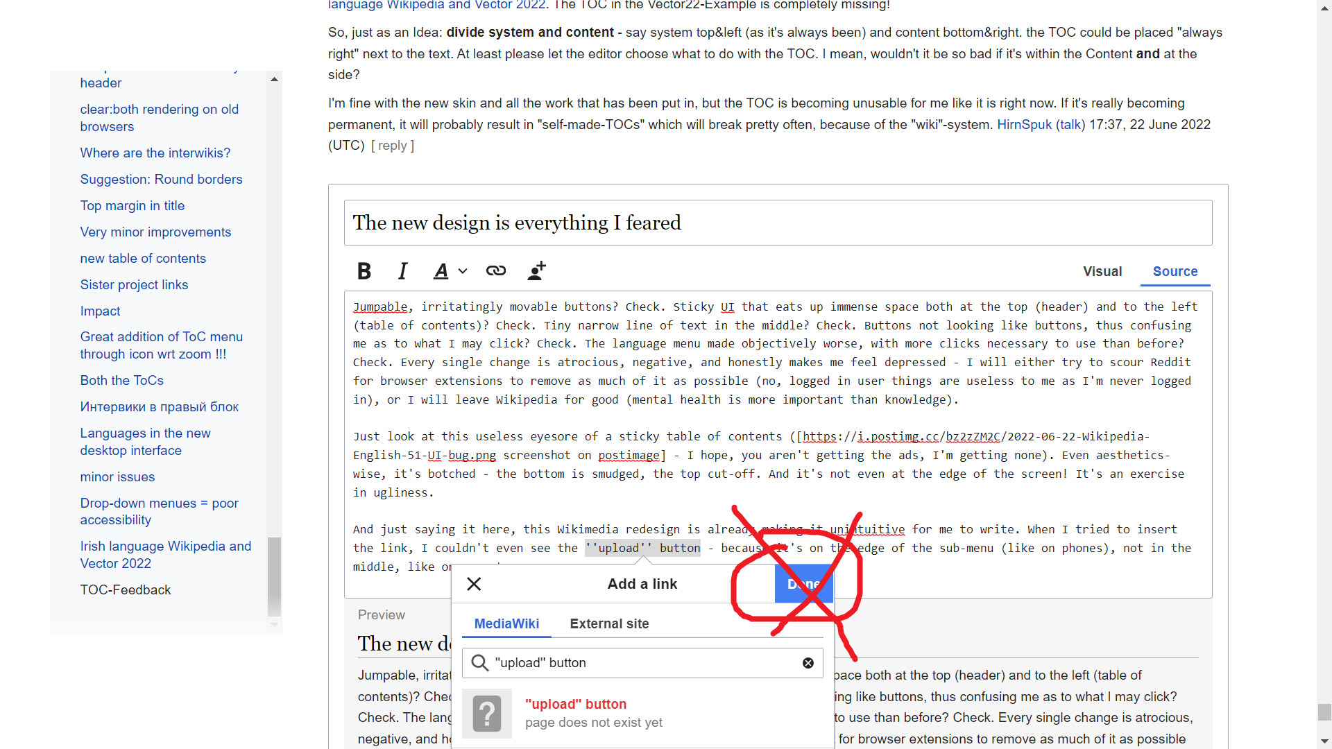
wordmark no longer appears after upgrading to MediaWiki 1.38.1, style bugs
After upgrading to MediaWiki 1.38.1 from 1.36.1, the wordmark no longer appears next to the icon in the upper left. If the window is wide enough, the 150px space for the wordmark is reserved but is empty. When you make the window wider past a certain width, the coloring behind the sidebar also vanishes. This happens with Vector 2010 in both legacy and non-legacy mode and in Vector 2022. The wordmark image is an svg that has not moved and still has correct permissions Queernix1028 (talk) 19:43, 22 June 2022 (UTC)
- What is the value of wgLogos in your LocalSettings.php? Jdlrobson (talk) 14:22, 29 June 2022 (UTC)
$wgLogos = [
        'icon' => "$wgScriptPath/images/arcc/logo.svg",
        '1x' => "$wgScriptPath/images/arcc/logo.png",
        'wordmark' => [
                'src' => "$wgScriptPath/images/arcc/wordmark.png",
                '1x'  => "$wgScriptPath/images/arcc/wordmark.svg",
                'width' => 150,
        ],
];
- It previously worked with wordmark src set to the svg file, but now neither that configuration nor the one above work. Queernix1028 (talk) 14:32, 29 June 2022 (UTC)
- I believe you need to set a height on the wordmark. Jdlrobson (talk) 00:55, 1 July 2022 (UTC)
- left side menu persistency is screen wasteful, bad idea
- use a tab like google maps?
- left side menu: should be hamburger only
- as an option for experienced, registered users
- need style sheet that puts left side column at bottom of page as a footer
- language list:
- should include native and english names
- include a user-customizable shortlist
- 0mtwb9gd5wx (talk) 00:57, 23 June 2022 (UTC)
Language links on Wikidata are right at the bottom of the page
I've enabled the new theme (Vector 2022) globally on all wikis. I generally like the new interface. However when I am on wikidata, previously the interlanguage links were on the right. (Where an infobox usually goes on a wikipedia page) Now they are right at the bottom of the page! Some wikidata pages are massive, and having to scroll all the way down to the bottom of the screen to do the thing I do most frequently on wikidata (add new language links) is a real pain. Please can you move the language links on wikidata back to the top (top right) of the page? - Rooiratel (talk) 14:25, 23 June 2022 (UTC)
- Hello @Rooiratel. Thanks for your opinion. Are you talking about the desktop view? What's the resolution of your screen? I've tried to narrow my window down and change its width, and it seems that the width thresholds when the interwiki links go from the bottom to the right are the same. Is there any setting you use that may make your experience different? SGrabarczuk (WMF) (talk) 23:50, 27 June 2022 (UTC)
- Hi @SGrabarczuk (WMF): this is for the desktop view. I am seeing this behaviour on my 1080p laptop screen and my 1440p desktop screen. I haven't used the mobile view, so can't comment on that. - Rooiratel (talk) 06:32, 28 June 2022 (UTC)
Infobox element alignment is mangled in mobile view
Maybe I'm doing something wrong, but when I click on "Mobile view" with Vector 2022, many of the infobox elements are misaligned. Many elements that should be centered are left-aligned, and many elements that should be left-aligned are centered. At least that's what it looks like for me in Chrome for Mac OS at this page. Jonesey95 (talk) 02:57, 24 June 2022 (UTC)
- Wow, that looks odd. Thanks @Jonesey95 for reporting this. Right now, I only have one question - why do you use the mobile view and Vector 2022 mixed together? Minerva is dedicated for mobile, and Vector 2022 is dedicated for desktop. Having these two at the same time is bold and original :) SGrabarczuk (WMF) (talk) 23:08, 27 June 2022 (UTC)
- I was just doing some very beginner-level QA testing. Editors do all sorts of ridiculous things, so I try to do some QA testing by doing ridiculous things. If you want editors to use Vector 2022 for desktop-only and Minerva for mobile-only, then make the "Mobile view"/"Desktop view" link at the bottom of the screen switch between the skins. Meanwhile, I'll be over here in legacy Vector where I can fill my browser window with content.... Jonesey95 (talk) 01:15, 28 June 2022 (UTC)
Using the mobile domain with the Vector skin invokes a special mode with lots of odd behaviour. It's not part of this project but will hopefully get fixed some day. Jdlrobson (talk) 02:30, 28 June 2022 (UTC)
"Related articles" appear to be missing
I do not see the "Related articles" section at the bottom of the mobile view. I don't really care, but since the "Principles" section of this page says "We do not remove any functionality", I thought I'd mention it. It makes me wonder what other functionality has been removed, and whether this principle is really being followed in a systematic way. Jonesey95 (talk) 03:02, 24 June 2022 (UTC)
RelatedArticles appears to be working fine to me. I see it on Minerva. What do you mean by "at the bottom of mobile view"? The scope of this project is the desktop site so no changes to the mobile domain have been made.
RelatedArticles does not show on the skins of certain websites and has not shown on Vector or Vector 2022 unless the community has explicitly requested. See phab:T144812, phab:T181242 and phab:T278611 for example. Jdlrobson (talk) 14:59, 24 June 2022 (UTC)
- I think this is my mistake. I was comparing this (default mobile view on en.WP) with this (Vector 2022 mobile view) and assuming that the default mobile view used some version of the Vector skin, but I think that is not correct. Jonesey95 (talk) 16:38, 24 June 2022 (UTC)
Ah okay. This mode is only accessible by a special URL and is not being worked on as part of this project. Thanks for taking the time to explain! Jdlrobson (talk) 02:28, 28 June 2022 (UTC)
非常に見にくい
日本語で失礼します。本日ごろから日本語版ウィキペディアのスキンに変更があったようですが、
- 文字の大きさをブラウザ側から変更できない(Safari使用)。
- そもそも標準の文字サイズが大きすぎる。
- 目次が項目名の横に位置が変わったせいでアクセスが煩雑になった。
- Infoボックスが大きすぎる
などの変更のせいで、余計見づらくなったような気がします。可能であれば改善するか、もしくは変更前のスキンに戻して欲しいです。 イカしたイカ (talk) 08:38, 24 June 2022 (UTC)
Please evaluate CJK characters' font size in Vector 2022
For your infomation, the Chinese Wikipedia already has a gadget that increases the font size for a better Chinese reading experience. Japanese and classical Chinese Wikipedia also have such kinds of gadgets. Diskdance (talk) 08:19, 25 June 2022 (UTC)
- It would be nice if we could integrate these gadgets into new Vector skin directly. This would benefit other CJK and multilingual wikis. Diskdance (talk) 08:20, 25 June 2022 (UTC)
- Thanks @Diskdance! @AHollender (WMF) FYI :) SGrabarczuk (WMF) (talk) 23:03, 27 June 2022 (UTC)
I think we should create a phabricator ticket for this one. Jdlrobson (talk) 02:29, 28 June 2022 (UTC)
Feedback regarding Vector (2022) TOC
I've had Vector (2022) enabled for a while, and generally like it. However:
- I don't feel the new way of handling the TOC and side menu is user friendly. It took me a while to notice I could hide the side menu only to raise the TOC up the page, as I assumed it would also hide the TOC since the two are part of the same sidebar. With the side menu visible, I had to scroll much further down than usual to find the TOC on many articles with short lead sections, which undermined the convenience previously provided by the TOC as a way to skip scrolling and quickly navigate to a desired section.
- It also doesn't help that the new TOC breaks the functionality of {{Skip to talk}}, widely used on talk pages on Wikipedia, but I now understand that the change is intended to make that template unnecessary.
- The prototype linked by others above deals with some of these issues but is still a bit confusing. It's not clear that clicking "hide" on the TOC should result in a menu appearing by the article title rather than just collapsing it like collapsible lists which use the same "[hide]" links; while this behaviour can be learned, it's not clear why the hidden TOC menu button doesn't persist between the search icon and article title when scrolling down, which is what I expected after seeing it collapse to a button beside the article title.
- The new sidebar is wider to accommodate the TOC, but much of that space is blank so I'm not sure it needs to be quite so wide, particularly as the added width can cause issues such as galleries by default having less space for images per row. I understand the motivation is to limit the characters of text per line, but doing so by padding the sidebar with empty space seems like an unhelpful way to achieve that. Scyrme (talk) 16:57, 26 June 2022 (UTC)
Where are the watch/unwatch buttons?
Alright, if the article is long enough to be scrolled, I should scroll it down, the top row of icons will jerk left-right, and the "watchlist" icon will become the "watch/unwatch" toggle. Hopelessly inconvenient, counterintuitive, but it works. But what if the article is so short that it won't scroll at all? example Seems like "preferences/watchlist/edit raw watchlist" is the only go-around, is it not? Retired electrician (talk) 12:13, 27 June 2022 (UTC)
- @Retired electrician: There's a smaller star-shaped watch/unwatch toggle to the right of the "View history"/"История" link. Scyrme (talk) 14:48, 27 June 2022 (UTC)
- Thanks, that was most unexpected. I'd rather prefer old good text links. Retired electrician (talk) 15:59, 27 June 2022 (UTC) The new star looks almost exactly like the existing GA star, just a different shade of grey (but in almost the same corner location as in standard monobook). Retired electrician (talk) 16:02, 27 June 2022 (UTC)
- "Thanks, that was most unexpected. I'd rather prefer old good text links" - you're a Monobook user, am I right? This may be a good reason why it's most unexpected for you. Vector 2022 is based on Vector legacy (2010), and the star icon has been there for 12 years. SGrabarczuk (WMF) (talk) 01:51, 28 June 2022 (UTC)
Merge notification block in the header: notifications and alerts
For me, it has always been a strange decision that notifications were divided into two unrelated blocks and icons with incomprehensible categorization. I forgot about it, but now I'm paying attention again.
Given that we removed the text from all menus, there are now a lot of icons at the top that do not understand what they do. Different blocks of notifications do not help this at all. Maybe it's time to put them in one menu and break it there already? Filters, tabs, whatever :) But at least you won't get confused in the icons.
I personally still (6 years!) do not know what their fundamental difference is. I asked my friends and they don't know either. Iniquity (talk) 17:29, 27 June 2022 (UTC)
 Strong oppose. The notices are the notifications that are not very important/urgent, unlike the alerts. Merging them would make me unable to found out at a glance if I have any important/urgent notification, and would also overload the notification box, as I receive many notifications. --NGC 54 (talk | contribs) 22:19, 27 June 2022 (UTC)
- It seems to me that it is possible to do this with filters and colored marker icons. Or a separate setting for users who really need it. Iniquity (talk) 09:47, 28 June 2022 (UTC)
 Comment:. I agree that the distinction could be clearer, but don't necessarily agree that there should be only one button. Presently, when both are empty the only difference between them is the header text and icon. Both share the exact same two buttons, which link to the same destinations. The text in the box doesn't even distinguish, reading "There are no notifications" instead of "There are no alerts". There isn't even a "help" or "about" link unique to each of them to explain the difference or what gets sent where. If you follow the links to the special page or preferences, it's still not clear which notifications are sent where.
- Based on the names, I would've assumed the difference would be that alerts are specifically for subscriptions to article alerts, whereas notifications would be for everything else. It makes sense to split them, since alerts would be activity that's less personal to the receiver. "Alerts" would be like a daily newspaper, but "notifications" are more like personal mail. Except this isn't how the system actually functions; messages to the receiver's talk page are placed under "Alerts" rather "Notices", for example.
- I understand that it may be helpful to filter urgent notifications from less urgent ones, but what counts as urgent or important? Shouldn't that be decided by the user's preferences? It would make more sense to have something like tabs, as Iniquity suggested, to filter types of notifications; this would let that user decide what is important. Scyrme (talk) 22:33, 27 June 2022 (UTC)
Table of contents: Bold format for active section
I really appreciate the new skin and layout. In the beta, the active/current section of the article was formatted bold in the table of contents on the left side. But in the live version, it's regular and black. I find it really, really hard to differentiate between the normal blue titles and the active title, because the only difference is the black vs. blue color. Could you please make the active titles bold again? Thank you! Lhennen (talk) 21:11, 29 June 2022 (UTC)
- +1 Bold and black would be best imo. L.xschlag (talk) 11:43, 1 July 2022 (UTC)
- @Lhennen, @L.xschlag - thank you for your feedback! Not sure if you've seen, but we are currently in the middle of testing some prototypes related to this question. You're welcome to give us more detailed feedback on the prototype page. One of the things we're testing on these is the way links should appear within the table of contents (see https://di-visual-design-toc-active.web.app/Otter) for an example. Currently, our feedback is showing us that people are leaning towards option 2: bold and black so we will most likely be continuing with that option and making the titles bold. OVasileva (WMF) (talk) 10:08, 4 July 2022 (UTC)
Jawiki has NOT reached consensus on implementing Vector 2022 yet
Jawiki has NOT reached consensus on implementing Vector 2022 yet. Why was it implemented without our consent? AppleRingo777 (talk) 22:01, 29 June 2022 (UTC)
- Hi @AppleRingo777 - we apologize for the confusion that the deployment process has caused and the lack of clarity from our side. We are currently working on reading back through our previous communications and clarifying the process and what happened with individual members of the community. We will to get back to the community with more detailed thoughts and a process for next steps by tomorrow July 1st. OVasileva (WMF) (talk) 12:04, 30 June 2022 (UTC)
Hello! I asked a question at the meeting, but I would like to duplicate it here. Will it be possible to control the location of blocks (right or left) through MediaWiki:Sidebar? Iniquity (talk) 15:34, 30 June 2022 (UTC)
When the window gets narrower the TOC is moved into a "Hamburger button". But the main menu stays where it is until the window get's quite a bit more narrower. I think as long as the main menu fits, the TOC should stay at its original place. Especially since the TOC behind the "Hamburger button" is quite easy to miss. L.xschlag (talk) 11:30, 1 July 2022 (UTC)
I think it's quite odd that the "More" drop down menu most of the time contains only "move". Is it on purpose to make it harder to find for the average user? L.xschlag (talk) 11:35, 1 July 2022 (UTC)
- @L.xschlag: , I have two items - the other is an add-on via preferences/gadgets. Unfortunately, I cannot use drop-down menues easily, so getting there in V-2022 is quite a nuisance. Retired electrician (talk) 21:31, 3 July 2022 (UTC)
When the main menu is active (meaning visible) and the window is quite narrow the actions menu (Read, Edit source, Add topic, View history) doesn't get condensed in the "More" drop down menu, resulting in a very ugly overflow. L.xschlag (talk) 11:41, 1 July 2022 (UTC)
Audio player issues (Vector 2022)
When pressing play from a wikipedia article (e.g. first clip in w:en:Aftermath_(Rolling_Stones_album)), the page changes text colour from black to pale grey. Almost unreadable. This dead time varies from a few seconds to many minutes, probably caused by unsteady connection on my side. I tried opening 2-3-4... windows with the same article, and some windows seem to be stuck indefinitely while others play with minimal (but still annoying) delay. If I press play directly from file description page ( w:en:File:Under_My_Thumb.ogg), it always plays instantly and the text always stays black. Win 10 Home / Chrome 102.0.5005.115 (64-bit) Retired electrician (talk) 19:29, 3 July 2022 (UTC)
Language mix in the interface
Pardon me if this had already been discussed here. It seems that the language of the interface (as set in preferences) mixes up with local-language elements where it shouldn't.
- My preferences are always "interface=en", and thus I always see "Contents Beginning" in the TOC section - be it Chinese, Russian or Spanish wiki.
- The pink box above TOC in ru-wiki says "On this Википедия[sic!] the language links are at the top of the page across from the article title. Go to top." In zh-wiki, however, the message is correctly "On this Wikipedia the language links ..." Retired electrician (talk) 21:23, 3 July 2022 (UTC)
Where are the categories?
Hi this is my first time looking at the prototype, so apologies if this question has been answered elsewhere - where are the categories? MassiveEartha (talk) 04:15, 5 July 2022 (UTC)
開発者集団は日本語版を軽視していると思われるThe group of developers seems to downplay the Japanese version
日本語版の利用者の一人としては、開発者の集団は日本語版を軽視していると考える。一つの証拠として開発者からの意見を求めるメッセージが英語だけで書かれていたことを挙げておく。機械翻訳があるのだから英語と共に日本語を添えることは簡単なことのはずである。それすらせずにVectorからVector2022への変更を強行したことは、一種の文化帝国主義であると評さざるを得ない。As one of the users of the Japanese version, I think that the group of developers disregards the Japanese version. One proof is that the message for the developer's opinion was written in English only. Since there is machine translation, it should be easy to add Japanese along with English. It must be said that forcing the change from Vector to Vector 2022 without doing so is a kind of cultural imperialism.--27.85.205.84 07:17, 5 July 2022 (UTC)
Vector 2022を強要する行為は、開発者が読者を軽視していることの証拠である The act of forcing Vector 2022 is evidence that developers are downplaying their readers.
開発者(の集団)はアカウントユーザーなら自分で好きなスキンを使えるのだから、あまり出来がよいとは言えないVector 2022を強要してっもかまわないと考えているようである。しかし、元々Vector 2022は読者として快適に使えることを考慮していない。開発者(の集団)は読者がいなければいくら記事を作っても意味がないということを忘れているのだろうか。It seems that developers (a group of people) are willing to force Vector 2022, which is not very good, because account users can use their favorite skins. However, originally Vector 2022 did not consider it to be comfortable to use as a reader. Do developers (groups) forget that it doesn't make sense to write an article without a reader?--27.85.205.84 07:29, 5 July 2022 (UTC)
Listed coordinates overlapping with header weirdly
for an example of this, see wp's london article (screenshot) LarstonMarston (talk) 20:00, 5 July 2022 (UTC)
Default to Collapsed Menu Exposed TOC
I was trying to figure out why I didn't like the new TOC, and then it hit me that the main reason was that it is hidden by the side menu when you first visit a page (I very rarely login to Wikipedia, and I'm thinking that's the norm for most visitors). Then I was thinking that I almost never use the main navigation links, they just aren't part of my normal use case of visiting Wikipedia (it is to learn a specific thing that I don't currently know enough about). I was going to post to make it possible to hide the main nav, but then realized that you already built it, but the default is for it to show. My hypothesis is that the bulk of users don't look or click on any of the menu items, and that the menu should be hidden by default and the TOC exposed above the fold. 195.134.163.110 10:34, 6 July 2022 (UTC)
Replace the "new section" tab text with "+" gadget not working.
On the English Wikipedia upon switching to Modern Vector the aforementioned gadget ceases to function as intended.