حالت مشارکت های پیشرفته تلفن همراه یک مجموعه ویژگی است که قابلیت های مشارکت کنندگی بیشتری را به نسخهٔ وب موبایل اضافه میکند. برای فعال کردن حالت پیشرفته، به صفحهٔ تنظیمات خود در نسخهٔ تلفن همراه بروید و «حالت پیشرفته» را روشن کنید.
ما در حال تمرکز بر روی افزایش قابلیت پیمایش و صفحات ویژه هستیم تا بیشتر نسخهٔ موبایل را شبیه به نسخهٔ رایانهای ویکیپدیا کنیم.
به بخش چه چیزی تغییر میکند؟ در زیر بروید تا ببینید چه نوع ویژگی ها و قابلیت هایی را امیدواریم اضافه کنیم.
اگر این ویژگی را فعال کرده اید، لطفاً از صفحهٔ بحث ما بازدید کنید تا نظرات (خوب یا بد) و ایده های خود را به ما ارائه دهید.
خلاصهٔ پروژه
Advanced mode on mobile is a feature set that adds several contributor features/capabilities to the mobile web experience. Advanced mode adds navigational elements and menus that allow easy access to talk pages, history pages, اطلاعات صفحه, and various other page tools, user tools, and special pages. Additionally, special pages (e.g. Recent changes and History) have functional parity with the desktop versions. In short, when advanced mode is enabled, the experience of the site via mobile more closely resembles the desktop experience. Some of the key features are:
| Article/Talk tabs at the top of articles | Article tools menu | منوی کاربر | Increased functionality on special pages |
|---|---|---|---|

|

|

|

|
Condensed process overview
۱.معرفی
As of early 2018, the mobile website did not support many key contribution workflows. This stopped many editors from being able to contribute using the mobile site. The Readers Web team decided to work on this problem. We wanted to expand the ability to contribute with functionality matching the desktop site. Our hope was that these changes would increase contributions using the mobile site.
۲.تحقیق
Between the Barcelona Hackathon (2018) and Wikimania Cape Town (2018), we spoke with over 40 editors to identify the main limitations with the existing mobile site.
۳.طراحی و آزمایش کردن
Based on initial research and past requests from communities, we decided to focus on navigation and access to special pages and tools. We built a prototype and tested it with 61 editors. The response was very positive, and included some great suggestions as well as some valid concerns, most of which we were able to integrate into our final design.
۴.گسترش
We began with introducing the Article & Discussion tabs at the top of the page. We released the feature as an opt-in setting on the Arabic, Indonesian, and Spanish Wikipedia projects due to their relatively large population of existing mobile editors. After we rolled out several additional features to those three wikis, we expanded to include the Italian, Japanese, Persian, and Thai Wikipedia projects.
۵.نتایج
As of August 6th, 2019, the expanded features are live on all wikis, and as an opt-in setting called "Advanced mode". Retention rate: There was an 81% overall retention rate across all target wikis where "Advanced Mode Contributions" was deployed (time period: March 20, 2019 - June 30, 2019).
Below, you will find our process notes and other information about the project.
If you've enabled the feature, please visit our talk page to ask questions and give us feedback.
پسزمینه
The mobile skin مینِروا نویِ was optimised for new readers and is missing several key contribution workflows that power editors depend on.
The skin choose not to link to certain pages to avoid overwhelming new users with links and other pages used on desktop were found not optimized or even usable on mobile devices.
Despite this, their absence prevents many contributors from being able to edit and moderate from the mobile web.
The Readers Web team has listened to requests from communities and has an increased focus on contribution workflows for the 2018/19 fiscal year.
The team aims to get the minimum work done that is needed to fix and expose the currently unavailable pages.
In addition to this, it will work on building expanded navigation to expose the wide range of editing functionality so that it can be used on the mobile web.
Our plan is to build this as an opt-in feature which editors can enable.
We believe this will decrease the necessity of switching between the desktop and mobile sites while on a mobile device and provide a better mobile editing experience.
We believe that expanding the contribution workflows on the existing Minerva skin will provide the most efficient way to increase the amount of productive mobile contributions at the trade off of perfection.
We also hope it will allow availability of the full breadth of tools in a short time-span, giving us more time to do thorough research and design for the most crucial workflows.
We have captured this goal in output 3.1 from the 2018-2019 Annual Plan: Contribution tools on mobile web via an existing MediaWiki skin.
بهروزرسانیها
August 1, 2023 - Full-page editing added on mobile

You can now open the full-page editor in the Minerva skin. People who have Advanced mode enabled will notice a new "Edit full page" button within each page's overflow menu.
۱۰ اکتبر ۲۰۱۹ - حالت پیشرفته اکنون در همه جا مستقر شده است.
حالت پیشرفته اکنون در همهٔ پروژههای ویکیمدیا در دسترس است.
۸ اوت ۲۰۱۹ - حالت پیشرفته اکنون در تمامی ویکیپدیاها مستقر شده است
Advanced mode is now available on all Wikipedias. Try it out and feel free to give us feedback, thoughts, and improvement suggestions on the talk page!
۶ اوت ۲۰۱۹ - ایامسی (AMC) تقریباً کامل است.
Many changes have happened since our last update:
ایامسی (AMC) مستقر شد.
AMC is now deployed on 7 Wikipedias: Arabic, Indonesian, Spanish, Persian, Japanese, Italian, Thai
Data so far
- There was an 81% overall retention rate across all target wikis where AMC was deployed (time period: March 20, 2019-June 30, 2019). This means that, overall, most people do not turn AMC off once it is turned on
- On target wikis, retention rates ranged from 72.6% (Japanese Wikipedia) to 90.8% (Persian Wikipedia).
- The completed report with per-wiki information is available:
https://analytics.wikimedia.org/datasets/web-reports/AMC_KPI_Metrics_Status_Report_FY2018_2019.html
تغییرات
- History page - the history page link at the top of the page now leads to a fully-featured history page, similar to desktop

- User menu - the new user menu at the top of the page includes links to the user's user page, talk page, watchlist, contributions, and sandbox

- Overflow menu - the overflow menu (accessed from the main actions on the top of the page) includes links to page information, wikidata description, permanent link, PDF downloads, and more)

May 8, 2019 - AMC main menu now deployed on Arabic, Indonesian, and Spanish Wikipedias
You can now access an expanded set of pages via the main menu on AMC on Arabic, Indonesian, and Spanish Wikipedias. The menu contains links to all special pages as well as a link to the community portal for each Wikipedia
Main menu examples


March 27, 2019 - First AMC deployment on Arabic, Indonesian, and Spanish Wikipedias
The first release of Advanced Mobile Contributions is complete! Logged-in users on Arabic, Spanish, and Indonesian Wikipedias now have access to the first set of features: easy access to the talk page (by selecting the “discussion” tab on the top of each page) and easy access to the history page (by tapping the history icon on the actions bar). Next, we will tackle replacing the current mobile history page with a responsive version of the page in desktop to provide the full set of functionality on mobile. For the first release however, the history page still navigates to the current mobile version of the page. You can turn on advanced mode on these wikis by selecting it from the settings page accessed through the menu menu on the mobile website.
Opting In

Talk Page Navigation

History Page Navigation

January 14, 2019 - Getting started with Talk page links
We're excited to be underway with the initial stages of development on Advanced Contributions mode. Based on our research and community collaboration we learned that making Talk pages more accessible is a key component of mobile contributions. So first up: we will be adding a Talk link at the top of each page, for all namespaces. Because we are aiming to work iteratively at first the Talk link will lead users to the current mobile talk page experience:

However this current Talk page experience is a little disconnected from the article it belongs to — particularly if you switch to "Read as wiki page". It can be a bit confusing to get back to the article. So one of our design goals is to unify the article and Talk experiences, by rendering the Talk page as a tab of the article, similar to desktop. We hope this will help people keep their context, while also allowing seamless navigation back and forth.
Additionally, while working on the designs for this we realized that we have not yet had a discussion with the community about which version of the Talk page is preferred. Here are some things we're wondering about:
- How well does the current, mobile-optimized, Talk experience work for advanced editors?
- Thinking about various actions such as: viewing discussions, responding to discussions, adding new discussions
- Are there features of the "wiki" version that are missing from the mobile version?
Or in other words, what are reasons that people currently might switch to the wiki version of mobile Talk pages?
- Generally speaking are there minor improvements that could be made to either Talk experience?
In the hopes of sparking discussion and ideas here's how we envision the Talk page functioning as a tab. The screens below show the basic workflow for editing a discussion in both the current/default version, and the "wiki" version. As a reminder, both of these experiences are currently available on the mobile site, so you can try them out for yourself to get a better sense of what you like/dislike and let us know (on the talk page of this page).
| نسخهٔ ویکی | Default version |
|---|---|

|

|
All feedback is welcome and much appreciated. Let us know what you think!
November 12, 2018 - Navigation prototype feedback summary
We are very grateful to have received feedback from 61 editors thus far on our advanced mobile navigation prototype. The response to the design was overwhelmingly positive, and included some great suggestions as well as some valid concerns raised. All of the feedback is valuable and will inform the next design iteration. We wanted to take a moment to both acknowledge all of you who took the time to go through the prototype, as well as highlight a few themes that surfaced. I'm considering something a theme if it was noted by two or more editors (considering the small sample size).

Themes
Questions and concerns:
- Should categories be on by default in this mode? What will the relationship between this mode and other beta features be?
- Is Sandbox something that people use on their phones?
- How does this new design look and work on tablet?
- The sticky toolbar is nice, but perhaps it would be better if it only appeared upon scrolling up (rather than always persisting)
- Can we add the main header to the sticky toolbar, so that you can get access to search and the hamburger menu from the middle of a page?
- Should this mode be available to logged-out editors?
- Could we support a namespace specific search UI?
- Icon improvements: Recent changes, History, Add discussion (on Talk page)
There were two other categories of questions and concerns raised:
1) Things pertaining to the display and functionality of Special pages (e.g. History, Recent changes) — it was great to see these remarks, as they guide us towards the next bit of work for this project, which is improving Special pages on mobile (more feature-rich, while still being manageable on a small screen)
2) Things that fall outside the scope of our current work: dark mode, an improved language icon
Appreciation:
- Having easy access to the Talk page
- Having easy to access History
- Wikidata item accessible
- Links to other Wikimedia projects
- صفحه تمرین
- Toolbar accessible without going all the way back to the top of the page
Quotes
"Much more convenient and usable than the current mobile view. Everything I would expect to find in a mobile view for editors is there." — Darylgolden
"I am eagerly waiting for this design." — AnkurWiki
"I think it's a great design, newcomers may be a bit confused but other than that, I like it." — Charizard201
"There seems to be lots of peculiar functions being added in this prototype compared to the existing experience. I appreciate the addition of Recent changes and "Special pages" but many of the other new links just add unnecessary confusion and clutter to the interface. I like the existing mobile interface because it reduces this clutter. Print is not something I need to do on my mobile phone for example." — Ming
“The previews presented look like a major improvement, currently the mobile browser doesn't seem editor-orientated at all.” — Donald Trung
Known prototype bugs
There were a number of errors in the prototype. We are calling them out here just so they are acknowledged as errors:
- Search experience, Wikipedia logo bug
- Notifications panel should have an “X”
- Missing section edit buttons
- Add edit button to action menu on Talk page (general & section)
- Heading on Talk page should be “Talk:”
- Some items in action menu don’t make sense on Talk page (Wikidata Item)
September 18, 2018 - Need your help! Collecting feedback for the new navigation prototypes
We have updated our prototype for the new navigation. The prototype is a response to the feedback we received at Wikimania. We have some questions on the current version as we continue to iterate. Any and all comments are appreciated! Keep in mind that since this is a prototype most of the links don’t actually work, and there might be other bugs or quirks that you’ll come across. We have also marked the feedback page for translation and hope to have it available in a variety of languages soon.
Click on this link to view the prototype and give us feedback.
Preview of prototype

August 24, 2018 - Published results from Wikimania interviews
We have published the results of from our research at Wikimania. Over the course of the conference, we interviewed 30 editors with the goal of identifying the main issues with mobile editing, prioritizing the pages that editors find most important, and raising awareness for the project among editors who are interested in mobile editing. In particular:
- We noted that editors we spoke to were, overall, very excited about these changes, allowing us to feel confident with moving forward with the project.
- We generated a list of the most important pages/workflows on mobile for the interviewed editors.
- We gathered a group of editors that are interested in the project and willing to review and collaborate in the future by giving us feedback on prototypes and participating in other user testing.
- We gathered feedback on our current prototypes for mobile navigation, giving us enough information to continue with the next round of iteration.
Please review our results and let us know what you think. Feedback is welcome and appreciated!
August 7, 2018 - Wikimania interviews
We performed 30 interviews with editors during Wikimania to collect information and feedback on the following:
- Pages that are most important to contributors for mobile use
- Feedback on our initial prototypes for advanced navigation
We are collecting and analyzing our results and will post an update to this page soon. We are also putting together a list of editors interested in providing feedback on prototypes throughout the development process. Let us know on the talk page if you're interested as well!
June 20, 2018 - IRC office hours
We will be holding IRC office hours to go over the proposal and brainstorm areas for improvement. We are particularly interested in speaking to editors on the contributions they would like to be able to make on mobile and on the special pages and flows that are most important.
May 19, 2018 - Themes from Barcelona Hackathon conversations
During the Barcelona Hackathon in 2018, we held two sessions focused on discussing this project with members of the editing and technical community. These are our notes from these sessions:
- Interest in exposing more pages in mobile was high and people agreed that any work in this direction would be valuable.
The main issues that were identified were use and availability of gadgets as well as specific workflow variation - tools used and shifting across wikis, different workflows based on projects, workflows split among multiple pages, etc. Interest was raised towards microcontributions and new microcontribution functionality (noting this here as it came up multiple times, although it is outside the scope of this project).
Full notes from the sessions can be found on this etherpad.
How people currently edit on mobile
- Switch back between Vector and Minerva, although some editors preferred Minerva
- Use mobile for language and translation due to better multi-language input
- Use mobile for better syntax highlighting
What we’re missing currently
- Users do not like the fact that certain pages are blocked on mobile - “a lot of what timeless did well was simply bringing back hidden pages and features”
- There is an interest in exposing all pages, even if they are flawed
- Gadgets - one user switches to desktop only for the ability to use their gadgets
- تغییرات اخیر
- تاریخچه
- Familiarity - If there were a mobile version of Vector, for instance, it would make it easier to find something familiar
- Mobile-specific workflows
- Easy way to read discussions - talk pages, help desk, administrative noticeboard
- New ways for microcontributions
Split audience here. While all could agree on missing functionality, the room seemed to be split along the lines of making this functionality mobile-specific versus making it available now and allowing editors to find workaround where necessary within their current workflows
Ideas on exposing all pages
- It probably won’t scale to expose all pages - begin with a prioritized list
- Collapsing rather than hiding can give a lot of the gains of hiding without the detriments
Minerva vs Vector
- No strong opinions either way - some people leaning towards Vector with the technical motivation of only having one skin.
Others disagreeing to say the more skins the better
- Either will be useful and an improvement from the norm
Other notes
- A lot of simple tasks are built into tools such as Twinkle and Huggle.
Focusing on performing these tasks directly from mobile might not get us the results we are expecting. However, not all editors use these tools.
- Whether responsiveness is desirable came up a few times - good to remember that regardless of what we do, it will make some people unhappy
- Often special pages might not even be that useful - while some people use recent changes, there’s a wide variety of workflows that this does not account for
- 80/20 rule applies to microcontributions - it would be helpful to have a way to tag articles/portions that fall into the side that requires more care, attention etc from mobile.
These can later be reviewed on desktop
- Vandalism example: “If you look at vandal-fighting the bots take 70% of the work. 30% left - automation to say likely hard/likely not hard. Likely not hard - show to mobile user like "do you think this might be vandalism" with buttons "yes" and "no"
Identified pages that need some work:
- Talk pages
- Village pump
- Administrative noticeboard
- صفحه راهنما
- تغییرات اخیر
- Pending changes
- Flagged revisions
- Special:RecentChangesLinked
- Special:NewPagesFeed
Questions
What percentage of editors use outside tools for microcontribution-type flows?
What are the main revision workflows per wiki?
پیشینهٔ پروژه
-
 Recent changes page in the Vector skin as seen from a mobile device
 -
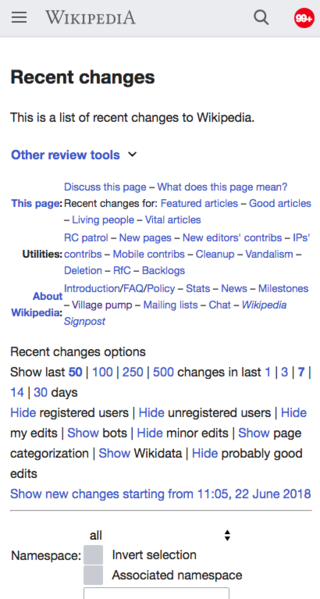 Recent changes special page in the Minerva skin before optimizations


We began the research process by consulting with individual members of the community on the main obstacle to mobile editing in their opinion. Combined with two group consultations led at the Barcelona Hackathon, the following main issues were identified:
- Pages necessary to perform contribution (editing and moderation) workflows are currently unavailable on the mobile website
- There is a lot of unexplored potential for microcontribution workflows on mobile
The focus of this project will be on the first issue - providing access to currently hidden pages from the mobile website.
چه چیزی تغییر میکند؟
Overview
For this project, we will be focusing on expanding the functionality of the mobile site to include navigation and special page access similar to the desktop experience. The new functionality will be available to all logged-in users via a preference on the mobile settings page. We will be rolling out changes progressively starting with the navigation portion. If you currently edit on mobile or plan to in the near future - we'd love your feedback on the proposed changes!
Navigation
The navigation for AMC mode will include the following:
- Talk page access from the top of the page (in tabs similar to desktop)
- History page access from the top of the page
- Expanded user menu that includes links to your user page, talk page, sandbox, and contributions
- Expanded menu that includes access to recent changes, special pages, community portal, and other projects
- Advanced page actions that include downloading the page as PDF, page information, permanent links, wikidata item, links to the page, etc
Special Pages
We will be working on providing partial or full mobile functionality for the following pages (in prioritized order):
- History
- Diff pages
- Watchlist
- Talk
- Contributions
- Recent changes
- User pages
- Village pump
- Preferences
- New pages feed
- Pending changes
- Related changes
- What links here
Recommendation
Expose currently unavailable pages on the mobile website using the Minerva skin as an opt-in setting option.
- Doing the changes in the Minerva skin is more straightforward from a technical perspective and requires lower maintenance cost than other options.
It also reduces disruption to existing workflows. Community members can use Minerva with the new optimised experiences on their mobile devices, and continue to use their existing experience with Vector or other skins on desktop.
Audience
- Active editors, in particular medium and high-volume editors (100+ edits)
- Editors focused on maintenance workflows - easier to make smaller contributions from mobile
- Nice to have: all mobile editors
Per project
While we will be reaching out and are open to feedback from all projects, we have created a list of projects that we would like to specifically focus on. We looked at wikis that already had a decent amount of editors on mobile, indicating that editing on mobile is a comfortable concept for users of these projects. As the target audience for this project is medium and high-volume contributors, our assumption was that projects with a decently large number (1000+) of monthly editors would be likely to have a higher percentage of editors with 100+ edits. Finally, in terms of priority, we wanted to focus on projects that had the largest gap in mobile editing - projects whose ratio of mobile edits to new active editors was the highest:
- ویکیپدیای انگلیسی
- ویکیپدیای اسپانیایی
- ویکیپدیای ژاپنی
- ویکیپدیای چینی
- ویکیپدیای پرتغالی
- ویکیپدیای ایتالیایی
- ویکیپدیای پشتو
- ویکیپدیای عبری
- ویکیپدیای عربی
- ویکیپدیای فنلاندی
- ویکیپدیای ویتنامی
- ویکیپدیای اندونزی
- English Wiktionary
- ویکیپدیای تایلندی
- ویکیپدیای هندی
Metrics
KPI’s
- Mobile web edit rate on target wikis: 10% increase
- Retention rate for opt-in advanced mobile mode amongst medium and high-volume editors (100+ edits previous month): At least 60% retention
- Moderation actions on mobile web on target wikis: 10% increase
Other potential metrics
- Decreased number of users of desktop version link?
- Number of users opting into/out of the feature
More details: phab:T210660
New functionality
An advanced editing option will be presented in the mobile settings menu (not a part of beta settings). Selecting this option will do the following:
- Add navigational elements within the user menu that direct to pages currently missing from the mobile website.
- Switch all MobileFrontend mobile special pages to redirect to the base MediaWiki special pages. (For example, if a link currently navigates to https://en.m.wikipedia.org/wiki/Special:History/King_Island_emu, switch to https://en.wikipedia.org/w/index.php?title=King_Island_emu&action=history)
Roadmap
- Perform user consultation based on proposed approach
- Determine navigational elements and hierarchy
- Determine metrics and build out instrumentation
- Build new navigation
- Switch links/Redirect mobile pages to MediaWiki pages
- Provide settings option and communicate widely
- Potentially provide banner/some sort of CTA for advanced editors
- Based on feedback, prioritize fixes necessary to special pages
- Perform fixes in prioritized order
Length
The total length of this project would be approximately 1.5 quarters
Technical estimates
The below estimate is for exposing the pages only. The special page fixes will require extra work depending on the scale/number of pages:
- Navigation, link switching, adding new setting: 1 Quarter, approximately 2 engineers
Working with the communities
We would like to work with communities to help prioritize the special pages and flows for the mobile website as well as to help get feedback on the state of the project throughout development. We plan to do the following:
- IRC Office hours
- Constant communication throughout the development process with updates and time for the communities to provide feedback
- Announce and discuss deployment schedules on all wikis
- Provide banner/call to action for advanced editors upon deployment
Next Steps
Based on feedback received, we may continue with the following:
- Expanding the set of fixes to special pages
- Expanding the possible workflows available (making certain gadgets work on mobile, for example)
- Continuing with similar changes in the vector skin (making vector responsive)
دلیل انتخاب این روش فنی
Product
Achieving the overall objective can be done through the following on mobile:
- Displaying hidden special pages in an existing MediaWiki skin
- Identifying issues with current special pages and performing fixes to make pages usable
In terms of functionality, both the Vector and Minerva skins can achieve the objective. Investing in the Minerva skin for mobile, however, will make future transitions between entry-level editing and advanced editing easier and ensure a more consistent user experience throughout the process. In addition, exposing veteran editors to Minerva is likely to make them more conscious of the way their edits are displayed on the mobile website, which could eventually lead to providing better content for readers and editors alike.
Technical Rationale
From a technical perspective, doing these changes in the Minerva skin is preferable compared to Vector because of the downsides of doing so in Vector:
- Less complexity - if we select Vector, we will need to hide the responsive vector changes under a feature flag, thus allowing for three separate versions of the mobile website - Vector, Responsive Vector, and Minerva. We would also have to work on making sure we hide gadgets for Responsive Vector or worse, audit all gadgets before shipping so that we do not break any existing gadgets or workflows in Vector
- Onboarding cost and development time will be higher - doing the project in Vector will take approx. twice the amount of time
- Higher maintenance cost - the team will be expected to bear the full burden of maintaining volunteer changes to Vector
Community risk and adoption rationale
From the community perspective:
- No strong preference was shown towards performing the changes in either skin.
- Doing the changes in the Vector skin introduces risk - it was highlighted during our sessions and individual consultations that many members of the community will prefer to use the desktop version of Vector on their phones despite the changes due to familiarity. We would like to allow editors to be able to continue doing this in the future
- Community members stressed the importance of informing users on Minerva about the new advanced functionality to promote adoption.
Documentation
- Technical analysis
- Community consultation summaries and product rationale
بازخورد
- برای بازخورد دربارهٔ این کار این صفحهٔ بحث را ببینید.
خلاصه ای از بازخورد خاص جامعه.
- Themes from Barcelona Hackathon conversations
- Themes from Wikimania 2018 user testing (notes to be added)