Talk:Requests for comment/Redesign user preferences
Sections
editWe can come up with sections than figure out what to put in them but I would recommend that we do the opposite, use a card sorting method to have user organize the settings that we want to keep into groupings then name those groupings in logical ways. With a search mechanism that filters across all sections this become further irrelevant but still makes for a good entry point for preference browsing. I speak from experience of reorganizing the 100's of preferences that existed in AutoCAD due to 25 years of legacy buildup. One tool to use is Optimal Sort if someone can fine a free tool it would be ideal but if not we can pay for this one or something similar. Jaredzimmerman (WMF) (talk) 20:28, 7 April 2014 (UTC)
- Search mechanism? Interesting idea... :) I would guess that's more of a long-term enhancement, rather than something we could achieve before Northern Autumn, though?
- Re: w:Card sorting - This one is currently free http://conceptcodify.com/ - I've looked at the examples for OptimalSort and ConceptCodify, and they're certainly intriguing. Would you suggest that this method is more helpful if we were to drastically change the section-names (versus retaining most of them as-is, and simply merging some tabs into other tabs)? I'm definitely interested as to what "outside the box" orderings we could come up with; but I'm also keeping in mind that the less we change, the less problems we'll have with longterm editors getting lost and documentation to update. There would have to be an overwhelming benefit, to commit to a complete overhaul.
- For reference: Enwiki has 12 tabs, split into ~30 subsections, each with 1-15 elements. I've listed the standard (En/MW) subsections in in this diff as a raw list, and also in this public trello board (sadly not a great card-sorting tool). If anyone plays around with the data in those or other tools, let us know! –Quiddity (talk) 04:01, 8 April 2014 (UTC)
- Quiddity, by search i really just mean simple on-page filtering, similar to what you see in chrome browser at chrome://settings/ https://www.dropbox.com/s/pckp67nvkteyka4/Screenshot%202014-04-14%2016.27.05.png
- as far as should we completely redefine how things are organize vs an iterative step? lets rip the bandaid off, and organize things how they should be organized, if we have basic filtering and well written alt text on things, findability won't be a problem, and new users, and infrequent preference users will be helped by items being in logical places. Jaredzimmerman (WMF) (talk) 23:29, 14 April 2014 (UTC)
- @Jaredzimmerman (WMF): Re: Search, yes, that's what I guessed you meant (but that's a great example, thanks :). Also, see en:SMOP! ;) (Though possibly that is indeed "simple" to code? idk.)
- Re: reorganizing entirely: My main hesitation is that I can't think of a vastly different ontology that makes any sense! I grok that this is why Card Sorting requires numerous participants, but still... How much divergence from the current state and proposals can you envisage for the standard MediaWiki & Wikimedia preferences? (ie. I need a strong motivator, in order to spend hours of time setting up a card-sorting process. If you or someone else comes up with some outside-the-box ideas, then fine and good! but otherwise we're probably going to just fix and iterate upon the existing logical organization.). –Quiddity (talk) 00:26, 15 April 2014 (UTC)
- Quiddity, its easy, we don't need to think of a better way, "we are not our users" (I know you are an active editor and user of the software, but i think this still holds true) I can come up with a grouping, and I'm sure it will be fine, so can you. But only with the aggregate views of many many users do i think that we will get an organization that resonates with the largest number of users. Obviously we have to make tradeoffs, when to we trust our intuition, when do we use data. In this case lets do both, let's get the info from Analytics to show what properties users use, and then with that in mind make an initial cut of things that should be removed, and things that should be prioritized and then balance that will how users, both familiar with the current system and those who are not to organize their ideal.
- as far as should we completely redefine how things are organize vs an iterative step? lets rip the bandaid off, and organize things how they should be organized, if we have basic filtering and well written alt text on things, findability won't be a problem, and new users, and infrequent preference users will be helped by items being in logical places. Jaredzimmerman (WMF) (talk) 23:29, 14 April 2014 (UTC)
- Concept Codify looks interesting, once we have usage numbers from Analytics lets work together to run some test with it, could be a useful datapoint. Jaredzimmerman (WMF) (talk) 01:43, 15 April 2014 (UTC)
- JZ: I tried to get the Wikimedia Foundation design team involved in redesigning Special:Preferences, but nobody seemed interested. :-)
- I've proposed a series of simple steps to iteratively and incrementally improve the user preferences interface. If the design team would like to work on the layout specifically (bugzilla:63583), that would be wonderful. If the design team would like to make concrete proposals for moving preferences to different sections or if the design team would like to make concrete proposals for adding, removing, or renaming preferences sections, that would also be wonderful.
- As it is, I understand your philosophy (or process) for re-sorting user preferences and I'm not sure I disagree with the approach you're proposing here, it simply isn't the approach I've decided to take. --MZMcBride (talk) 03:01, 15 April 2014 (UTC)
- MZMcBride, and thats fine, I just ask that you take the work from the analytics team into account when its available about usage data for individual preferences to inform, the order, and basic/advanced groupings.
- when I look at your mockups, a few things come to mind, such as are all these items really necessary? should they have the same visual weight? how can they be further organized within their groupings. How can we provide access to help and actions from some of the non-actionable items. e.g. for Username, should we provide access to the help page on how to change your username? why write the account creation data that way, rather than a more readable, and widely accepted format? Should user ID have the same level of visibility and information hierarchy as user name (probably not…)? Should username and password be more closely associated and connected apps be sub-sectioned off a bit. This is the kind of thinking that I'm asking for. We're both on the same page about goals I think, so I'm not particularly worried about the end result, and I'm happy your working on this. Jaredzimmerman (WMF) (talk) 00:18, 16 April 2014 (UTC)
- JZ: Yeah, I think we're pretty much agreed. We should let any reasonable analytics inform our decisions, sure.
- Currently in this RFC, most of the content remains unchanged. This RFC is about laying a framework for how changes should be implemented: using focused discussion about concrete proposals, which can individually be killed or accepted.
- I think the entire user profile section should be redone or possibly moved to a separate place altogether (a preferences page is an odd place for a user dashboard). I've filed bugzilla:63987 and bugzilla:63988 with concrete-ish ideas. :-) --MZMcBride (talk) 03:44, 16 April 2014 (UTC)
Collapsing
edit"will be collapsed using JavaScript". No. --Nemo 20:45, 14 April 2014 (UTC)
- Nemo, We don't design FOR no JS as a default user experience, but we should make sure that things degrade gracefully in no JS situations. I think that User:MZMcBride is correct in suggesting that more advanced features be hidden by default. Jaredzimmerman (WMF) (talk) 21:04, 14 April 2014 (UTC)
- Collapsing only means hiding the dust under the carpet. It's never a solution to clutter and we clearly have a problem with clutter. --Nemo 21:19, 14 April 2014 (UTC)
- Nemo I respectfully disagree, I think we should do both, we should take a hard look at what should be cut, and then of what should remain, we'll take the data being looked at by the analytics team about preference usage, and use that to inform what is "above and below the fold" for users, based on thresholds of frequency of use by user, and some cohort analysis by users types. Jaredzimmerman (WMF) (talk) 23:25, 14 April 2014 (UTC)
- @Jaredzimmerman (WMF): and Nemo: To begin: I'm generally opposed/reluctant/cautious about hiding content (in articles). It massively reduces the likelihood that the content will ever be seen, either by readers, or by editors (meaning mistakes and vandalism can go un-noticed). However, this interface has some different permutations.
- Re: this thread: I think you're both discussing different things. Nemo is referring to MZ's Mockup section, which is about the overall visual design (and the way the Mockup is shown, would have all-but-one section "collapsed". Very similar to the Mobile interface for articles.). Whereas Jared is referring (in his 2nd comment at least) to the idea that certain advanced options might be "hidden" somehow, either via a "show advanced options" button[1], or via re-organizing the options within each section (eg. above/below the fold).
- I think there are other solutions though, such as simply Highlighting the basic options and Muting the advanced-options, or having 2 columns (basic on left, advanced on right), or other?
- I'm generally a fan of options, particularly advanced-options for advanced-users. Firefox does this Right™ with their "about:config" page. Ubuntu and Windows angered a LOT of their powerusers, in recent years, by trying to remove the "underutilized" advanced-options. Hiding them (whether by moving them to subpages, or CSS/JS visibility-toggling), or Rearranging/Restyling them (to be less overwhelming for newcomers), is vastly preferable to Removing them. –Quiddity (talk) 00:04, 15 April 2014 (UTC)
- Quiddity, thank you for translating, yes, thats exactly what I'm referring to, if you look at Chrome's preferences it shows a very similar pattern to what I'm referring to as one…possible…option.
- Nemo I respectfully disagree, I think we should do both, we should take a hard look at what should be cut, and then of what should remain, we'll take the data being looked at by the analytics team about preference usage, and use that to inform what is "above and below the fold" for users, based on thresholds of frequency of use by user, and some cohort analysis by users types. Jaredzimmerman (WMF) (talk) 23:25, 14 April 2014 (UTC)
- Collapsing only means hiding the dust under the carpet. It's never a solution to clutter and we clearly have a problem with clutter. --Nemo 21:19, 14 April 2014 (UTC)
- What do you mean by "No."? Let's be clear here: the longstanding currently in-use Special:Preferences interface uses JavaScript to collapse every section into tabs. Again, the current user interface of Special:Preferences uses JavaScript to collapse the sections.
- At stake in bugzilla:63583 (changing the layout of Special:Preferences) is whether we take the currently horizontal tabs:
- [User profile] [Editing] [Search]
- and instead turn them vertical (and possibly add icons):
- [User profile]
- [Editing]
- [Search]
- In the current layout or in the new layout, we're still collapsing all sections except the initial tab (User profile).
- I don't understand what you mean by "No." What do you think about the current implementation of Special:Preferences? What do you propose as a layout for Special:Preferences? --MZMcBride (talk) 02:51, 15 April 2014 (UTC)
"Redesign"?
editI don't see anything about redesigning here, just cosmetic changes (which are important but not a redesign). Apart from the removal of useless preferences, the actual redesign is IMHO where to present preferences and switches. See bugzilla:31882. --Nemo 20:48, 14 April 2014 (UTC)
- It's kind of encompassing all aspects of "update the damn preferences!"
- 1) Triage the bugs and wikis and memories for: Preferences-to-add and Preferences-to-remove. (to define/understand the scope, and allow for growth)
- 2) Research how to organize the hundreds of preferences into a few sections. (either keep-but-update the current, or brainstorm an overhaul)
- 3) Redesign the interface, to show those hundreds of preferences in the most efficient and usable way possible.
- 4) Profit!
- :) –Quiddity (talk) 00:10, 15 April 2014 (UTC)
- This section is about the current title of the RFC ("Redesign user preferences")? If so, please suggest a better title or be bold and move the page. I think "redesign" is fine because we're dealing with the design of "Special:Preferences" both aesthetic and non-aesthetic, but the page title of this design document is pretty trivial. --MZMcBride (talk) 02:43, 15 April 2014 (UTC)
Miscellaneous cheerleading
editIt's really, really heartening to see long-neglected parts of the core application getting this kind of attention. Thank you. — Scott • talk 21:17, 8 June 2014 (UTC)
- The proof is in the pudding, but conceptually, I like the idea as a start. The organization has been lacking for a while. A part of me thinks we need two "modes", Easy and Advanced, defaulting to Easy so new users aren't overwhelmed by all the choices. Dennis Brown (talk) 09:03, 24 July 2014 (UTC)
An Ode to Options, A Paean to Preferences
edit- Some mumblings about why this is needed, and what direction it ought to go in.
| “ |
|
” |
—Two staff devs on IRC, discussing mediawiki installs | ||
I want to see our Preferences menu become better organized, so that it can grow, with all the tweaks and powertools that some editors need permanently available - The things the various overlapping communities have built over the last 14 years, and continue to create and refine - So that newcomers can find what they're looking for without being overwhelmed, and so that new powerusers can find the brilliant tools they didn't know they wanted.
--
When I sign up for a new website, I immediately go to the profile menu to see: What things I can turn on, and what I might want to turn off (either now, or in the future). When I install a new program, operating system, or game, I immediately look at the Preferences/Options menu. It tells me a lot about the software:
- Technical vocabulary (concepts, keywords, and groupings),
- what configurations the developers thought were useful but not crucial,
- what options the various demographics of specialized-powerusers might need, that I might want to investigate or use.
--
| “ |
|
” |
— @MrAlanCooper[2] | ||
This wiki endeavour, requires tools that are as convoluted as photoshop or autocad, for many editors but not all. Newcomers often need something simple, as do casual-editors. We need Photoshop for powerusers, as well as MS Paint for the newcomers and casual editors. - (MS Paint is great! It's Welcoming, and easy to learn via experimenting, and easy to create simple (sometimes even complex) projects in!) - (Photoshop is great! A dense abundance of menus, a profusion of tiny and detailed-metadata, for those who need it! For those who spend many hours every day, for many years, working hard within it.) - We want and need both ends of the spectrum. Examples follow. –Quiddity (talk) 21:55, 27 July 2014 (UTC)
- I put this into a section in the essay Just make it a user preference. –Quiddity (talk) 03:16, 21 July 2017 (UTC)
Label the defaults
editWe should automagically label the Preference defaults, so that people know what is recommended, and what they'll get if they click [Reset]. (Now filed as Bugzilla:68689 with image-mockup attached). –Quiddity (talk) 21:55, 27 July 2014 (UTC)
Merging preferences into the tools themselves
editWe could move some of the preferences directly into the tools they affect. Because, the further away a preference is, from the tool it is tweaking, the less likely users are to find&use it. Especially if new sub-features are added/tweaked, but necessitate visiting a preference menu to discover.
Hence, Search-preferences have recently been moved to the AdvancedSearch page itself (bugzilla:52817, but it still needs some UX improvements); hence, Watchlist-preferences are soon moving to the Watchlist page itself.(bugzilla:31881) This works well for some parts of the system, but not for all. –Quiddity (talk) 21:55, 27 July 2014 (UTC)
Layout of the menu-sections
edit- Main notes at Redesign user preferences#Visual design.
This one is complicated. The design team had some good ideas about it, and experience with this exact overhaul process in other software. I believe they're currently researching the quantitative metrics, and will be proposing some brainstorming via a card-sorting tool at some point soon. Thankfully, this can continue to be discussed and investigated, whilst the other work continues. :) –Quiddity (talk) 21:55, 27 July 2014 (UTC)
Gadgets
edit
We should overhaul the Gadgets section, to be like the Beta Features section, so that each item has:
- a clear name
- a blurb/description
- a link to further documentation
- a count of the current-users
- a small screenshot or intuitive-icon.
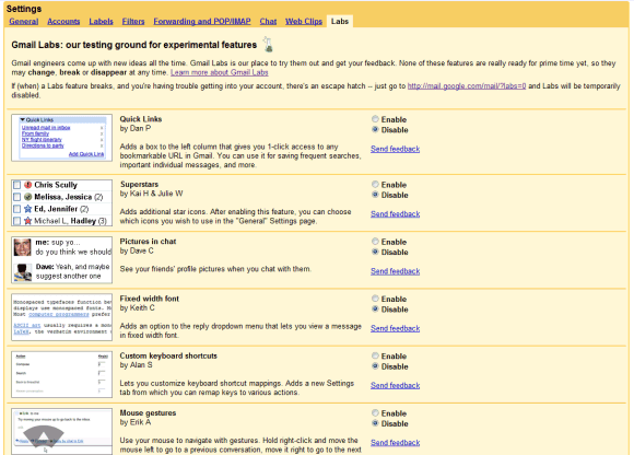
(Compare with the Gmail "labs" menu) It will be a longer page, but so much more useful/usable. It will highlight the brilliant tools that each community uses or has created. People might try more of the [features/gadgets/etc] if they easily knew what resulted (repercussions). Showcase the Shiny Toys! –Quiddity (talk) 21:55, 27 July 2014 (UTC)
- Added a rough mockup. It really needs real screenshots or icons instead of the placeholders, but it's basically what I'm thinking of. –Quiddity (talk) 03:57, 2 September 2014 (UTC)
- How/where will the additional info be defined and maintained? The syntax used by MediaWiki:Gadgets-definition currently does not allow for this, as far as I know. -- Duesentrieb ⇌ 21:35, 29 October 2014 (UTC)
- It looks really nice, the only thing I would ask is that a
(source)link be added to each entry (there seems there would be room for this under the link to the detail doc page). Other than that +2 Technical 13 (talk) 00:08, 18 December 2014 (UTC)
See also Gadgets 3.0. Helder 17:02, 9 April 2015 (UTC)
- +1 to the idea :) Addshore (talk) 17:10, 10 January 2017 (UTC)
The Appearance menu
edit
This needs something more nuanced. (And a whole separate discussion, but I'm adding it here to get it out of my head). E.g.
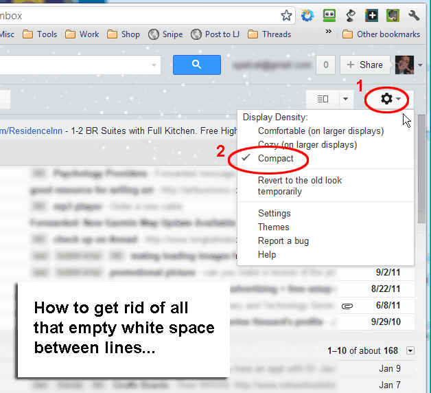
- NYTimes 3-level font-size options - (screenshot)
- GMail's 3-level interface-density options - (screenshot, details)
- Battlefield's 3 color-blind options - (4 screenshots)
- Fixed-width experiments in Typography Refresh and Flow - Some users love this (eg); Some like the idea but want to be able to change the default width; Some want (the current) full-width. We should make it changeable. One possibility is to make it "resizable", just like the editing-text-box currently is (which also has a hard-override in Preferences->editing for columns and rows). Maybe http://jqueryui.com/resizable/#snap-to-grid or similar?
- Reference Tooltips has, and Hovercards will have, an opt-out for anons. Reference Tooltips has 2 additional settings (timing-delay, and hover/click to activate - screenshot)
Anything accessibility & usability reading-related could be moved to a simple site-style menu, and thereby become available to logged-out users, too. The skin-system is in the process of being overhauled, and hopefully more modular possibilities will arise from that. We should aim to: Provide sensible defaults, but make the fundamental settings easy to tweak. So that people who want (less clutter vs more metadata everywhere) or (basic design vs more styled design) or (etc...) can choose for themselves.
(Sidenote: The GPII.net and connected projects seems to be aiming at this, at a global scale; see FLOE example video (2 min) and click "show display preferences" in the top-right of the window).
(I want even more info-density in my watchlist/toolbar/sidebar/ToC/etc, but I completely understand how other people don't!) –Quiddity (talk) 21:55, 27 July 2014 (UTC)
- Wireframe mockup image created. Thoughts? –Quiddity (talk) 03:58, 15 September 2014 (UTC)
- Quiddity, I really like this conceptually! I don't know if we'd want to surface at this level of complexity however, e.g. we might want to tie things like larger font size, higher contrast, longer popup delays etc. into a bundled accessibility mode OR have things just more in-context, e.g. contrast and font size are presented inside the UI where you use it, popup delay in popups, etc. I'm always wary of preferences creep. There are also settings which you've bundled under accessibility that I'm not sure fit like fixed header and compact list views, while I don't deny they are appearance preferences I'm not sure if they should be rolled up under the umbrella of accessibility. My motto has always been accessible design is good design for everyone. Jaredzimmerman (WMF) (talk) 01:06, 16 September 2014 (UTC)
- Thanks :) I included "Appearance" as well as "Accessibility", partially because they often overlap, and partially because FLOE and GPII do the same. I included line-spacing (formerly labelled "density") because it's the most prominent option in gmail, and because FLOE included it, and because it's a frequently discussed/divisive aspect of Flow. I also tried to include many of the visual elements that don't have subjective "right" answers, and that opinion is split on - but some more elements should be added such as "collapsible sidebar" for the left-hand (for LTR) side sidebar, which has been much discussed but noone can agree to change the default. –Quiddity (talk) 03:50, 16 September 2014 (UTC)
- Also discussed at bugzilla:70879. –Quiddity (talk) 23:09, 18 September 2014 (UTC)
- I've updated the wireframe to a very simple version, without the Fixed-header control or Popups controls (those would indeed be best accessed directly via Popups). –Quiddity (talk) 18:24, 12 October 2014 (UTC)
- Quiddity, I really like this conceptually! I don't know if we'd want to surface at this level of complexity however, e.g. we might want to tie things like larger font size, higher contrast, longer popup delays etc. into a bundled accessibility mode OR have things just more in-context, e.g. contrast and font size are presented inside the UI where you use it, popup delay in popups, etc. I'm always wary of preferences creep. There are also settings which you've bundled under accessibility that I'm not sure fit like fixed header and compact list views, while I don't deny they are appearance preferences I'm not sure if they should be rolled up under the umbrella of accessibility. My motto has always been accessible design is good design for everyone. Jaredzimmerman (WMF) (talk) 01:06, 16 September 2014 (UTC)
- Re: Fixed width - my wireframe above just has 2 options (fixed and full), but it might be good to have a few more options, at particular widths (eg. 1024, 1280, 1600, full) partially to remind editors that article layout should be edited to accommodate various screen sizes (+fonts etc), and partially to allow widescreen monitor users to see wide-content (tables, templates, galleries, in-article-maps, etc) at their preferred size. (I've just gotten my first 24" widescreen monitor (from a 19"), and I'm suddenly wanting a toggle, some of the time. 1920 is very wide! But I prefer a maximized window, hence I don't want to just resize it.) –Quiddity (talk) 07:05, 25 September 2014 (UTC)
Save + restore
editWhen something like phab:T757 bites me I try to disable all unclear "gadgets" and features to figure out if that helps. In that case the HHVM beta test was the culprit (for some hours). At that point it would be nice if I could revert my preferences to a saved state. Of course a "saved state" should be either not visible to anybody else, or exclude sensitive data.
Another wish: Finding a minimal working combination of "gadgets" and features is very hard. When something turns out to be good I'd like to have it on all projects (c:, m:, mw:, ...). –Be..anyone (talk) 01:36, 27 October 2014 (UTC)
- I've not tested this, but if you were to leave your preferences open, and then reset your preferences in another tab, would returning to the previous tab and saving not restore your preferences to how they were? (And also give you a chance to modify them first.) 137.147.65.114 02:25, 27 October 2014 (UTC)
- It's an idea, but actually I'd like to have several saved configurations, e.g., I'm not at all sure that I now have the state before the HHVM issue on all projects I care about, but HHVM is on again.
 –Be..anyone (talk) 03:26, 27 October 2014 (UTC)
- It's an idea, but actually I'd like to have several saved configurations, e.g., I'm not at all sure that I now have the state before the HHVM issue on all projects I care about, but HHVM is on again.
- I believe the values of the preferences could be saved in local storage when the user clicks on the button "Restore all default settings" at Special:Preferences/reset, so that a script could provide an undo button which would restore the previous preferences. Helder 17:05, 9 April 2015 (UTC)
- Script is exactly what I try to avoid at almost all costs. And local storage sounds like Flash cookie or similar abominations. At the moment I test a global preferences tool to get at least my language preference everywhere, but it's not doing anything for me so far. This issue should get a bump to one µm below unbreak now. –Be..anyone (talk) 03:32, 11 April 2015 (UTC)
Quiddity's mock-up from a long time ago
edithttps://i.imgur.com/xctzYPr.png --MZMcBride (talk) 01:20, 23 December 2014 (UTC)
- Horrible, one huge page without ToC or tabs. Be..anyone (talk) 07:49, 6 April 2016 (UTC)
- @Be..anyone: (a late clarification) That was just a screenshot of the non-JavaScript version of the page (in order to get everything in one screen), with some red-text annotations suggesting sections that could be merged and other notes. I wrote in IRC at the time: "Next step is hypothetically going to be: mark the preferences that are "Advanced", and could be hidden by default, behind a "Show advanced options" button. plus more annotations of sections to merge, and things that multiple people want to add." It was related to the ideas being discussed in phab:T64559, of having collapsible sections (instead of tabs) or a sidebar style tab system. –Quiddity (talk) 03:16, 21 July 2017 (UTC)