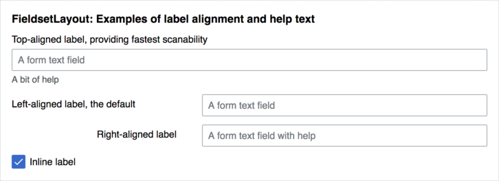
One of the most commonly used layouts is the FieldsetLayout, which is composed of one or more FieldLayouts or ActionFieldLayouts that contain a field widget, such as a form input. In addition to a field widget, ActionFieldLayouts contain a button.
FieldsetLayouts, FieldLayouts, ActionFieldLayouts and HorizontalLayouts can be configured with a label. Both field and action field layouts can also be configured with help text, which is accessed by the user via a help icon in the upper-right corner of the field.
Note that each field and action field layout requires a widget object (e.g., a button or input field), which should be specified by reference before any optional configuration settings. A FieldsetLayout should only contain field and action field layouts.
<!-- This is an example of a FieldsetLayout that contains four FieldLayouts
(one for each of the labeled form elements). Each field has been configured
to illustrate a way in which labels can be aligned: `left`, `right`, `top`, or
`inline`. -->

<style>
body {
	font-family: sans-serif;
	font-size: 0.875em;
}

.container {
	width: 600px;
	height: 300px;
	border: 1px dotted #c8ccd1;
	padding: 16px;
}
</style>

<script>
// Create form elements (text input, checkbox, submit button, etc.).
var input1 = new OO.ui.TextInputWidget( {
		placeholder: 'A form text field'
	} ),
	input2 = new OO.ui.TextInputWidget( {
		placeholder: 'A form text field'
	} ),
	input3 = new OO.ui.TextInputWidget( {
		placeholder: 'A form text field with help'
	} ),
	input4 = new OO.ui.CheckboxInputWidget( {
		selected: true
	} ),

// Create a fieldset layout.
	fieldset = new OO.ui.FieldsetLayout( {
		label: 'FieldsetLayout: Examples of label alignment and help text',
		classes: [ 'container' ]
	} );

// Add field layouts that contain the form elements to the fieldset. Items can
// also be specified with the FieldsetLayout's `items` config option:
fieldset.addItems( [
	new OO.ui.FieldLayout( input1, {
		label: 'Top-aligned label, providing fastest scanability',
		align: 'top',
		help: 'A bit of help',
		helpInline: true
	} ),

	new OO.ui.FieldLayout( input2, {
		label: 'Left-aligned label, the default',
		align: 'left'
	} ),

	new OO.ui.FieldLayout( input3, {
		label: 'Right-aligned label',
		align: 'right'
	} ),

	new OO.ui.FieldLayout( input4, {
		label: 'Inline label',
		align: 'inline'
	} )
] );

$( document.body ).append( fieldset.$element );
</script>
Field labels are aligned in one of four ways:
top: The label is placed above the form field. A top-alignment is used for brief forms that users fill out from top to bottom.left: The label is placed before the form field (or other object) and aligned with the left margin. A left-alignment is used for forms with many fields.right: The label is placed before the form field and aligned to the right margin. A right-alignment is used for long but familiar forms which users tab through, verifying the current field with a quick glance at the label.inline: The label is placed after the form field and aligned to the left. An inline-alignment is best used with checkboxes or radio buttons.
Example of a fieldset layout with an action field layout:
// An example of a fieldset with an action field layout.

var fieldset = new OO.ui.FieldsetLayout( {
		label: 'FieldsetLayout with an action field layout'
	} );

// Add an action field layout:
fieldset.addItems( [
	new OO.ui.ActionFieldLayout(
		new OO.ui.TextInputWidget( {
				placeholder: 'Action field text input'
		} ),
		new OO.ui.ButtonWidget( {
				label: 'Button',
				flags: [
						'primary',
						'progressive'
				]
		} ),
		{
				label: 'This label is top aligned.',
				align: 'top'
		}
	)
] );

$( document.body ).append( fieldset.$element );
HorizontalLayout
edit
For specific forms, for example when the checkboxes are direct modifiers of an input element, it can be considered to use a horizontal layout for the side-by-side alignment. Please be aware about the implications for user orientation flow, when the reading direction is changed from vertical to horizontal, therefore it should only be used in specific, option-rich forms.
// An example of a fieldset with horizontal layout.

var fieldset = new OO.ui.FieldsetLayout( {
		label: 'HorizontalLayout'
	} );

// Add an horizontal field layout
fieldset.addItems( [
	new OO.ui.FieldLayout(
		new OO.ui.Widget( {
			content: [ new OO.ui.HorizontalLayout( {
				items: [
					new OO.ui.ButtonWidget( { label: 'Button' } ),
					new OO.ui.ButtonGroupWidget( { items: [
						new OO.ui.ToggleButtonWidget( { label: 'A' } ),
						new OO.ui.ToggleButtonWidget( { label: 'B' } )
					] } ),
					new OO.ui.ButtonInputWidget( { label: 'ButtonInput' } ),
					new OO.ui.TextInputWidget( { value: 'TextInput' } ),
					new OO.ui.CheckboxInputWidget( { selected: true } ),
					new OO.ui.RadioInputWidget( { selected: true } ),
					new OO.ui.LabelWidget( { label: 'Label' } )
				]
			} ) ]
		} ),
		{
			label: 'Multiple widgets shown as a single line, ' +
				'as used in compact forms or in parts of a bigger widget.',
			align: 'top'
		}
	)
] );

$( document.body ).append( fieldset.$element );
For a full list of supported methods and configuration options, please see the code-level documentation for FieldsetLayouts, FieldLayouts, and ActionFieldLayouts
OOUI is maintained by the Design System Team.
Get help:
|

