Universal Language Selector/Specification
This page will contain a detail specification of the interaction with the Universal Language selector. At the moment it contains a set of statements that we want to make sure they are considered when the selector is developed. These statements are the response to some of the issues found during usability testing.
Integration in the page
editTwo locations have been mainly considered for the Universal Language Selector: top-rigth and left-side menu.
Tests with users showed that both locations work when all language-related settings are in the same place.
- Attempts to combine the top-right location for UI and Input language settings with the current interlanguage links for content language resulted in user confusion.
Left menu location
editBy including a cog icon next to the current language indicator, language settings can be accessed.
- It allows a gradual integration. The access to the new features can be applied to the current interlanguage links.
- It was not an obvious place for input method settings for some users. This can be solved with the editing support.
Top-right location
editAn indicator of the current language at the top-right region allows the user to open the selector for content language change (replacing the current interlanguage inks). The selector includes links to display and input settings.
- It is a big change from the current location but user tests show it was easy to find and made sense to them to be there.
- This region may have little free space. As it is illustrated in the attached image, the short list of languages can be shown only when the selector is open.

Apart of the main location of the selector, some specific features may have a different placement.
The purpose is to provide direct access to specific functionality closer to the place where this is needed.
See the adaptations section for more details on specific placement.
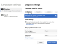
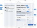
Settings view
editWhen there is not a default purpose for the language selection on a specific context, the settings view is shown.
The settings view is composed by three regions:
- A header. This indicates the user that he is at the settings dialog.
- Settings sections menu. Currently two sections are defined: display settings and input settings.
- Display settings is the selected option by default.
- Settings configuration. The specific options for each category are shown.
Language selection for settings
editBoth setting sections require languages to be selected. For this purpose they include a list of likely languages and a button to select a different one:
- The list of likely languages is based on:
- Languages defined in browser settings.
- Contributed and consumed languages by the user (if this information is available).
- Language defined in the user settings (if this information is available).
- Languages spoken in the current geographic area.
- Previously selected languages.
- Variants of the current language (e.g., include "Simple English" when "English" is the current language).
- English as a global default.
- For this context, the list of languages will contain up to four languages.
- The "add" button is depicted with an ellipsis.

Notification on language change
editWhen the user selects a different language, a notification is provided to inform of the consequences and allow the user to undo his action. The messages to display are:
- For display settings: "Menus will be show in <Language Name> now. Undo."
- For input settings: "Now you can write in <Language Name> (Undo). Indicate your preferred method for input below."
Messages are displayed using the UI language. In the case of UI language change, the original UI language is used for the message since one of the purposes of the message is to allow recovery.
-
 UI language change notification.
 -
 Input method notification.


Display settings
editRegarding input settings, the user is able to select:
- The language for the UI
- Whether webfonts are enabled.

UI Language
edit- UI language change should preview immediately. When the user changes display settings, the UI language should change immediately keeping the selector open for confirmation or cancellation (if the user cancels, the changes are reverted). The rationale for this is that in a foreign environment a user could identify his language and just by clicking it, he is presented with a familiar environment. If the user applies the changes, the dialog is closed and everything remains in the selected language. If the user cancels, ULS is closed and UI language is reverted to Greek.
Font settings
edit- Download fonts automatically. A check box (enabled by default) will allow users to indicate whether fonts are automatically downloaded for scripts that require it.
- When downloading is available and several fonts exist, a drop-down box will be presented to the user to customize the font used.
- Preferred fonts customization. For each language in use that supports multiple fonts, a drop-down selector is shown to the user to customize the font used. The preferred fonts section is only shown when the check box is checked.
- When different languages are used, text explaining whether the language was used for content, menus and/or input is shown.
- The entry corresponding to input font provides a "Change input language" link to access the input settings.
Input settings
editRegarding input settings, the user can select:
- The language used for input.
- The input method to be used for input for this language. For each language a set of input methods are provided grouped by types. For each type a brief description (and a help link) are provided. When several options are available, the appropriate control will be shown for selection. Conversely, when no options exist, widgets for selection must not be shown. For example, a language for which no methods are provided, will not show this section at all.
- The preferred input method for a language is persistent. That is, when the user changes to a different language, the method to use would be the previous one used for this language.

Language list
editThe language list is presented to the user each time that a language needs to be selected.
- The language list is closed when an element is selected from the list. In the case of multi-language selection this behavior is different.
- The user is returned to the previous context (the original page or the settings view depending on the origin).
- Once the language list is shown, a link will be provided to the user to go back.
- The escape key will be used for the same purpose.

List layout
edit- Languages are organized in 4 columns (initially 5 columns where considered as shown in most of the mockups) with 10-items per column and two rows of items initially visible (to invite for scrolling if needed).
- Languages are grouped in clusters in a way that communicate the ordering of scanning to follow alphabetical order.
- The width for each language should be enough for the language not to span several lines.
- A category is defined for each geographic sub-region (e.g.: Europe, Africa...).
- The first region to be placed on top depends on the user current location.
- The rest of the regions will be consistent with the regions in which the map is divided.
- The list is presented as a continuous long list the map filtering scrolls the view to the appropriate region but does not hide items from the list. In this way, items can be explored by scrolling.
- Any language that is likely to be selected by the user will be highlighted in the list.
- Highlighting will consist on using bold text and setting the background of this text to a different color.
- Languages with the same type of script will be displayed together. This allows the user to focus on the region of the list where more familiar text appears (see the image above).
- Scripts with the greater number of languages will be placed first.
- Script regions should avoid fragmentation and have a clear starting point.
- Two scripts cannot be in the same cluster if they span more than one cluster.
- If a set of languages spans multiple rows it should start at the first column.
Search box
editSearch is triggered as the user types the first character. Only languages that match the search criteria are kept in the list. Languages are re-arranged to avoid big gaps and region labels which do not contain any language are removed to avoid languages to become hidden below the fold.
- When the language list becomes visible, the search box should receive the input focus.
- For tablet devices it is preferred not to gain focus automatically since the virtual keyboard can hide the language list.
- When the search term is not empty, an 'X' icon will appear to the right of the form. This will allow the user to clear the search term.
- Search should be flexible in order to match:
- Languages in their own name
- ISO codes
- Alternative names in different languages.
- Languages using a relaxed version of the script. For scripts that provide variants for some letters (e.g., capital letters or accent marks), the search should be capable of matching the equivalent variants (e.g., "maori" should match "Māori").
- When searching, if there is a prefix match, the remaining part of the matched element should be shown in the search box in grey (in a similar fashion as the autocomplete pattern is commonly applied).
- When the user hits tab key, the suggestion turns into the current input text.
- When there is no suggestion, the tab key will behave as normal (for changing the focus element).
- When the user hits enter, the current suggestion is selected.
- When the user hits tab key, the suggestion turns into the current input text.
- The search should include all regions to avoid results to be hidden by mistake (and this should be indicates graphically in the map by removing highlighting from all zones).
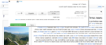
World map
editA World map divided vertically in three regions (with labels) is used to reduce the number of languages to the ones spoken in a specific region.
- The world map is divided in three geographical regions: America; Europe, Africa and Middle East; Asia and Oceania. An additional label-only region named "Worldwide languages" is included to consider constructed languages and w:World_language world languages.
- By default the filter is activated to show only the languages spoken in the current region the user is located.
- The highlighted region is consistent to the languages the user observes in the list.
- The world map is synchronized with the scrolling action. When the user scrolls down the list to a different region, the map changes the highlighted region.
- When searching the full map gets highlighted to indicate that the search considers all regions.
Duplicated languages
editSince the languages are arranged by region and script. The same language will appear several times in the list when:
- The language is widely spoken in several regions.
- The language is written in multiple scripts.
Constructed Languages
editConstructed languages are normally conceived to be universal. It is still unclear how to deal with them:
- Repeat them for each region since they have a global scope.
- Repeat them for the regions where there is a significant number of speakers for the language.
- Create a miscellany region (e.g., "worldwide") where constructed languages and world languages appear.
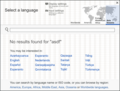
No results found
edit- When the search term does not match any results, a message is displayed to the user to indicate alternative ways to look for the language:
"No results found for '<SEARCH TERM>'. You can search by language name or ISO code, or you can browse by region: America, Europe, Africa, Middle East, Asia or Oceania ." (Region names being links to each sub-region in the list).
- The user will be provided a short list of relevant languages in this context:
- Likely languages
- Similar languages to the search term (based on Levenshtein distance)

Adaptations to specific contexts
edit
Right to Left languages
editThe following considerations should be taken into account:
- Alignment of UI elements is reversed with respect to the Left-to-Right version of the UI. For example, the world map is placed at the left and menus are placed at the right.
- Each language group (by script) preserves its own ordering direction which is not altered by the general UI direction.
- The labels in the language list are left or right-aligned depending on the language direction.
-
 Mock Up for the display settings to illustrate the Right-to-Left adaptation.
 -
 Mock Up for the input settings to illustrate the Right-to-Left adaptation.
 -
 Mock Up for the language list to illustrate the Right-to-Left adaptation.


Content selection
editFor contexts where the content language can be changed, the current language indicator will trigger the language list to appear. In this case, the language list will include links to the display and input settings.
For monolingual wikis with inter-language links such as Wikipedia, content selection can be integrated into the interlanguage links.

Top-right location is an alternative position for language content selection. In this case, since there may not be room for showing a short list of languages, a compact tooltip may be shown when there is a language change (allowing the user to undo the change).

This tooltip is intended to be unobtrusive: it will disappear after a few seconds and appear again when hovering over the language name (when the user may need it). In this way, although manual dimissing is also possible by clicking the tooltip, the user is no required to do so each time.
Editing
editIn order to allow an easy support for editing, the ULS may be placed closer to the editing context. By placing an indicator of the current input language close to a text box or text area, the user can use it to access input settings directly:
- Current language and input method. At the bottom-right of the text area, an indicator for the current input language will allow the user to access input language settings. The indicator is composed by a keyboard icon, a label indicating the current language for input (and input method in parenthesis if any) and an arrow pointing down to invite the user to access the menu.
- For contexts where there is little room, only the keyboard icon can be shown. In this case, once the menu is open, the current language will be shown (the input method is not indicated since it will be visible at this point).
- Change input method. The menu includes a list of the available input methods for the current language. The active method for the current language can be changed or disabled.
- A check mark will indicate the active method. The default input method (not part of the list) is used when no method has the check mark.
- A link to disable input methods is added as an option to make more clear how to unset them.
- Specific actions such as show/hide the virtual keyboard (or the keyboard mapping if only a static mapping is available) can be placed next to each option.
- Keyboard shortcuts are supported and indicated to make the process more fluent for advanced users.
- Select a different language. A short list of 3 languages is shown.
- The list is initially based on the same criteria than the previous short lists of languages but prioritizing languages with a non-latin script (that may require input aids) and languages previously selected by the user.
- A "more" button depicted by an ellipsis is used to select a different language not included in the list. The language list is shown when the button is accessed.
- When a language is selected the menu is closed. and the latest input method used for the newly selected language is used (as noted below, a tooltip will inform the user for the method activation).
- A "More settings" link allow the user to access the language settings (with the input settings view open by default).
- A tooltip is used to notify the user of changes and provide links to help resources.
- The tooltip may be activated either by input method change or by a language changed that has associated an input method change.
- When an input method is activated, the text message displayed is "Now you can use <method name> when writing in <language name>. Learn more".
- For the first time the user selects a language with one or more input methods available, a tooltip will indicate the user that "You can activate different aids to help you write in <language name>" in order to provide better guidance to the user.
- The tooltip will be closed when the user clicks on any region or keeps typing in the text area.
The current language indicator will be shown when the text area receives input focus. Other alternative possibilities for activation are:
- Always visible.
- When the user starts typing in the text area.
- On first deletion of characters.

Adaptations
edit- For certain contexts, only input methods can be modified but not the current input language. For these contexts, the language indicator will not indicate the current input language (as it is described above for situations with little room to include the label) and a list of languages to use will not be included in the menu.
- This is the case for the search bar used in the ULS since adding language input selection to introduce a language name could require language selection itself adding an unnecessary loop of complexity.
-
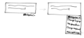 Sketch to illustrate the adaptation of the ULS to an editing context.

Multi-language selection
editFor contexts where the outcome is a list of languages (e.g., such as translators being subscribed to their languages of choice). The ULS is presented with these elements:
- The list of current selected elements. Each language is represented with a label and an "X" icon to remove elements from the list.
- If the list is empty it is indicated explicitly.
- An add button represented by an ellipsis that allows new languages to be added to the list. The button makes the language list appear.
- A tooltip is shown on hover to provide an explanation of the functionality.
- The short list of languages. A short list of languages is integrated into the language selector to make it easy to select all the usual languages for a user.
- The long list of languages. The list of languages with the usual aids (search bar, map, arrangement by script type).
- The language list is located below the list of current selected elements without hiding it.
- When a language is chosen from the list, the list is not hidden. The list remains open so multiple elements can be added sequentially.
- The language list includes a "done selection" button at the bottom to make it easy to complete the process of adding new languages.
- Selected languages in the list are presented also with the "X" icon to allow them to be removed from the list. These languages can be removed by clicking on them from the list.

-
 Sketch to illustrate how the ULS is adapted to support multiple language selection.
Reduced number of languages
editFor specific contexts where language selection is performed for a subset of languages, the selector can be adapted to avoid those languages to be sparsely distributed in the list:
- If there are 15 languages or less, they can be shown in a single list.
- If there are 50 languages or less, languages are not divided in sub-regions and the three global regions are used instead.
Layout and visual style
editLayout and sizes
editThe Universal Language Selector layout is based on a flexible grid. The layout of the selector has been defined to leverage the available screen real state so that languages with long names can be displayed but without resulting in a very big selector. We defined the selector width as 45% of the screen width (with a minimum size of 715 pixels).
The design was based on a 24-column grid system (using is 24px width columns with an 8px margin between columns) but the implementation has been adapted to a flexible 12-column CSS grid (with 5px margins) based on the previous designs. An initial version of the grid-based design has been created in order to test the layout.
The initial grids used for the designs are shown below. Font sizes are also indicated below by using points and pixels as a reference (for implementation em units should be used to properly suppors zoom levels).
-
 Grid used for the language list.
 -
 Grid used for the display settings.
 -
 Grid used for input settings.
 -
 Grid used for "results not found" message.


Visual style
editThe visual style should follow the design guideline.
Colors
edit- Blue for emphasis.
- Color value #3366bb has been used for emphasis in current settings section and current geographical zone in the map (the highlighting effect uses a 16% transparency version of this blue)
- A linear gradient between the previous blue value and a lighter blue (#3670c8) has been used for the primary action button ("apply changes" button) and the notification background.
- Blue for links
- Links use the #0645ad blue.
- Grey for de-emphasized text.
- Some explanations use the #323232 dark grey.
Icons
editThe icons used in the designs are available as SVG files:
-
 Display settings.
 -
 Input settings.
 -
 Language selection.
 -
 Settings.
 -
 More settings.


