Reading/Web/Desktop Improvements/Recherche et conception : phase 1
Notre processus de recherche et de conception pour le Projet d'amélioration des postes de travail a commencé en mai 2019. À ce moment-là, le projet n'était pas encore bien défini (en termes de portée, d'exigences, de calendrier), donc en partie cette recherche et la conception visait à aider à donner une définition au projet, mais ce n'était pas l'objectif principal. La phase I consistait principalement à enquêter et rechercher, à déterminer où nous pouvions créer de la valeur et à définir les objectifs.
Nous avons commencé par examiner l'expérience par défaut actuelle avec la version pour bureau (habillage Vector) et nous nous sommes demandé : de quelle façon pouvons-nous améliorer cela ? Où sont les possibilités de modifier l'interface afin de créer une meilleure expérience pour tous les lecteurs et les éditeurs ? Comment pouvons-nous faciliter la tâche des gens pour faire ce qu'ils veulent faire ? Comment pouvons-nous créer un environnement de lecture plus agréable ?
Pour aider à démarrer la conversation voici une carte de base des principaux éléments de Vector qu'une personne déconnectée voit :
.png)
Activités de recherche et de développement
Les activités de recherche et de conception que nous avons menées afin d'explorer ces questions (voir le paragraphe principal) comprenaient :
- Comprendre l'histoire de l'interface de bureau
- Lire les recherches Wikipedia précédentes conduites par la Fondation Wikimedia ou d'autres institutions de recherche ainsi que les particuliers
- Discussions au sein de notre équipe pour développer une compréhension partagée du projet et susciter des idées
- Winter, Timeless, et autres restructurations Wikipedia
- Lectures à propos des restructurations/mises à jour d'autres grands sites web (Reddit, Twitter, etc.)
- Réalisation d’un audit d’autres grands sites web pour essayer de trouver des éléments structurels communs
Sorties attendues
The output from phase 1 was: a better understanding of the desktop interface, and proposed focus areas for improvements. We didn't have strict criteria for what a focus area could be. Generally speaking it was an idea of an improvement we could make, though at varying levels of specificity, such as: a less cluttered reading experience, or language switching ease.
Domaines ciblés
Les zones d'intérêt proposées sont :
- Creating a more focused and "quiet" reading environment by consolidating or optionally collapsing navigational links, including:
- Main sidebar navigation
- Article tools
- User tools
- Language switching
- Search
- Article navigation / table of contents
Additional, more feature-specific, ideas that came up: reading preferences (e.g. dark mode), share button, larger edit button / add new article button (for smaller wikis) / making it more obvious how to "get involved", article stats / activity summary.
Historique de l'interface pour bureau
Les résultats de ces investigation peuvent être vus ici : Une histoire des habillages Wiki.
Recherche précédente
Recherche conduite par la Fondation Wikimedia (du dépôt principal)
Expériences avec le nouvel éditeur (2017)
- “Finding 5. The complexity and separation of how Wikipedia is made, and the community behind it, make it difficult to convert readers to editors, and new editors to experienced editors. Many new editors were confused about how Wikipedia works, or were not aware that their understanding of the model was incorrect. Some thought that Wikipedia was edited only by experts or a small group, until they noticed the edit function or learned that anyone could edit outside of Wikipedia (e.g., through news articles, friends, or social media). Once they started editing, most new editors did not understand Wikipedia’s policies and the rationale behind them, and were not aware of or had not interacted with other editors.” (p19)
- “Finding 9. Editing processes and the mechanisms that support them (e.g., communication with other editors, help pages) are not intuitive or discoverable, making it difficult for new editors to learn and progress. Many non-retained new editors struggled to remember the basics of editing (e.g., how to login, their username, where the editing interface is located) making it difficult for them to replicate their edits and become repeat editors. Many new editors, both retained and non-retained, were unaware of or confused about the more advanced editing functions and the processes that support them (e.g., how to talk to or where to receive messages from other users, where to find help or ask questions).” (p25)
Readership survey (2011)
- Broad survey about reading
- Finding B: “Search is the most desired improvement to Wikipedia About 32% of our readers said they were extremely/very likely (score of 9+ out of 10) to use Wikipedia more if the search functionality was improved. Better search emerged as the most desired feature, over others like more multimedia content, a better mobile site, a more simplistic design, and so on.” … “Some of the search features desired by these readers were: auto-completion for search terms and better keyword search for both Portuguese and Indic languages, and also transliteration plugins for Indic languages.”
- This proves that search is relevant. While we don’t plan to focus on functional improvements to search it’s helpful to know that it’s an important feature to folks and therefore increasing prominence seems like a good idea
- They measured trust and other “quality” metrics
- “Readers compare Wikipedia favorably with most major websites” “Readers from all 16 countries in our sample compared Wikipedia's interface and ease of navigation to other Internet properties. If we look at the sample as whole, Wikipedia (8.09 on 10) was rated a close second to Google (8.44) on these measures.”
New readership data: Some things we've been learning recently about how Wikipedia is read (2016)
- Similar conclusions as How the structure of Wikipedia articles influences user navigation (2017) - basically people spend more time in the top of the article
- Interestingly, the top of the article is where the most surrounding clutter us
Documents académiques
Comment la structure des articles Wikipedia influence la navigation des utilisateurs (2017)
- This paper is focused on how people find the information they’re looking for within “information networks”, specifically focusing on navigating via links. Their main conclusion is that people mostly click the links in the lead paragraph or infobox of an article:
- “Our results suggest that article structure has a strong influence on navigation. We find evidence that a large share of user clicks are to links in the lead section or an infobox. For free-form Wikipedia navigation, navigation decisions can be best explained by a bias towards the article structure, favoring links located near the top of the article.”
- They discuss how people initially scan a page to figure out whether or not the page contains the information they’re looking for:
- “Web users have been found to quickly decide whether a page is worth their interest. Weinreich et al. (2006) report that users stay on most pages only for a short time span and that 52% of all visits are shorter than 10 seconds. Web users frequently skim a page at first to determine its relevancy (Liu, White, and Dumais, 2010; Liu et al., 2014). This behavior also shows in the analysis of click locations: in a study, 76.5% of clicks were made in the area visible without scrolling and 45% on links located near top left corner (Weinreich et al., 2006).”
- Based on this, we can draw the conclusion that displaying all of these additional links in the sidebar might not be very effective and in fact might make it more difficult for readers to find what they need
A large-scale study of Wikipedia users’ quality of experience (2019)
- This study focuses on the “quality of experience”, determined exclusively by loading speed. They surveyed 62k people from 59k distinct IP addresses across 46k Wikipedia pages. They used quick survey to ask people if the site loaded fast enough.
- The findings were that the vast majority of people were happy with the loading time and therefore perceive the site to be a quality experience — the breakdown was positive (84.8%), neutral (7.7%), negative (7.5%).
- "The main takeaways in our analysis are that users are consistently satisfied, and that scores do not exhibit seasonality at circa- dian or weekly timescales, which is unexpected. Quite surprisingly, scores are also not affected by network-related events (e.g. data center switchover) happening during the period, nor by Wikipedia- related events (e.g., banner campaigns that alter the page rendering) nor by known browsers events (e.g., Chrome 69 first paint regres- sion"
- "Additionally, we find that scores are, as expected, heavily influenced by user-level expertise and equipment (e.g., device, OS and browser), as well as network and country-level characteristics (including access technologies, ISP and economical factors). Interestingly, scores are not affected by the Wikipedia page size, nor by the device price (unless economical factors are also weighted in)." One explanation for why people with greater user-level expertise are more likely to be satisfied with the loading time is that they've become accustomed to it and aren't necessarily comparing it with other websites (as less frequent visitors might be doing).
- Potential implications on this project: 1) the site is already very performant which might suggest it's not important to try and further improve, 2) performance plays a large role in quality perception and therefore we should be mindful of maintaining the current status quo
Intrusion rapide dans le comportement du lecteur (2015)
- Small study (12 participants), only focused on mobile
- Notes that people don’t use Wikipedia search very much
- Part of this is because it doesn’t work well with keywords - “Strong search mental models involve keywords. It can be challenging to find a relevant Wikipedia articles using keywords to search in EN:wiki” (link to slide)
- Also notes that one person had a difficult time finding search, and that this came up in past testing - “Hard time finding wiki search...have seen this before in guerrilla testing)” (link to slide)
Discussions at team offsite

Our team had an offsite in Prague during May 12th–15th, 2019. We had three sessions regarding different aspects of the project. The general goal was to develop a shared (emergent) understanding of the project, and begin to generate ideas for the kinds of work that needed to be done. The first session was a review of the history of the desktop interface. The second was focused on framing and design, and included a brainstorming activity to generate possible focus areas for improvements.
[TBD - Alex to add images of the framing concepts from the presentation — inclusivity, flexible container, populations graph]
Voici la sortie groupée par catégorie :
|
Sidebar & nav
|
Editing
|
Language
|
|
Reading features
|
Content
|
Search
|
|
Misc.
|
The third session was focused on technical aspects of the project, as well as scope and timeline.
Winter, Timeless, et autres restructurations Wikipedia
Winter (2014)
Winter was a proposal for a new skin in 2014. According to the project page: "Winter attempts to solve several problems inherent with the Vector skin/interface. In addition, it serves to inject a modern look and feel and serve as a showcase and prototype bed for new features and design changes." The stated goals of the design are:

- Tightly couple page actions and views (read, history, discussion, edit, etc.) to the page content itself
- Reduce interface clutter (either actual or perceived) to focus on content
- Synchronize design direction across devices and platforms
- Make search available at all times.
- Make user tools available at all times.
- Better surface exploration features, such as inter-project and inter-language links.
- Spur further "what if" design thinking.
- Generally improve the overall aesthetics of the interface.
Some notable aspects of the design include:
- Fixed header with search, table of contents dropdown, some page tools, and user tools
- Page tools (Edit, History, etc.) located below the page title instead of above
- Descriptive button titles (e.g. "39 Discussions" instead of "Talk", and "Updated 10 days ago" instead of "History")
- Language switcher and categories moved up the page, located to the left of the article
- Responsive layout
- Subtle differentiation between "Watch" and "Watchlist"
Timeless (2015)
Timeless is a MediaWiki skin developed in 2015. According to the MediaWiki page it was "based on Winter and an attempt to incorporate all the sensible things suggested on this 2015 Village pump discussion into a skin". Some notable aspects of the interface design:

- Fixed header with a prominent search bar
- Page tools located to the right of the article (when screen is large enough)
- Language links above the fold, located to the left of the article (when screen is large enough)
- Responsive layout
- User tools consolidated into a dropdown menu
- Article content constrained to ~820px
- Watchstar moved to the left, located next to Talk
- Categories moved up
Wikiwand
Wikiwand is a proprietary Wikipedia reader website and app. It doesn't support any editing workflows; editing tools (History, Edit, etc.) are present but clicking them leads you to Wikipedia. Some notable aspects of the interface design:
- Prominent table of contents to the left of the article (this is collapsible)
- Cover image at top of article
- Content width constrained to 75% of screen width
- All images moved to the right of the article text
- Serif body font
- Disambiguation content hidden under an icon
- "Connected to" feature
- Reading settings (font size, dark mode, content width)
- Share menu
- Image gallery with filmstrip at the bottom
-
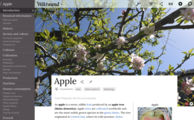 Screenshot of Apple article on Wikiwand
 -
 Screenshot of Apple article scrolled on Wikiwand
 -
 Screenshot of reading preferences and disambiguation panel on Wikiwand
 -
 Screenshot of image overlay on Wikiwand
 -
 Screenshot of short article on Wikiwand


Golden
Golden is an encyclopedia-like knowledge base started in 2017. The site automatically scrapes information from the internet and assembles it into Wikipedia-like pages called "topics". Topics are organized into "clusters". Topics are also editable by people. Some notable aspects of the interface design:

- There is an emphasis placed on "contributors", a ranked list is shown on the right-side of each topic page and they also appear in search results
- "Sign up" and "Log in" are emphasized (this may have to do with it being a new site)
- Fixed header with Search, Edit, and Create topic
- Separate Watch and Favorite actions
- Share button
- Persistent table of contents
- Prominent "Feedback" button
- Each topic has the following tabs: Overview, News, Suggestions, Issues, Contributors, Activity
- Maximum content width of 890px
Everipedia
Everipedia is a Wikipedia-like online encyclopedia started in 2014. Some of the background technology is unique (it uses blockchain to store edit history, and incentives users with cryptocurrency) but from a general reading perspective it is quite similar to Wikipedia. Notable aspects of the interface include:
- A prominent table of contents that is shown conditionally based on the length of the article
- A fixed site header (with Search and Create article) and a fixed article header (with Edit and View history)
- A view count (e.g. on the Los Angeles, California page it displays 9.0K views)
- Maximum content width of 980px
- "Back to top" button when scrolling down
-
 Screenshot of "Los Angeles" article on Everipedia
 -
 Screenshot of "Los Angeles" article on Everipedia (scrolled)

.png)
Autres restructurations
Quelques unes des autres sources où les restructrations peuvent être vues :
- The page Wikipedia:Unsolicited redesigns discusses the topic of unsolicited redesigns and links to several (though most of the linked sites seem to be down).
- Run a search on Dribbble for
Wikipedia(https://dribbble.com/search/wikipedia) which will yield a number of interesting redesigns. - Look through the various skins listed at mw:Category/All Skins
Restructuration d'autres grands sites web
In 2018 Reddit did the first major redesign of their website in ten years. While Reddit differs from Wikipedia in many ways there are also some notable similarities: it's a large online community that has been around for over 10 years, the audience is similarly split between readers and editors, they offer a large amount of customization on a per-project basis, their design and development process is done out in the open in collaboration with community members. In the words of their design team, “Reddit is not a one-size-fits-all experience. It’s a site based on choice and evolution. There are millions of you, spread across different devices, joining Reddit at different times, using the site in widely varying ways, and we're trying to build in a way that supports all of you.”[1] We found the stated goals of their redesign to be helpful when formulating our own:
- Make our desktop experience more welcoming - Lower the barrier to entry for new redditors, while providing choice and familiarity to all users.[2]
- Design a foundation for the future - Establish a design foundation that encourages user insight and allows our team to make improvements quickly, release after release.[3]
- Keep content at the forefront - We want to make sure viewing, posting, and interacting with content is easy by keeping our UI and brand elements minimal.[4]
Some parts of their process that are inspiring to us:
- They set clear expectations around how to give feedback, and responded to the feedback as it came in
- They published project timelines and regular updates
- They ensured that it was easy for users to opt out of the new experience at any point in time
- They did a lot of user testing
- They rolled the new experience out incrementally
Some additional links to read more about the redesign: