مطالعه/وب/بهبودهای دسکتاپ
از زمان استقرار پوستهٔ پیشفرض کنونی ویکیمدیا (وکتور) ۱۲ سال میگذرد. Over the following decade, the interface was enriched with extensions, gadgets and user scripts. Most of these were not coordinated visually or cross-wiki. At the same time, web design, as well as the expectations of readers and editors, evolved. It was time to take some of these ideas and bring them to the default experience of all users, on all wikis, in an organized, consistent way.
|
بهبودهای دسکتاپ
.png) مجموعهای از ویژگیهای جدید و بازطراحی در پوسته وکتور
|
هدف ما این است که ویکیهای ویکیمدیا را دوستانهتر کنیم و سودمندی آن برای مخاطبان را افزایش داده و سودمندی آن برای ویرایشگران موجود را حفظ کنیم. ما میزان افزایش اعتماد و تمایلات مثبت نسبت به وبگاههای خود و سودمندی این وبگاهها (کاربرد عملهای معمول مانند جستجو و تغییر زبان) را اندازهگیری میکنیم.
در حال حاضر، در بیشتر ویکیها تنها کاربرانی که به سامانه وارد شدهباشند میتوانند بهطور فردی به مشارکت بپردازند. در ویکیهای منتخب، تغییرات ما بهطور پیشفرض برای همگان مستقر خواهد شد و کاربران وارد شده به سامانه قادر به انصراف هستند. ما در حال افزایش ویکیهای دارای وکتور ۲۰۲۲ به عنوان پوسته پیشفرض هستیم را افزایش دهیم تا زمانی که بهبودهای ما به طور پیشفرض در دسترس باشد.
بهروزرسانیها
نوامبر ۲۰۲۳: Visual changes, more deployments, and shifting focus

?vectorzebradesign=0)
?vectorzebradesign=1)New styling inspired by Zebra prototype
As part of Zebra #9 prototype, which we wrote about in the last two updates, we introduced two kinds of visual changes: color-based area separation, and other CSS modifications. As we reported previously, the A/B test didn't prove that the color-based separation was an improvement. We focused on the other CSS modifications instead, and we're implementing these changes now. To preview the difference, you may use URL parameters: ?vectorzebradesign=0 (without the changes) and ?vectorzebradesign=1 (with the changes). The changes are:
- Dropdown menus (the sidebar, table of contents, user menu, and tools menu when not pinned) have a lighter outline and drop-shadow.
- The "انتقال به نوار کناری"/ "نهفتن" buttons in the dropdown menus have a gray background instead of the square brackets.
- The main menu no longer has a gray background when it is placed in the side column (when it's pinned). Instead, all menus have the same appearance when placed in the side columns.
- The left and right columns have equal width.
- Due to the change above, the content width gets slightly narrower when menus are pinned in both columns.
- The gap between the table of contents and content area is smaller.
In mid-November, we shipped these changes to the following Wikipedias: French, Catalan, Hebrew, Polish. We are planning on introducing these changes across all the wikis within 2-3 weeks. These will enable future modifications, like the Accessibility for reading menu.
Continuing deployments of the Vector 2022 skin
Since our last update, we have changed the default skin on a few Wikipedias: Dutch, Hindi, Hungarian, Norwegian (bokmål), and Swedish. We have also released a short video about the skin. In addition, after receiving all logos from our Design team, we were also ready to continue the wide-scale deployments on sister projects.
- The Vector 2022 skin is now the default on all non-English Wikibooks, Wikinews, Wikiquotes, Wikiversity, as well as on Meta-Wiki.
- We are continuing conversations and scheduling deployments to the remainder of sister projects, beginning with non-English Wikisource, Wiktionary, and Wikivoyage.
Some of these projects may need adjustments, like default settings for limited/full-width at namespaces unique to Wikisource. Gadgets or user scripts may need to be updated, too. We gladly make fixes or assist in making them, depending on whether changes need to be made in the skin itself or a community-controlled code. Reach out to us on the Desktop Improvements talk page or write directly to SGrabarczuk (WMF) if you have any questions or requests for further changes.
Focusing on further desktop and mobile readability improvements
The team has shifted focus onto the Accessibility for reading project. We will work on improvements in typography and introduce dark mode to the Vector 2022 and Minerva skins. Please visit the project page for more details and information on how to get involved.
سپتامبر ۲۰۲۳: نتایج حاصل از آزمایش A/B جداسازی محتوا (گورخر شماره ۹)
در ژوئن ۲۰۲۳، آزمایشی را انجام دادیم که طرحبندیهای مختلف جداسازی محتوای رابط را مقایسه کرد. این نمونه اولیه طرح آزمایش شده را نشان می دهد. ما آن را «گورخر» مینامیم. هدف بهبود خوانایی و تمرکز بر محتوای صفحه بود. این آزمایش طرح نمونه اولیه را آزمایش کرد و آن را با طرح فعلی تمام سفید وکتور ۲۰۲۲ مقایسه کرد. نتایج آزمایش نشان داد:
- افزایش ۳ درصدی در بازدید از صفحه در هر جلسه گروه درمانی که به گورخر نسبت داده شده است
- کاهش ۳.۴ درصدی در ویرایشها در هر جلسه در گروه منتسب به گورخر
- کاهش ۱۷ درصدی در نرخ کلیک فهرست مطالب
- افزایش ۸۷ درصدی پین ابزار صفحه در هر جلسه
After reviewing the settings of our test, we did not find any issues that would result in data inconsistencies. Next, we studied other factors which might affect the results of the test. We noticed that a significant amount of the decrease in edits and pageviews came from screen sizes narrower than 1200 px. We combined these results with the results of our user tests.
These did not indicate significant differences in readability between the test and control designs.
Our conclusion was that the prototype did not, in its tested form, improve readability and could negatively affect edits.
We decided not to proceed with the deployment of this prototype in its tested form. Instead, we plan to improve readability and focus on the content through the following:
- Introducing changes to the typography, focused on improving readability and content comprehension. This is the goal of the new project, Accessibility for reading
- Introducing improvements to Zebra, optimizing for narrower screens, and repeating the tests.
هدف ما چیست؟
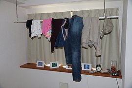
یک جارختی را تصور کنید
-
 ما میخواهیم بهتدریج این را...
 -
 به این شکل ساماندهی کنیم :)

.jpg)
در حال حاضر، رابط کاربری...
...با انتظارات مطابقت ندارد. ...درهمریخته است و قابل لمس نیست. ...سمت اجتماع را برجسته نمیکند. ...با نسخهٔ تلفن همراه یکپارچه نیست.
- رابط کاربری دسکتاپ با انتظاراتی که توسط پلتفرمهای مدرن وب ایحاد شدهاند، مطابقت ندارد. این رابط گمراهکننده بهنظر میرسد و حس قطع ارتباط را به مخاطب القا میکند. ناوبری و پیوندهای رابط کاربری با بینظمی چیده شدهاند.
- درهمریختگی موجود، کاربران را از تمرکز بر کاری که دنبالش بودهاند، منحرف میکند. تمرکز بر محتوا برای مخاطبان چالشبرانگیز است. امکان تغییر زبانها بهشکل شهودی، جستجوی محتوا یا تغییر تنظیمات مطالعه برای آنها وجود ندارد. ویرایشگران جدید قادر نیستند تا از بینش خود برای تنظیم حساب کاربری خود، باز کردن صفحهٔ ویرایشگر یا آموختن چگونگی استفاده از صفحههای غیر مقاله برای کاربردهای متعادلسازی استفاده کنند.
- درصد بسیار کمی از مخاطبان چگونگی عملکرد ویکیهای ویکیمدیا را درک میکنند. بسیاری از مخاطبان آگاه نیستند که محتوایی که در حال مطالعهٔ آن هستند، توسط داوطلبان نوشتهشده و بهطور مکرر بروزرسانی میشود، و از این که خودشان هم میتوانند مشارکت کنند نیز خبر ندارند.
- تفاوت بزرگ میان تجربه بهواسطهٔ رابط کاربری دسکتاپ، اپلیکیشنها و نسخهٔ وب تلفن همراه ما، برقراری ارتباط با محصولات ما را برای مخاطبان سخت میکند. کمبود اتحاد در مفهوم وبگاههای ویکیمدیا وجود دارد.
چگونگی اعمال تغییرات
اصول
با به محتوا دست نمیزنیم. هیچ قابلیتی را حذف نمیکنیم. به پوستههای دیگر بهجز وکتور دست نمیزنیم. از ابزارهای موجود الهام میگیریم. در قدمهای واحد، تغییرات عمده اعمال نمیکنیم.
- ما تنها در حال کار بر روی رابط کاربری هستیم. هیچ کاری بر روی سبکبندی الگوها، ساختار صفحهها، پشتیبانی از نقشهها یا الگوهای میانویکیایی انجام نخواهد شد.
- پوستههایی بهجز پوستهٔ وکتور در محدودهٔ تغییرات ما نیستند. ما پوستهٔ وکتور را در وکتور لگاسی بهشکل ثابت درآوردهایم و استقرار ویژگیهای خود را بهعنوان بخشی از وکتور جدید پیشفرض آغاز کردهایم.
- اگرچه تغییرات ما بهراحتی قابل تشخیص هستند، ما از رویکردی تکاملی پیروی میکنیم و میخواهیم وبگاه همچنان حس آشنایی را به مخاطبان و ویرایشگران منتقل کند. هر ویژگی بهطور جداگانه مورد بحث قرار میگیرد، توسعه داده میشود و پیادهسازی میشود.
- هدف ما این است که بهبودهای خود را با همکاری مجموعهای متنوع از ویکیهای زودپذیرندهٔ داوطلب آزمایش کنیم.
- هم پیش از توسعه، و هم پس از استقرار، ما دادههایی را جمعآوری میکنیم ( بهواسطهٔ آزمایش A/B، دور بازخورد نمونه اولیه و غیره). در صورتی نتابج بهطور قابل توجهی منفی باشند، تغییرات خود را واگردانی خواهیم کرد.
- ما ویکیهای زیادی را تحلیل کردهایم و ابزارهای بسیار مفیدی را پیدا کردهایم. برخی از آنها قطعاً لایق ترقی و تبدیلشدن به بخشی از تجربهٔ پیشفرض هستند.
- جای عناصر رابط کاربری ممکن است عوض شود، اما تمام آیتمهای ناوبری و سایر قابلیتهایی که اکنون بهطور پیشفرض در دسترس هستند، باقی خواهند ماند.
| اکثریت ویکیها | ویکیهای زودپذیرنده |
|---|---|
| ویرایشگران یا مخاطبان بهطور پیشفرض تغییرات ما را نمیبینند |
ویرایشگران یا مخاطبان بهطور پیشفرض تغییرات ما را میبینند |
| فقط ویراییشگران میتوانند مشترک شوند (از طریق ترجیحات کاربری، و با غیر فعالسازی وکتور (۲۰۲۲) در زبانهٔ نمایش صفحه) |
تنها ویرایشگران میتوانند انصراف دهند (از طریق بازگشت به ظاهر قدیمی در نوار کناری یا بهطور مستقیم از ترجیحات کاربری خودشان) |
برنامهٔ استقرار و خط زمانی
The skin is now ready to become the default on any wiki.
فهرست ویکیهای زودپذیرنده (ویکیهای تست)
|
|---|
|
گروه اول ویکیها (در جدول زمانی بالا با ※ مشخص شدهاند):
گروه دوم ویکیها (در جدول زمانی بالا با † مشخص شدهاست) :
گروه سوم ویکیها (در جدول زمانی بالا با ‡ مشخص شدهاست) :
Fourth group of wikis (marked as § on the timeline above): |
Get involved & Contact
- Test individually: in Preferences, check the option وکتور (۲۰۲۲). همچنین میتوانید تغییرات ما را با استفاده از ترجیحات سراسری فعال کنید.
- ترویج: به جامعه خود اطلاع دهید. بهروزرسانیها و مطالب وبلاگ ما را به اشتراک بگذارید.
- گزارش مشکلات: برای گزارش یک مشکل، یک وظیفه در فبریکیتور ایجاد کنید و برچسب #Desktop Improvements Vector 2022 را به آن بیفزایید.


.jpg)
- ترجمه: به ما در ترجمهٔ صفحههای مرتبط کمک کنید: