Reading/Web/Desktop Improvements/機能/目次
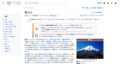
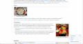
デスクトップ版の改善プロジェクトの主な目標は、よく使われるツールに読者や編集者がよりアクセスしやすくすることです。 最も重要なツールのひとつが目次(Table of contents= ToC)です。 この機能が果たす重要な役割が2つあります。 文脈について情報を与え、ページ内を移動することができるようにします。
現在のところ、目次はページの上部でのみ利用可能であり、有用性が限られています。 目次を常駐させてページ全体を通して利用可能にすることを計画しています。 目標は読者および編集者が目次により簡単に到達できるようにすることです。 より簡単に文脈を把握できるようにし、上部へスクロールする必要なくページ全体を移動できるようにしたいと考えています。
背景と目標
インターフェースにナビゲーション要素を含めて、より使いやすくしたいと考えています。 これまで、折りたたみ式サイドバーおよび固定ヘッダーを構築してきました。今度は、新しい目次を準備しています。
現在のところ:
- 現在の目次はページの上部でのみ利用可能です。 わざわざ上にスクロールしないと文脈を再び把握し移動することが困難です。
- 導入部の節が長いページでは少し下にスクロールするまで目次が見えません。
- 利用者は目次を利用してページのメンタルモデルを作成します。 これはページの導入の役割と似ています。 利用者はページに何が含まれているか、どれくらい長そうか、どの部分が最も長そうか、などを知ります。 これは目次をもっと頻繁に参照できなければ失われます。
- 目次はコンテンツ領域に多くの使われていない空間を生み出します。その空間はコンテンツや他の機能を表示するために使うことができたかもしれません。
新しい、常駐型の目次で利用者にとって以下のようなことがより簡単になるでしょう
- ページの文脈を理解する
- 目次にアクセスしたいときに毎回ページの上部へスクロールすることなく、ページの別の部分へ移動する
使用事例
- 読者または編集者として、読もうとしているページに関して文脈(内容および構造)を把握できるようになりたいです
- 読者または編集者として、次に何を読むか選べるようにページのどこでもページの次のいくつかの節を参照できるようになりたいです。
- 読者または編集者として、わざわざ上にスクロールすることなくページにいくつの節があるのか知れるようになりたいです。
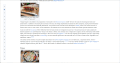
機能の説明と要件
目次はページの片側に持続的に表示されるようになる予定です。 目次の以前のバージョンで利用可能であったセクション(節)およびサブセクションをすべて含む予定です。
目次は以下の機能を含む予定です:
- 折りたたみ可能なサブセクション - 上位のセクション見出しのみ見たい利用者のため
- セクションを太字にする - ページの現在のセクションを太字で表示する予定です。 利用者は目次の太字に注目することによってページのどこにいるのか特定することができるようになります
- ナビゲーション - 目次内のセクションを選ぶことでページ内の適切なセクションに移動することができるようになります
- 1000pxより小さい幅のスクリーンに対しては、目次は折りたたまれ、セクション名が目次として利用される予定です。
- <span lang=
-
-

-
-

-
-

-


.png)

.png)
.png)
設計要件とガイドライン
試作品
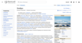
General ToC functionality: https://en-toc.wmcloud.org/wiki/Moon
Collapsible section functionality: https://di-toc-collapsible-sections.web.app/Aretha_Franklin

定性的テスト
読者および編集者の利用者テスト
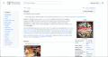
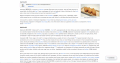
目次の利用者テストを読者および編集者で実施しました。 テストは3か所(アルゼンチン、ガーナ、インドネシア)で、異なる言語で行われました。 The participants were asked to interact with different versions of a persistent table of contents. Their task was to give feedback on their preferred version. The test also included an open study of the way readers and editors saw and used the table of contents.
All users found the table of contents to be essential to the reading experience. They needed it for both navigational purposes as well as for setting the context for the page.
Main observations:
- Testers preferred persistent access. Across all tests, the best prototype was the persistent one
- Testers preferred having more information. Prototypes that contained all sections and subsections gained more positive opinions
- Testers did not want the ToC to overlap the content. Even in the cases where it was supplementary to the main ToC at the top of the page
- Testers liked getting a sense of location within the page. They noted that additions like bolding the title or the section helped with their orientation
The results of the test were used to select the best prototype. Next, we worked on it to better fit the needs of the participants. See the full results of this test.
- <span lang=
-
-

-
-
-


編集者対象の試作品テスト
2021年12月、30ウィキにわたりログイン利用者で試作品テストを実施しました。 目次の使いやすさと機能性についてフィードバックを集めることを意図してテストを設計しました。 大多数のフィードバックは肯定的でした。 ほとんどのコミュニティのメンバーは新しい目次の場所と機能性を気に入り、変更を支持しています。
| Topic | Feedback | Next steps |
|---|---|---|
| ToC | The majority of the feedback we received was positive, with only 23 of the tested 236 users reporting a negative experience with the ToC (110 were explicitly positive, and 38 were neutral and did not prefer either the new or old versions) | Continue with proposed overall design for ToC |
| Expanded sections | People leaned towards having the ability to expand sections when necessary. | We have changed the design to allow for expanding sections when possible/enough space is available on the page, and collapsing them for pages with longer ToC's, thus optimizing for seeing the highest number of sections possible |
| ToC on Talk Pages | The majority of people who tested the ToC on talk pages agreed that the ToC should take the form it does on article pages and reported a positive experience with the new ToC. Users also suggested a number of customizations and ideas for the ToC on talk pages, such as including the number of replies for each topic, or the number of people participating in a given discussion |
|
| Lower resolution solutions | The majority of users preferred the presented solution for lower resolutions. However, a large number of people also expressed concerns around their ability to navigate the article with the proposed solution that presented sections as collapsible | We are continuing discussions for the optimal lower resolution solution for the table of contents and have explored a few more options. Progress can be tracked in this ticket |
| Main menu access | A large number of users were unhappy with the proposal to display the ToC or the sidebar at a time and expressed the need to have access to the main menu alongside the ToC. | We have restored persistent access to the sidebar. The sidebar and ToC can now both appear at a time. See our Page Tools page for more details on our plans for the main menu in the future |
| Magic words | Most users suggested that the usage of magic words should continue where relevant | We will continue respecting all magic words that do not move the location of the table of contents across the page |
定量的テスト
目次の現在のバージョンと新しいバージョンの機能性を比較するA/Bテストを実施する予定です。
主な疑問:
- 旧来の目次と比べると新しいほうはもっと頻繁に使われているかどうか
- ページの冒頭に画面をスクロールして戻る必要は、新しい目次によりニーズが減ったかどうか
- 利用者が画面をスクロールする回数や速さ※は、新しい目次により減ったかどうか(※=データ取得が可能なら)
- 新しい目次とページ閲覧時間の変化
FAQ
How can I get the old table of contents?
We intentionally do not add the old table of contents to the article in addition to the new sidebar location. This is because it increases the overall size of HTML that is shipped to clients, increases the storage requirement for our parser cache, and requires additional CSS to render. It's a trade off we've taken to reduce the work involved maintaining the code and keeping the site optimized.
Users can restore the old table of contents position with the following JavaScript code:
document.querySelector('mw\\3Atocplace,meta[property="mw:PageProp/toc"]').replaceWith( document.getElementById('mw-panel-toc') )
How do magic words work with this feature?
The __TOC__ magic word do not work in Vector 2022 as the table of contents is always in the sidebar and this cannot be changed. However magic words relating to presence of table of contents continue to work i.e. an article can disable the default table of contents and apply its own if necessary.
All magic words will continue to work for other skins which render the table of contents within the article.