Mobile design/Wikipedia navigation/Article Action Bar
This page summarizes the diverse viewpoints regarding the design of the Action Bar, which is the proposed method of separating article actions from site-wide or general functions.

The following list should capture all of the input so far:
- the Action Bar icon is not suggestive of its intended function, which is to collect all article-specific functions
- supported by four user tests, which include the feedback that the Action Bar icon is not suggestive of its intended function, and that the icon seems to be associated with the search bar
- proposed solutions: change the iconography to a more appropriate symbol, use something more in keeping with the abstract nature of the Main Menu icon, use a visual cue to suggest it is associated with the article
- put the Action Bar functions into the Main Menu as a separate section
- user Axel Boldt suggested this with the reasoning that users can never remember which menu will include which functions
- put Contents and Language as functions within the article page
- Jon suggested this as being more clear and convenient
- Jon also suggested making the Contents icon as persistent in the lower right corner of the screen
- put the Action Bar icon in the upper right of the article page
- Lindsey suggested this as a way to make the association with the article more obvious
- put some functions of the Action Bar into the top bar, together with back/forward, an icon to open other Action Bar functions, and a collapsed search field
- this was Lindsey's original design which puts less emphasis on search but makes the article functions more obvious and accessible
And finally, a separate but related issue that could affect the design of the Action Bar is enabling hide and reveal of the top bar.
Persistent TOC
edit- A proposal for making the TOC accessible at all times is a swipe to reveal it on the right side. In the article view there is a possible conflict with viewing content that flows off-screen to the right, but a possible solution is to enable scrolling of content until it ends, and then invoke the TOC with a further swipe.
- Another proposal is a persistent icon in the bottom right corner, although implementing this uniformly across browsers may be challenging.
Candidates for the Article Action Bar
editSome additional features are likely next steps for inclusion in the Article Action Bar:
- Expand or collapse all sections
- Find text in article - needed in the apps and iPhone browser, this would reduce the need for scrolling, enhance searching overall, and is a typical user expectation - requires research on future features in Safari, as well as other browsers
- View article history - a legal requirement, removes the need for the Contributors link in the footer, and aids editors or experienced readers
- Save this page - while already a feature in the apps, this could work for a certain number of HTML5 browsers (more data to come), and requires a fair amount of development
- Watch this page - this is a common function for experienced Wikipedia users and requires login (and if fully expressed, account creation)
- User sandbox editing - could be a precursor to actual editing, also requires login
A longer list of possible functions is available on the Wikipedia Navigation project page.
Contributors
editA way to see the contributors to an article is a basic requirement of the CC-BY-SA license. On the desktop site, this is accomplished through the View history tab, which includes several functions in addition to showing the contributors. For mobile viewing, several aspects of View history need to be re-designed.
A Contributors feature could show the contributors without the added functions of View history. There are two ways to show contributors:
- Number of edits
- Order the list by the number of edits made by each user, showing the username/IP address and number of edits
- Most recent
- Order the list by the most recent edits, showing username/IP address and date (time can be excluded)
The list can be limited to the first 50 users, and a See more link will show the next 50.
There is a script on Toolserver which does sort contributors by number of edits already:
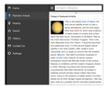
Mock-up
editDark Chrome With Pulldown Action Menu
edit- Does blue make sense in this context for the article action pull-down menu? We already use the settings icon in the other menu, so what are some alternate icons we could use here?
- Blue makes sense
- I like the idea of the letter A, which is not very international but on the other hand it implies all the right things
- This layout makes it difficult to add labels to the icons. Especially if we start considering different languages. The intention here is to make the menu seem like it more strongly correlates to the page content.
- Do the menu items seem like they would pertain to the content here or be more global? Would it make sense to add a label at the top that said "For this article.." or something similar?
- The label at the top is a good idea
- What are some thoughts on the light gray for the menu? Would a reverse menu (dark background/light icons) work better for any reason?
- Reverse menu for both the Main Menu and Article Action menu could work. I do worry if the Article Action menu becomes too long it will become awkward


Light Chrome
edit
More Options
edit-
 Alternate layout with persistant TOC and settings in page that scroll with content
 -
 Pulldown action bar that loads list views within
 -
 All Light Chrome
 -
 All Dark Chrome


