Mobile design/Full-screen search
This page is obsolete. It is being retained for archival purposes. It may document extensions or features that are obsolete and/or no longer supported. Do not rely on the information here being up-to-date. |
This document is a work in progress. Comments are appreciated but this is not a final draft.


This document describes the design of a full screen search for the developing Wikipedia Mobile site.
Rationale
editA full screen search allows more space for search terms, and a certain visual clarity. The implementation of the full screen search on the current mobile site beta could use some refinement for a user experience more in line with other Wikipedia products.
To address Bugzilla 34233
Goals
edit- To outline a simple full screen search.
- To make the visual elements elegant and appealing.
- To make interaction simple, smooth and intuitive.
- To discuss and solidify useful features and their behavior.
- To remove unnecessary components.
Interface Behavior
edit- (Here is an imagined minimal interface to go along with this simplified search.)
This interaction begins when the search box is selected from any page.
Transformation to full screen search
editAfter the search box is selected, it "expands" in all directions to take up the remaining top row of the page.
The icons (W and search button) fade out and the entire top row is white.
- This brings into question the appearance and existence of the search icon button.
The page scrolls to remove the browser heading from view.
Search rows fade in and down from this white row, completely covering the remaining page content.
The fixed state of the white search box row is emphasized by a shadow.
While the page is transformed, icons appear along with a blinking blue cursor in the search row.
- The cursor should be enough to indicate the typing action, but can be supported by a faint 'Type your search here' if necessary.
Initial full screen search appearance
edit- The propagation of the full screen search rows includes,
- back arrow to the left (in the top row)
- flashing blue cursor (in the top row)
- white field
Icons should be more than one self-width from the edge of the screen.
The search rows share the screen with the keyboard.
The back arrow takes the user back to the previous page.
The SEARCH!
editThe user tries to type something. (What will it be?!)
- When a user begins to type,
- 'x' appears in the top row
- search terms appear below with separating lines
Entered search word and the search terms below align-left with each other.
Touching 'x' clears the search box back to the blue cursor, and the search rows empty.
Longer touch on each row takes the user to that article page.
Touching the row lightly selects the row. (This feature is currently not compatible with Android)
- When selected, the search term is bold.
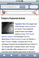
- The selected term loads an article preview.
Scrolling the search rows makes the keyboard collapse.
- While scrolling, the white search box should remain fixed, not scroll off of the screen
- Touching the search box or "done" makes the keyboard return.
Pressing the native search button takes the user to that article page, or to a more complete Wikipedia search if a specific article does not match search terms.
Alternates gallery
editIn answer to three mock requests
-
 Search without article symbol.
 -
 Search without article symbol (shifted left).
 -
 Search without article symbol (shifted left), no gradient.
 -
 Full screen search, no gradient (symbol doesn't work with these colors and no gradient).
 -
 Full screen search, no gradient and no article symbol.
 -
 Simplified search extract.
 -
 Simplified search extract, no gradient.


Continuing answer to three mock requests
-
 Mobile minimum user enters search term, with expand symbols.
 -
 Mobile minimum user selects search result preview, with expand symbols.


Questions
editDo all devices have a 'touch' interface or should we be using a more general term to include other types of selection?
Meeting Notes
editFebruary 9, 2012
edit- Use of '+' is TBD. See this talk page and bug for reasoning and discussion.
- The icon on the left side of the search rows (currently a mag. glass) serves to visually balance the rows to the search box back arrow so it doesn't look like there is an empty space vertically. This icon will be replaced by an article icon from Brandon's new designs. In the future we may be able to indicate the file type of the search this way (image, user, category, etc).
- The 'Done' button its row at the top of the keyboard will be put back.
- If possible, we will figure out a way to include the "Did you mean..." stuff.
- type ahead matching by article name
- when matches end, performs full-text search, OR
- shows "Did you mean" based on similar word
Original search mocks gallery
edit-
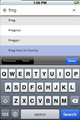
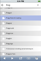
 A screenshot showing the Wikipedia search start page
 -
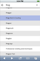
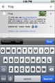
 A screenshot showing the initial full screen search interface
 -
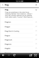
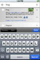
 A screenshot showing the 'text entered' full screen search interface
 -
 A screenshot showing the selected row of a full screen search interface
 -
 A screenshot showing the use of the + in the full screen search interface
 -
 A screenshot showing the full screen search interface when scrolling
 -
 A screenshot showing the Wikipedia search selection result screen
 -
 A screenshot showing search extract alternative 1
 -
 A screenshot showing search extract alternative 2


